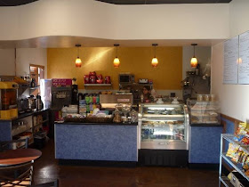
I'll be having a show at Barista Brew on May 8th for the Davis Art Walk. They have really great food, and from what I hear, some of the best coffee in Davis. I just had a pesto chicken wrap with sun-dried tomato spread that was awesome! And the prices are really really reasonable. My wrap was only $4.50 and was one the best sandwiches I've had in town.
I'll be showing a few originals and selling prints, and the show will be up till the 31st. Things should start around 6:00 pm.
More info about Barista Brew:
Here.
And more info about the Davis Art Walk:
Here.
Pages
▼
Wednesday, April 29, 2009
Saturday, April 25, 2009
James and the Giant Peach
So here's my giant James and the Giant Peach picture. I've always been a fan of the book by Roald Dahl, and love the imagery. My favorite illustrations are the ones done by Lane Smith, who also did the designs for the stop motion movie, one of the best book to movie adaptations I've seen. Lane Smith was the third official artist to take a crack at it, and though I like Quentin Blake, I was never satisfied with his images for the story, and the original illustrations weren't quite there, so I guess the third times the charm.
So my objective was to stay as true to the book as possible. This is the scene just before my favorite image in the book, when they tie the seagulls to the stem and the peach is lifted up into the air.
In my new illustration style my aim is to leave nothing to the imagination, and to cram as much as possible in there, so I have the sharks, the seagulls, all the main characters from the book with relatively accurate insect anatomy, and James. I gave James a couple of patches on his shirt because he was much abused by Aunt Sponge and Aunt Spiker, and my guess is that he didn't have the best clothes.
The descriptions of the characters in the book are sparse, which leaves a lot of leeway for interpretation, but I stayed pretty literal. James was the biggest bitch to nail. I drew James I don't know how many times. I"m still struggling with my kid drawings, but received much good advice from Mark Martin and Angelique Benicio.
So this one's all about the peach, so I gave the peach the most room in the composition.
So click on this one for the bigger version:
And a detail:
And last, the ridiculously huge version:
As before, I drew and inked each element of the picture separately. First the background with the water, the peach and the sharks, then each character and seagull. Here a few of those figures:
I drew a lot more seagulls than I ended up using though. If I had used all of them you wouldn't be able to see the ocean, so I kept it to a few.
Once again I made watercolor textures and scanned them in, then cloned them into the drawing as needed.
I very seldom use anything but the clone tool for color to give it more of a wet media look, adding only a few highlights here and there with the regular brushes. As a final touch, I printed out some of the seagulls in light blue, painted each individually and scanned them.
I'm most proud of the water in this one. Water is a very weird thing to draw with a clean contour line, since it doesn't really have any hard edges. You're sort of making it all up, coming up with your own vocabulary to describe this moving substance. Drawing things like sea foam and waves with lines is a real challenge.
So that's it. This one also took about three weeks to draw. On to the next one!
Click Here to Buy the Poster!
So my objective was to stay as true to the book as possible. This is the scene just before my favorite image in the book, when they tie the seagulls to the stem and the peach is lifted up into the air.
In my new illustration style my aim is to leave nothing to the imagination, and to cram as much as possible in there, so I have the sharks, the seagulls, all the main characters from the book with relatively accurate insect anatomy, and James. I gave James a couple of patches on his shirt because he was much abused by Aunt Sponge and Aunt Spiker, and my guess is that he didn't have the best clothes.
The descriptions of the characters in the book are sparse, which leaves a lot of leeway for interpretation, but I stayed pretty literal. James was the biggest bitch to nail. I drew James I don't know how many times. I"m still struggling with my kid drawings, but received much good advice from Mark Martin and Angelique Benicio.
So this one's all about the peach, so I gave the peach the most room in the composition.
So click on this one for the bigger version:
And a detail:
And last, the ridiculously huge version:
As before, I drew and inked each element of the picture separately. First the background with the water, the peach and the sharks, then each character and seagull. Here a few of those figures:
I drew a lot more seagulls than I ended up using though. If I had used all of them you wouldn't be able to see the ocean, so I kept it to a few.
Once again I made watercolor textures and scanned them in, then cloned them into the drawing as needed.
I very seldom use anything but the clone tool for color to give it more of a wet media look, adding only a few highlights here and there with the regular brushes. As a final touch, I printed out some of the seagulls in light blue, painted each individually and scanned them.
I'm most proud of the water in this one. Water is a very weird thing to draw with a clean contour line, since it doesn't really have any hard edges. You're sort of making it all up, coming up with your own vocabulary to describe this moving substance. Drawing things like sea foam and waves with lines is a real challenge.
So that's it. This one also took about three weeks to draw. On to the next one!
Click Here to Buy the Poster!
Thursday, April 16, 2009
Sunday, April 05, 2009
The Road To Oz
So I've been trying to figure out for a long time how to make a living making pictures. I tried editorial work for a while, but I was never too terribly good at it. I didn't have the same feel for it that a lot of people I admire have. I've never been that interested in journalism or politics, and solving those kinds of illustration problems didn't come naturally to me, but I had it stuck in my head that if I wanted to be successful in the field, that was what I'd have to do.
So, in an attempt to emulate the people I admired, I tried to cultivate a very graphic, eye-catching style that I thought would appeal to that market. But somewhere I lost track of why I wanted to do this in the first place.
So David Maxine of Hungry Tiger Press asked me to do an Oz picture for his fanzine, just a one-off black and white picture based on the book, "The Road to Oz" for the magazine. I had always liked the Oz books as a teenager, and it seemed like a fun project, so I decided to make a color image instead (I could always grayscale it later), something that I'd have liked looking at as a kid. Looking at a lot of Winsor McCay, I decided to do something really lush and detailed. I've always been much more interested in traditional storytelling than editorial, and as a kid I really liked fantasy, and I had always wanted to make picture books and comic books.
And this is as close as I think I've ever come to something I would have liked to be able to make when I was a kid:
On my browser the colors always seem a little more muted on these blogger posts, so the real colors may be more brilliant than what you see here.
And here are some details:
Process
Doing an image as complex as this would have been intimidating if I didn't approach it in pieces, and lately I've been drawing my figures separately from my backgrounds. I drew and inked each figure individually and then composited them into the picture later.
Perspective has always driven me nuts, and I've never been particularly good at it, but recently I've been using google sketch-up to put together primitive backgrounds that I can then work up and add details to:
And the finished background:
I've always been heavily reliant on photo reference, and usually take a number of photos of myself posing for each figure, but this time I didn't. Most of the reference I used was for for costuming and to get a general idea of fabric folds, but this time all the poses came mostly from my imagination. Here's an example of some of the reference I used:
I colored in on the computer, cloning in watercolor and dry brush textures on photoshop that I had scanned for things like the marble, the rust, and Polychrome's dress.
So I don't know where this is going to lead, but this seems to be the general direction that I'm headed in, with a new focus on Children's markets. We'll see how it goes. I'm kind of excited.
Click Here to Buy the Poster!