Pages

Tuesday, December 31, 2013

T-Shirts Are In!


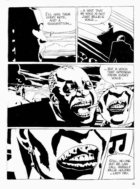
So the T-shirts have arrived in time for the new year! These shirts are designed to last!  Quality inks, 100% cotton, preshrunk and silkscreened in two-colors!  Nice big images just like we planned. I've had requests for t-shirts of this image in years past, and it had been suggested that I go the Cafe Express print-on-demand route with smaller, digitally printed images, but I was holding out till I could do it just right. This is how these shirts were meant to look!

These will ship with everything else sometime in late February, early March.


My GQ pose: 

Kickstarter Exclusives!

For now these shirts will not be offered through my site, or by mail outside of those pre-ordered by Kickstarter backers, though in the near future I might offer them locally and anywhere we're promoting the book.

Similarly, we're only printing a limited number of The Dry Brush Book beyond those pre-ordered with a run of only 125 books. The price of digital printing is a killer, and there's little profit in selling them retail. 

Details, Details...

I also had a little bit of a cost overrun on (Mostly) Wordless due to a copyediting issue so one of the signatures (or in plain talk, 8 pages) had to be reprinted. I just couldn't live with the idea of a misprint, so the cost was worth it for the correction. You'll notice a number of improvements from the PDFs--typos corrected, a tangent in one of the images (that sword no longer collides with that border!) and some other design issues have been ironed out. Fortunately we'd budgeted for it, and if we sell out on the limited first run (a boutique run of only 1000 copies) we'll save a little more in printing costs on the reprint and print more copies.

Postcards went out--everyone who backed at the postcard level got more than one in a sealed envelop, including a tri-Fold Christmas card (unless I ran out--in which case you still got two)! If you were supposed to get a postcard and didn't, let me know and I'll send one off! Unfortunately after I sent them I realized I neglected to sign them! So if you'd like a signed postcard, I'll mail an extra, signed and free of charge. Otherwise I'll be glad to sign it in person if we meet at a book fair or bookstore in your area. I apologize for the inconvenience--it's been a busy year.

(Mostly) Wordless Still Available for Pre-Order on Amazon! 

Pre-orders for the limited run are still available for the special reduced price throughAmazon for those interested. Since the book wasn't available for the holidays, pre-orders have been light, but that's definitely understandable considering that most people had lighter wallets from their holiday gift buying. But pre-orders do increase the number of books Amazon orders over all, so if you think someone might like to pre-order the book before it's wide release in April, spread the word.

Thanks again so much for all the support, and I hope to reward that support with great books posters and swag!

--Jed

Tuesday, December 24, 2013

In Defense of Keith Giffen

As a kid growing up in the 80s, Keith Giffen's art was both a prevalent, and a polarizing presence in American comics.  Sometime in the early 80s Giffen went from being an unremarkable Kirby clone:


Defenders #49

To this:


Unfortunately, it turned out that this style wasn't exactly the height of originality either. Instead of Kirby, Giffen was aping a Argentine cartoonist little known at the time in the states, Jose Munoz:


In some cases outright plagiarizing whole panels of Munoz's work. This became somewhat of a scandal, but not enough for Giffen to no longer get work. 

Forgive the tangent, but as much as I like Giffen, Munoz was, and is, in every way a more talented artist than Giffen. There's really no comparing them. Take a look:


Munoz and Sampayo, Billie Holiday

But Giffen continued to get work. A lot of it. He was doing work for mainstream franchise characters for both Marvel and DC. While little more than a decade earlier  DC Comics hired Al Plastino to redraw the faces of Superman drawn by Jack Kirby at the height of Kirby's popularity, because Kirby wasn't drawing Superman "on model," they let Giffen draw Superman like this: 

Action Comics #579


Despite fan protests, they kept hiring him. Fan's protested not because he was plagiarizing another artist (whom most fans had never seen), but because a lot of them just plain hated it. But they kept using him. Maybe it was because he was good at meeting deadlines. Maybe he was just a really nice guy. I once read a quote from one of his peers, who gave Giffen the feeble defense of being a "homage artist." Whatever that means. 

But in the 80s, I'd never seen Munoz, so I hadn't yet had the opportunity to form a bias. I was wide open to Giffen, whose work didn't look like any other artist I'd ever seen, and I fell in love with it. I remember being particularly enthralled by a Menthor serial he did in one of the many, (and probably the best) T.H.U.N.D.E.R. Agents revivals. I think it was in one of these stories that I discovered later a couple of panels or figures that were direct swipes from Munoz. But still, Giffen had his own way of doing things:


These are from Wally Wood's Thunder Agents from Deluxe Comics


Dense layouts, sometimes with no gutters between panels, the images often oddly cropped, sometimes so much it was hard to decipher what was going on, but it was definitely his. It had it's own character and language. Lacking the draftsmanship of Munoz, Giffen instead distilled stylistic elements from Munoz's work to make his own symbol vocabulary.

While there was a good deal of experimentation happening in franchise comics at the time with artists like Miller and Sienkiewicz, what Giffen was doing was so different, his formal language so idiosyncratic, it had more in common with contemporary indy cartoonists like Ron Rege than what was being done then.

And sometimes his pages could be elegantly designed. This one-off he did for Spider-Man is a particularly good example:


Peter Parker, The Spectacular Spider-Man #120


And other times the action could be completely incomprehensible:


Hex #16

Then his work could veer into complete abstraction, pure shapes and patterns: 


I have no idea

Video Jack #1


To the point where he went so far away from Munoz territory that there really was no comparison. Then there was the famous Giffen 9 panel grid. Here, again from Spider-Man:


Giffen would sometimes do entire issues with the same 9 panel grid. For his adaptation of Robert Bloch's Hell on Earth, he even went so far as to do a 16 panel grid:


With, of course, at least one close-up of a giant eyeball. That was Giffen. I don't know who colored this one, but the colors are fantastic.

Fans tended to respond better when Giffen was doing humor. His own creation, Ambush Bug had a cult following for a while.


And Ambush Bug's very close, but less successful cousin, The Heckler:


But Giffen scored better with fans with his run on Justice league, doing only layouts and plotting for Kevin Maguire's pencils, and J.M. Dematteis' dialogue. As long as he wasn't drawing, apparently. But once again, his layouts had a typically idiosyncratic approach:


And some time after that, Giffen aped...Kevin Maguire.


According to my sources, in an earlier incarnation of Legion, Giffen did impersonations of various other artists, but this particular impersonation is notable for its shamelessness. He just couldn't stop.


During the 90s, he changed styles yet again, trading all those dark spotted blacks for near incomprehensibly dense contours with Trencher:


Which fit right in at Image Comics, with their splashy exaggerated action over substance line of creator owned books. Though it wasn't exactly a huge hit.

Now Giffen has given up drawing altogether except for occasional layout work, sticking mostly to scripting. At least I think so. I haven't read any of his new stuff. But I think I'll always prefer the old stuff. 

Wednesday, December 18, 2013

What Shia LeBeouf Really Took From Dan Clowes


I generally have a more flexible idea of the dos and don't of intellectual property, but in the case of Shia LaBeouf's recent plagiarism of Dan Clowes short work Justin M. Damiano, my feelings are a little more personal. I've been a longtime fan of Clowes, and his work has been very important to me. 
Someone on the comments section of a recent article about LeBeouf's plagiarism, (which you can read, here), suggested that Clowes benefited from LeBeouf's fame because of the publicity brought on by the the incident I don't happen to agree. 
The whole point of licensing is not just compensation but artistic control. the two pre-existing films made from Clowes’ work, Ghost World and Art School Confidential,  were close collaborations with his friend, Terry Zwigoff. He was not consulted for LeBeouf’s film in any way, and would more than likely not have given him permission to adapt the story if he had been given the choice. LeBeouf did not give him this choice. 
Clowes has had many opportunities to pursue a kind of fame. He’s been invited to appear on national talk shows, but has refused these offers, and declines most interviews. Saying that he benefits from LeBeouf’s fame suggest that fame is something that Clowes values over the integrity of his work, and that’s just not the case.
Then there’s LeBeouf implication that he was the author of the work. It could have been a fan film, but that’s not how LeBeouf presented it. It was only when LeBeouf was caught, that he revealed the truth. He presented the film as his own original work at the biggest film festival in the world. He received acclaim for work he did not do. He was found out, but the damage has largely been done. Giving Clowes a credit on a film that Clowes had nothing to do with doesn’t reverse this. A credit on the film implies that Clowes in some way takes responsibility for its content, and only gives further credibility to the project.
For as long as Clowes is able to maintain legal control over his work, that control should be respected, and LeBeouf should get more than a slap on the wrist. Otherwise, what’s to prevent someone else from doing the same thing? The film needs to be killed. Clowes needs to be compensated. End of story.

Friday, December 13, 2013

Mercer Mayer: an Appreciation, or Why Mercer Mayer Is So Much More Than a Poor Man's Maurice Sendak

After this:


Mercer Mayer is best known for the seemingly endless and ubiquitous Little Monster, and Little Critter series, which I've never been too terribly impressed with. These series have become early reader staples, along with Arthur and The Berenstain Bears. So even if you don't know him by name, you've probably seen one of these:


Early in his career, Mayer was criticized for being a Maurice Sendak clone, and it's easy to see why:


I know a lot of people are fans of the book, but I never liked There's a Nightmare In My Closet. To me, it always seemed like a less imaginative version of Where the Wild Things Are. Not that the stories were similar, but the look of the book was obviously more than a little inspired by Sendak's Wild Things. It's not just stylistically derivative, but a near dead-on impersonation. But it's no Wild Things. It was done early in Mayer's career, in 1968, was very popular, and helped to establish him in the field, but critics at the time felt the same way I did. Even as a kid, I wasn't fooled by the knock-off.

A book by Mayer in this vein that I do like is Frog Goes to Dinner:


Beautifully drawn and completely wordless, it looks a lot like Sendak, but it was done with more imagination and energy than Nightmare. There were 6 Boy, Dog and Frog books in the series, all wordless, though I've only seen this one, published in 1974. The first of these books and Mayer's first published book, was A Boy, a Dog and a Frog, in 1967.

When I was in elementary school, I was hooked on the now out of print John D. Fitzgerald series, The Great Brain. These were stories that took place in Utah just before the turn of the century, about John Dennis Fitzgerald and his brother, The Great Brain, who was always coming up with some new way to swindle the neighborhood kids, or put one over on somebody. I cannot fathom why this series still isn't popular today. It was pretty brilliant. At least that's how I remembered it. It's been a few decades, but I think I'd still like The Great Brain. And though at the time, I didn't make the connection between The Great Brain which I loved, and A Nightmare In My Closet, which I didn't, The Great Brain was illustrated by The Very Prolific, Mercer Mayer


The interior illustrations were in black and white and featured Mayer's usual Sendak inspired pen work, but the subject was very different than Mayer's early work for younger children, and as the series progresses,  you can see Mayer coming into his own and forming his own identity as an illustrator.  The first book was published the same year as A Boy, a Dog and a Frog, and the last, a decade later.


I find this image particularly affecting:


Here, on the cover of one of his later books,  you can see how his craft is a little more refined--he's no longer hiding uncertain details with dense crosshatching. In general, his approach is more confident and assured.


 And he was starting to look less and less like Sendak. To be fair, when A Nightmare In My Closet was published, Mayer was only  25. But the book's enduring popularity unfortunately has eclipsed Mayer's other accomplishments. Of particular note is a book that's difficult to come by these days, the long out of of print, East of the Sun, and West of the Moon, a book I discovered only today, on a recent post by Charlie Jane, which inspired me to revisit Mayer.


This was published in 1980, 12 years after Nightmare, and just after the last Great Brain book appeared. It was based on a Norwegian folktale, and is probably the most beautiful thing I've ever seen Mayer do.  I've seen a version of Beauty and the Beast he did around this period, but it doesn't compare to this. Since the book can run you upwards of $100 these days on E-Bay, and since I've never seen the book in person,  I'm going to post as many images from the book as I was able to find: 


There's no crosshatching--just watercolor and contour, all Mayer with hardly a hint of Sendak influence remaining. I love these images, though I'll admit a prejudice against the doe-eyed dragon, but that's easily forgiven. It was a 70s thing, a little leftover zeitgeist from the  Keane kids and Robin James Serendipity series, and you can't fault the guy for being of his time. It's the only thing that really dates this book, and someone really needs to bring it back into print. 

And as a cherry on the sunday, while I was tracking these down, I discovered this cover he did to one of my favorite books, The Master and Margarita:


This was the cover of the version that I read, and it perfectly suits it! I had no idea it was Mayer!