So here's the first spread for my current book proposal in progress, Hippopotabus.

Be sure to open it in it's own window--it's nice and large, and doesn't have quite the same impact at this size.
And some details:


Getting Better at What I'm Already Good At
Be forewarned: I offer a lot of technical detail that's likely only going to be of interest to art students and other professionals, so if this isn't your thing, you might want to skip this part and go right to the next portion, "other influences."
as I explained in an earlier post, I'm working on concentrating on my strengths and getting better at the disciplines I've already been developing and improving. I've done a lot of experimentation in the last few years to find my way. Now it's time to hone in on what's been working for me. Experimentation is great, and I'll continue to work on my realistic rendering skills in my personal work, but for my professional work, I'd like to use more of a cartoon and contour vocabulary, something more rooted in line than tone and realistic rendering.
Many of the figures above are done with dry brush (ink with less moisture on the brush so it catches more of the texture of the bristles and the tooth of the paper), but the emphasis is on contour and line.The dry brush is more to suggest surface than the play of light, which I achieve more through color.
I'm still doing work in pieces and assembling figures and backgrounds on the computer since this seems to have worked best for me so far. This allows me to do complex images without worrying about screwing up details.
Here's another example of an image done in pieces:
 I tend to render these parts more than absolutely necessary--in this case I knew the feet would get cropped out, and a lot of detail is lost under the water in the picture, but I find it's better to have too much than not enough.This figure is more watercolor than dry brush to make the changes in value in the scales look more organic, something in the past that I would have done in the digital rendering..
Color
I'm making more of an effort to bring organic watercolor textures into my images. One technique is to use not only scanned watercolor textures, but watercolor overlays. I'll print out my full black and white image after it's been assembled, put it on my light box, then paint in shadows on a separate sheet of watercolor paper to be scanned and applied.

this gives a little more organic variety to my color, making it less digital. One thing that this achieves that I really love, is to give me those hard edges--the way a puddle of watercolor has that hard edge when it dries, which makes for excellent core shadows and sharper light. The hippo's head, here, is a good example. I can't fake that effect with digitally applied highlights. It just doesn't have the same sharpness.

This also helps to unify, better integrating the figures drawn separately into the space, making the image feel less like a collage.
the jungle background through the windows are like little mini watercolor paintings, in this case, done with dip pens and ink, with some brush and ink wash:
 Still line-based, but the tones also have a nice unified feel when I color them digitally.
Color Concepts: Using Color to Provide Contrast and Richness
I use color, contrast and light to lead the viewers eye so that they won't get lost in a miasma of Where's Waldo detail. I use red accents both to compliment the dominant green and to further call attention to our main protagonists. Red is a very powerful color and tends to attract the viewer's eye, so this accent in my main figures should come in handy in future images. The other principal colors are purple and blue, both analogous to the blue-green and accented by the split compliments of the yellow/orange of the outdoor light that provides necessary contrast.. I think it's always good to have both black or almost black, and pure white somewhere in the picture for contrast. Though I do this intuitively, each color has its hierarchy within the space, First the dominant green, then the receding, darker purples and blues, then the complimentary accents.
It takes me a lot of digital fiddling to get to where I'm trying to go with the color, and with a little distance--breaks are important-- I have a good sense when I've gotten there. I often am timid about adding darks, but seldom regret when I do. It's all about where you want the viewer to look--the focal point--contrast, and the balance of the composition--how can it be better unified? One technique I sometimes use is to put a watercolor texture over the entire image on a multiply layer as if it were a wash, and erase out highlights as needed. This technique really helped me to get the darks I needed for this image.
Embracing the airbrush
I've long resisted using the airbrush tool in Photoshop--it always seemed to make the work look too slick and plastic, but I've been recently looking at the work of Leo and Diane Dillon and rethinking how I feel about the tool. They used a conventional airbrush in some of my favorite images, and while I do want my work to look organic, airbrush can help add mood and richness if used sparingly. There's nothing inherently bad or good about any tool. It's all in how you use it, and it this case it was helpful to add shadow to the corners of the images to provide greater depth, and draw the viewer in.
Water

The water, too, is done on an overlay, this time with brush and ink with just a little bit of dip pen when I want a line to come to an especially sharp point. Sometimes a pen gives just the right amount of snap to the line.
Water is one of my favorite things to draw, and this is a great example of how I significantly veer from tonal rendering.Water, constantly in motion, has very elusive edges. Contour lines in drawings are more often than not, an invention. Little in nature has a true line around it, and this is particularly the case with water. So the magic trick is being able to imply movement with nothing but edges. I also use a symbol vocabulary for this task, so I have a certain way I draw foam and wave crests that has less to do with observation, and more to do with expressionism or straight up cartooning.
One key inspiration for this approach is Hokusai's woodblock prints:

In a realistic painting of water, you're going to want to rely more on value and tone. On the way water looks optically. But this kind of rendering is all about the way water moves and feels. There's always expressionism in painting of any kind, but this is expressionism using line and symbol rather than naturalistic values.
Perspective
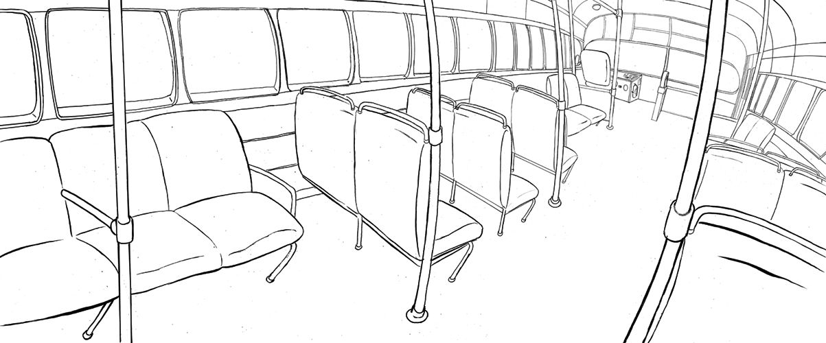
As discussed in an earlier post, I've been experimenting with intuitive and exaggerated perspective. No rulers are used, and the only measurements are made by drawing an X through a shape to find its middle. This image is technically inaccurate, but makes intuitive sense. And while I want to exaggerate the perspective to give a sense of a roomier space, I don't want it to be too extreme or too caricatured. While I admire what he does, the fish-eyed look of an artist like Mark Fredrickson is less what I'm going for.
You also might notice that I changed the dashboard of the bus. Shortsightedly, it hadn't occurred to me that I would have to draw this part of the bus from another perspective on a future image, so I couldn't get away with faking it. I had to make sure it was not just a box of random buttons and squares, but something resembling a real dashboard with a break pedal and a stick shift.It's never a good idea to fake technology or anatomy. It's always going to bite you in the ass later. You don't have to render every detail, but the basics are critical.
I also wanted to make the lever mechanism that opens the bus doors manually on older buses, but found this looked long and unwieldy within the exaggerated hippo accommodating width of my bus. It would look like something out of Seuss or Rube Goldberg, and this wasn't the aesthetic I was going for. So regrettably, I decided leave it out.
Other Influences: Babar and Zephir, Moebius an Darrow
As I grow older I find that I'm beginning to again embrace the art that had the most impact on me as a kid which has always been picture books and comics. While my tastes have changed and varied, these early influences still resonate for me, and I've found it meaningful to revisit them.
One of my favorite books from childhood that I recently rediscovered is Babar and Zephir. Zephir is the monkey companion of Jean De Brunhoff's classic character, Babar, though despite the title, Babar does not make an appearance.

I find images like this irresistible both in their whimsy and simplicity.
There's a lot of space for the reader's imagination to fill in. Just a few of these tree-houses implies a grand city in the trees. I also love the whole aesthetic of these books, with their handwritten cursive script unfortunately replaced in recent editions with traditional typesetting.
I remember as a kid finding this sequence both fascinating and horrifying (the mermaid, to my relief, survives). It's also one of the great sequences in the story with no narration, told entirely in pictures:

I loved its depictions like these of water, and among all the Babar books, this one had the most whimsy, with mermaids and monsters:

Moebius and Geof Darrow
Moebius, the pseudonym for the also French artist Jean Giraud, has also been an enduring influence, and this image done in collaboration with Geof Darrow, was an particular revelation:

this is from the now very rare City of Fire portfolio,but was printed in a book I had as a young teen, The Art of Moebius. There's so much life and energy and detail in this image you can see something new every time you look at it.
Later, Darrow did his own comic, Hard Boiled, with Frank Miller.

The world of Hard Boiled was much seemier than anything Moebius had ever drawn. This is one of the milder spreads. But as a teen I found it irresistible.
I wanted Hippopotabus to allow the reader to have this same kind of rich exploration, to discover something new every time they looked at it. So somewhere in between Hard Boiled and Babar and Zephir lay the childhood influences behind my current project.
Rather Than Emulate, Be Inspired
As I write this I realize I mention a lot of other artists. I love to look. But I do think it's important to find your own voice. It's not about emulating the work you admire, but recognizing through those images that you have your own unique observations. Because no one sees an image in quite the same way. And it's what you see that others don't, both in nature and art, that makes the work your own.
It's also useful to see how other people solve problems, both to inform your own approach, and to discover what you would like to do differently. So as long as you're spending more time making art than looking at it, the work you consume is only going to enrich the art you make.
Be sure to open it in it's own window--it's nice and large, and doesn't have quite the same impact at this size.
And some details:
Getting Better at What I'm Already Good At
Be forewarned: I offer a lot of technical detail that's likely only going to be of interest to art students and other professionals, so if this isn't your thing, you might want to skip this part and go right to the next portion, "other influences."
as I explained in an earlier post, I'm working on concentrating on my strengths and getting better at the disciplines I've already been developing and improving. I've done a lot of experimentation in the last few years to find my way. Now it's time to hone in on what's been working for me. Experimentation is great, and I'll continue to work on my realistic rendering skills in my personal work, but for my professional work, I'd like to use more of a cartoon and contour vocabulary, something more rooted in line than tone and realistic rendering.
Many of the figures above are done with dry brush (ink with less moisture on the brush so it catches more of the texture of the bristles and the tooth of the paper), but the emphasis is on contour and line.The dry brush is more to suggest surface than the play of light, which I achieve more through color.
I'm still doing work in pieces and assembling figures and backgrounds on the computer since this seems to have worked best for me so far. This allows me to do complex images without worrying about screwing up details.
Here's another example of an image done in pieces:
Color
I'm making more of an effort to bring organic watercolor textures into my images. One technique is to use not only scanned watercolor textures, but watercolor overlays. I'll print out my full black and white image after it's been assembled, put it on my light box, then paint in shadows on a separate sheet of watercolor paper to be scanned and applied.
this gives a little more organic variety to my color, making it less digital. One thing that this achieves that I really love, is to give me those hard edges--the way a puddle of watercolor has that hard edge when it dries, which makes for excellent core shadows and sharper light. The hippo's head, here, is a good example. I can't fake that effect with digitally applied highlights. It just doesn't have the same sharpness.
This also helps to unify, better integrating the figures drawn separately into the space, making the image feel less like a collage.
the jungle background through the windows are like little mini watercolor paintings, in this case, done with dip pens and ink, with some brush and ink wash:
Color Concepts: Using Color to Provide Contrast and Richness
I use color, contrast and light to lead the viewers eye so that they won't get lost in a miasma of Where's Waldo detail. I use red accents both to compliment the dominant green and to further call attention to our main protagonists. Red is a very powerful color and tends to attract the viewer's eye, so this accent in my main figures should come in handy in future images. The other principal colors are purple and blue, both analogous to the blue-green and accented by the split compliments of the yellow/orange of the outdoor light that provides necessary contrast.. I think it's always good to have both black or almost black, and pure white somewhere in the picture for contrast. Though I do this intuitively, each color has its hierarchy within the space, First the dominant green, then the receding, darker purples and blues, then the complimentary accents.
It takes me a lot of digital fiddling to get to where I'm trying to go with the color, and with a little distance--breaks are important-- I have a good sense when I've gotten there. I often am timid about adding darks, but seldom regret when I do. It's all about where you want the viewer to look--the focal point--contrast, and the balance of the composition--how can it be better unified? One technique I sometimes use is to put a watercolor texture over the entire image on a multiply layer as if it were a wash, and erase out highlights as needed. This technique really helped me to get the darks I needed for this image.
Embracing the airbrush
I've long resisted using the airbrush tool in Photoshop--it always seemed to make the work look too slick and plastic, but I've been recently looking at the work of Leo and Diane Dillon and rethinking how I feel about the tool. They used a conventional airbrush in some of my favorite images, and while I do want my work to look organic, airbrush can help add mood and richness if used sparingly. There's nothing inherently bad or good about any tool. It's all in how you use it, and it this case it was helpful to add shadow to the corners of the images to provide greater depth, and draw the viewer in.
Water
The water, too, is done on an overlay, this time with brush and ink with just a little bit of dip pen when I want a line to come to an especially sharp point. Sometimes a pen gives just the right amount of snap to the line.
Water is one of my favorite things to draw, and this is a great example of how I significantly veer from tonal rendering.Water, constantly in motion, has very elusive edges. Contour lines in drawings are more often than not, an invention. Little in nature has a true line around it, and this is particularly the case with water. So the magic trick is being able to imply movement with nothing but edges. I also use a symbol vocabulary for this task, so I have a certain way I draw foam and wave crests that has less to do with observation, and more to do with expressionism or straight up cartooning.
One key inspiration for this approach is Hokusai's woodblock prints:
In a realistic painting of water, you're going to want to rely more on value and tone. On the way water looks optically. But this kind of rendering is all about the way water moves and feels. There's always expressionism in painting of any kind, but this is expressionism using line and symbol rather than naturalistic values.
Perspective
As discussed in an earlier post, I've been experimenting with intuitive and exaggerated perspective. No rulers are used, and the only measurements are made by drawing an X through a shape to find its middle. This image is technically inaccurate, but makes intuitive sense. And while I want to exaggerate the perspective to give a sense of a roomier space, I don't want it to be too extreme or too caricatured. While I admire what he does, the fish-eyed look of an artist like Mark Fredrickson is less what I'm going for.
You also might notice that I changed the dashboard of the bus. Shortsightedly, it hadn't occurred to me that I would have to draw this part of the bus from another perspective on a future image, so I couldn't get away with faking it. I had to make sure it was not just a box of random buttons and squares, but something resembling a real dashboard with a break pedal and a stick shift.It's never a good idea to fake technology or anatomy. It's always going to bite you in the ass later. You don't have to render every detail, but the basics are critical.
I also wanted to make the lever mechanism that opens the bus doors manually on older buses, but found this looked long and unwieldy within the exaggerated hippo accommodating width of my bus. It would look like something out of Seuss or Rube Goldberg, and this wasn't the aesthetic I was going for. So regrettably, I decided leave it out.
Other Influences: Babar and Zephir, Moebius an Darrow
As I grow older I find that I'm beginning to again embrace the art that had the most impact on me as a kid which has always been picture books and comics. While my tastes have changed and varied, these early influences still resonate for me, and I've found it meaningful to revisit them.
One of my favorite books from childhood that I recently rediscovered is Babar and Zephir. Zephir is the monkey companion of Jean De Brunhoff's classic character, Babar, though despite the title, Babar does not make an appearance.
I find images like this irresistible both in their whimsy and simplicity.
 |
| Babar and Zephir in it's original French |
There's a lot of space for the reader's imagination to fill in. Just a few of these tree-houses implies a grand city in the trees. I also love the whole aesthetic of these books, with their handwritten cursive script unfortunately replaced in recent editions with traditional typesetting.
I remember as a kid finding this sequence both fascinating and horrifying (the mermaid, to my relief, survives). It's also one of the great sequences in the story with no narration, told entirely in pictures:
I loved its depictions like these of water, and among all the Babar books, this one had the most whimsy, with mermaids and monsters:
Moebius and Geof Darrow
Moebius, the pseudonym for the also French artist Jean Giraud, has also been an enduring influence, and this image done in collaboration with Geof Darrow, was an particular revelation:
this is from the now very rare City of Fire portfolio,but was printed in a book I had as a young teen, The Art of Moebius. There's so much life and energy and detail in this image you can see something new every time you look at it.
Later, Darrow did his own comic, Hard Boiled, with Frank Miller.
The world of Hard Boiled was much seemier than anything Moebius had ever drawn. This is one of the milder spreads. But as a teen I found it irresistible.
I wanted Hippopotabus to allow the reader to have this same kind of rich exploration, to discover something new every time they looked at it. So somewhere in between Hard Boiled and Babar and Zephir lay the childhood influences behind my current project.
Rather Than Emulate, Be Inspired
As I write this I realize I mention a lot of other artists. I love to look. But I do think it's important to find your own voice. It's not about emulating the work you admire, but recognizing through those images that you have your own unique observations. Because no one sees an image in quite the same way. And it's what you see that others don't, both in nature and art, that makes the work your own.
It's also useful to see how other people solve problems, both to inform your own approach, and to discover what you would like to do differently. So as long as you're spending more time making art than looking at it, the work you consume is only going to enrich the art you make.


