Pages

Tuesday, March 25, 2014

Why Pat Boyette's Korg: 70,000 B.C. Is One of the Greatest Comics of All Time


Pat Boyette is one of the great unsung heroes of comics.

 Boyette's best known work is from Warren's Creepy and Eerie magazines and  the much maligned, Charlton, and Charlton is where he did one of the greatest comics of all time, Korg: 70,000 BCCharlton was a company from Derby Connecticut that printed their comics on the cheapest paper with the cheapest coloring on their own presses, and notoriously paid their talent the lowest rates. But Charlton also offered its talent more creative freedom than they could get just about anywhere else, and artists like Steve Ditko and Pat Boyette were largely left alone to do what they wanted.

Boyette made up for Charlton's cheap page rates by producing a ton of work, working on numerous Charlton titles at once during the late 60s and 70s. He did everything, soup to nuts: pencils,inks, letters and sometimes scripts and fully painted covers. He famously did a complete issue of Peter Cannon, Thunderbolt in under a week. Sometimes, as a result, his work could look rushed, but at Charlton Boyette was given free reign to do some of the most formally experimental work of that era, on a book that nobody cared about. Korg: 10,000 BC, based on a pretty awful short-lived TV series. But Boyette made Korg his own.

Here's one of Boyette's typical painted covers:


Korg wasn't exactly great literature. Yes it looks kind of trashy. And this is the problem with a lot of comics, particularly from the past: some of the best storytelling wasn't always in the service of the best stories.

 But dismiss Korg at your own peril! If you're into comics, you should be into Korg. Why? Because of stuff like this:


This page is all diagonals and reads, not from left to right, but clockwise. Who does that?

Or this page:


Since Boyette did his own lettering (a rare thing in newstand comics at the time) he was able to use word balloons to guide the eye from left to right and then right to left again. but check out that second panel: 


Not only does the action go from right to left, but so does time. The guy on the right throws the spear, and then the middle guy says, "look out!"  But that's not the cool part!


 He switches the action seamlessly because the arrow is launched between panels, carrying us from left to right again. We don't see the arrow being shot, but the implication of the direction of the arrow changes the direction of the action. He emphasizes this forward momentum by having the stricken character lunge into the next panel.

This page looks to be shot from the original artwork, so you can see the art in it's original black and white, before Charlton coloring and bad printing had a chance to dull Boyette's line.


This one's a little more confusing. Now we have three panels. As the two men are attacked, we see a full figure shot of  one and a reaction shot of the other, each panel a kind of montage, with the last image in the second panel a reaction shot of the first as he struggles with the rope around his neck. At least I assume it's the first guy. Since they both look exactly the same, the rope is the only way we can tell one from the other. In the last panel, the action is joined together in one scene, and you have this sense that the action all happened very quickly, maybe even simultaneously.

I don't think this page entirely works, but it's still very ballsy, and typical of the kind of invention that you see again and again in Korg. Not every experiment worked, but nobody was trying this stuff, and Charlton was the perfect place to do it, because no one was watching. Boyette experimented with diagonals and other formal inventions in earlier stories, like Children of Doom from Charlton Premiere in the 60s:


(Back when the color printing was particularly bad) but never quite to the degree of Korg

Which is why Korg is one of the greatest comics of all time. Am I wrong?


Sunday, March 23, 2014

In Search of Moebius' Aedena Cycle in English Translation

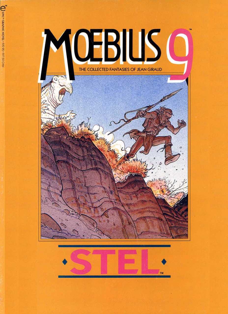
For reasons I can't entirely understand, U.S. translations of the late Jean Giraud's alter ego are rare in the states. In the 80s and early 90s, there were a series of graphic novels released by Marvel Comics Epic imprint. This was how I was introduced to Moebius' work. This was the first of those to be released.


When I bought this at 14, I was immediately hooked. If you're familiar with Moebius' work, I don't have to tell you why. If you don't know, I recommend you Google him immediately. Other collections included short stories and longer works, classics like The Long Tomorrow (which inspired the look of the film, Bladerunner) and The Airtight Garage, an strip that was completely improvised in three and four page episodes, and continues to be one of my favorite works. But Upon a Star not only one was my first discovery of Moebius, but the first in a series called The Aedena Cycle that completely kicked ass.

Upon a Star was a commission done for the dealership of a car manufacturer called the Citroen, but eventually turned into one of his most enduring and personal works. The first three books of this series were easy enough to find  in the states when they were first released: Upon a Star, The Gardens of Aedena and The Goddess. After that the search became a little more difficult. 

Stel was released in this now near impossible to find volume that I had the privilege of reading, but not owning a couple of years ago:


I think this was written when Giraud was just getting out of a a religious cult he had been involved in, and was unusually bleak for the series. 

The fifth wasn't reprinted at all, a book called,  Sra:


What I think is a  fan translated version is out there, or if it's not fan translated, it had a very limited run. The sixth had an even stranger release.


Concrete Earth Day, that featured a story done by Paul Chadwick about his signature character, Concrete, and a few others, included another story, a wordless story by Moebius.


So when recently I got the French version of the final Aedena book, Les Reparateurs,


I discovered that the story was very familar, most of it from the Earth Day book. Here are a few of the pages that were, for whatever reason, omitted in the reprinted story:


Part of me was a bit disappointed that I had seen the material before, part of me bewildered that it would be reprinted without any mention or acknowledgement that it was the final installment of the Aedena Cycle. Why had it been released with so little acknowledgement or fanfare? Moebius was still a big deal at the time.

While Moebius' collaboration with Jodorowsky, The Incal, has recently been reprinted for the U.S. Market, very little of his other work has seen English translation in recent years, including his very last album, A final story about one of his most iconic characters, Arzach.  For us Moebius fans, it's a bit daunting.

I lended out The Airtight Garage so often, that it's no longer in my possession, and these days, will cost me upwards of $100 to replace. There was a digest-sized sequel to the Airtight Garage released in the 90s by Dark Horse, but it seemed to be unfinished, and I'm wondering if it was ever continued.

Some day I'm sure there will be a beautiful hardbound collection of Moebius' complete works in English translation, but until then, unless you're willing to shell out hundreds of dollars, his work in translation remains hard to find. 


Friday, March 21, 2014

Cheetah Studies (Sans Spots)

Here are some more Cheetah studies for a commission I'm working on, just figuring out the anatomy. I didn't bother to put in the spots so they don't exactly look like Cheetahs, but you get the idea.


Tuesday, March 18, 2014

Why David Letterman Once Mattered: Satire on TV


Small town news on David Letterman, circa 1980 (at 3:26) the original internet content, irony provided by Dave.

 For better or worse, Letterman represented a sea change in mainstream media.

The Johnny Carson and Mike Douglas model offered straight Bob Hope and Borscht Belt inspired gags, and Letterman was the first to add a post-modern edge to the format. Political content was minimal and lacked the teeth of shows like Colbert and The Daily Show today, but Letterman was the original source of the tone of those shows, a wink to the audience that what they were watching was artifice. Unlike Saturday Night Live, (which by the early 80s was going through one of its worst periods) Letterman mocked the format itself and the fundamental fakeness of TV talk shows in the context of a TV talk show, something no one had done before. 

One convention of the format that Letterman hated was product endorsements, a mainstay of talkshows since their inception, segments in which the host would introduce whatever product the sponsor was selling. Even Mike Wallace shilled cigarettes.


But Letterman's ambivalence was apparent. I remember at one point seeing him walk out in the middle of one of these endorsements, refusing to continue. Eventually the network allowed him to stop altogether.

I remember as a kid being introduced to cartoonists like Harvey Pekar (who Letterman didn't really get) and Lynda Barry (who else would book a small press comics writer and cartoonist on a late night talk show?) Here he is interviewing Barry:


and the underrated Chris Elliot, a writer on the show who also helped to set the tone.


Letterman featured singularly unique guests and comedians who seldom appeared anywhere else, like Andy Kaufman and Brother Theodore. Brother Theodore would show up on the occasional Tonight Show episode, but he was a frequent guest on Letterman. The mainstream audience didn't have the patience for anything that wasn't Seinfeld style, gag a minute comedy, but Brother Theodore found a home on Letterman.

Here's Brother Theodore doing his thing:


For me, as a Kid, Letterman was my Mad Magazine. Mad Magazine was the original inspiration for Saturday Night Live and Letterman's brand of humor, but by the 80s had gotten into a kind of rut and had lost a lot of its former bite. Letterman had something new to say, or at least, a new way of saying it.

Letterman The Shill

Not that Letterman wasn't subject to the constraints and compromises involved in working for a show and  network whose main job was to sell soap and mouthwash and shill movies and TV shows with celebrity appearances. While subversive in its way, Late Night With David Letterman was still fundamentally a part of the corporate machine. When GE bought NBC, Harvey Pekar, in a now notorious appearance, took Letterman to task on this point, in affect, pulling down the curtain and revealing what Letterman's job truly was:


Letterman's anger here is personal. Letterman knows what his job requires him to do, and like his ambivalence about endorsing soap and mouth wash, he has some awareness that he's a passive actor in a larger high stakes game. He's owned by a corporation whose job is to sell junk.

Pekar revealed the failure and threshold of Letterman's ability to subvert, and I think he knew that what Pekar accused him of was fundamentally true. Lacking the charisma of Letterman (and with Letterman's own dismissal of Pekar as a guy who "writes comic books") nobody was listening. Pekar was considered a crank who had outstayed his welcome. He was no longer an amusing eccentric to serve as the butt of Letterman's jokes but an annoying nuisance.

Unfortunately many of these more oddball guests were treated as objects of ridicule by Letterman. They were lovable eccentrics, but "lovable" only went so far. Once again, Letterman gave a wink to the audience to say, "look at the freak show,"tolerating, but never fully embracing his guests who went just a little too far outside of the mainstream.

Now that every talk show on the air has adopted Letterman's ironic pose, this post-modern self-referential wink has lost any real irony or subversiveness it once had. Its been reduced to a trope, and The Late Show with David Letterman has blended into the background.


Steven Colbert as Heir Apparent

While Comedy Central's The Daily Show continues to be great satire, the most progressive talk show on the air is The Stephen Colbert Show which owes no less a debt to Letterman. Colbert has taken Letterman's knowing wink a step further. He presents a character whose every word is a lie. The subtext is the constant acknowledgement that all media is a lie. Using this character as vehicle, he's able to criticize the media in such a biting way that he would otherwise appear shrill and difficult to digest to a mainstream audience. But Colbert pulls it off smoothly and flawlessly, and his message is seldom lost on them.

As long as he's not selling something.

While on a certain level, Colbert's commercial endorsements, because of the inherent insincerity of his character, subvert their purpose, they're all too effective. Despite his pose, the audience's love for Colbert negates whatever intended irony or inherent insincerity lies in the pitch. In that moment he becomes the character he parodies, and is no less a celebrity pitchman.

This is the essential compromise that is commercial television.You can't bite the hand the feeds you. It's why, for the majority of its run, Mad Magazine, the grandfather of all media parody in this country, refused to accept advertisements. It was only after Bill Gaines sold the magazine to Warner Brothers and Gaines was long dead that ads began to run. Mad Magazine became a part of the corporate machine just like Letterman and Colbert. In the end, you can't be owned by GE or Warner Brothers, and you can't run endorsements for other products without compromising the very purpose of satire.

While the compromise is less glaring in Colbert, it's still there, and unfortunately, this is the only kind of satire that the mainstream public has an appetite for. You can only poke the corporate beast so hard. There's only so far that we'll allow our own contradictions to be revealed to us, especially when we're being entertained.


Friday, March 14, 2014

Yet Another Gingerbread Man Rough, A Hard Business

It seems like most of the work I'm doing these days involves layouts and roughs and little finished work. The roughs are probably the hardest part--that's where all the hard stuff--composition, resolving anatomy--mostly takes place. Theres some pleasure and satisfaction in rendering and inking--not that I don't enjoy this part, it's just a little more stressful.

So here's the cow's diner. She smells the delicious gingerbread man (which you might notice tiny in the background).


Oh yay. White has decided to become the color muddy when uploaded to blogger. Well, imagine the lighter shades of dishwater gray as white. It's all going to be a different color in the end, anyway. The red and blue are just in there to distinguish figures from ground, and architecture from background and has nothing to do with the real Palette


Palette


I've reworked a lot of the color in the few finished pieces I have done for this one. It seemed like I was committing myself to this very saturated palette because I was admiring other people's saturated palettes. But I guess high saturation doesn't work for me as well as I thought. Then I thought about the artists who generally inspire me and they don't tend to have astro bright colors. It's all about contrast. It's the subdued overall palette that makes brighter colors shine, even if they're not totally astro bright. 


Wednesday, March 12, 2014

Yesterday's Figure

The spatter is not on purpose--that happened sometime in the middle of the piece. I'm not sure how I feel about it. I'm usually very picky about a finished ink piece. This one was done in about 2 hours or so.


Tuesday, March 11, 2014

More Gingerbread Man in Progress

Rough spread for Gingerbread Man work in progress:


Thursday, March 06, 2014

Advance Copies of (Mostly) Wordless Look Seriously Great!


So, after the misprinted endpapers debacle, Asia Pacific, true to their word, have reprinted the book. I just got a few advance copies, and they look terrific!

Here are the endpapers as they're meant to look:

With the indicia (all that small print legal stuff) and dedication on the page facing opposite the title page:

And here's the cover:

And here I've tilted it just a little so you can see the spot lamination effect as it catches the light:
 And here it is listed in the distributor's catalog, solicited for May:
 Though yours will be sent out in April.

I'm in the process of getting the original art done--our $1000 contributor chose cheetahs as the subject of her painting commission, so I've been working on some Cheetah sketches in preparation. 

Tuesday, March 04, 2014

Cheetah Study

In preparation for a large commission I'm doing for one of my Kickstarter supporters, I did this small cheetah study in dry brush:


The finish will be a small pack and will be about 24x30.

I tried to do a video demo of this one using my iphone, but was disappointed to discover that the 1.99 ifast Pro zoom app I got does not work so well for clarity. I did get a new lighting set-up and microphone that I'm anxious to use, but this one was unfortunately a bust.  But the picture came out OK!

Here's another less successful study as I was figuring out the anatomy:

But Cheetah's aren't nearly as interesting stalking as they are running.

Saturday, March 01, 2014

New Sketches from Florida

My dad and I met at my sister's house in Fort Myers Florida last week so that we all could spend some time together. My niece and nephew are all grown up--21 and 23 respectively. Pleasantly, my niece and I learned that we had a mutual interest in Manga and Anime, and we had something to talk about, sharing favorites and introducing one another to new discoveries. So that was cool. 

Just about every time I visit my dad, I do a portrait, and this time was no exception.


Each portrait is a little different, and the last time his face was a little fuller because he was taking the blood thinner, Prednisone after his heart surgery. So this is 89 year old post Prednisone dad, a little skinnier, and a little better drawn than the last one. Good to know that I've improved a little in the last couple of years.  Drawing my dad is a good time for us to talk (as long as he manages to stay awake) and he's about the only one of my friends and family willing to pose long enough to make a decent portrait.  

In Fort Myers we took a pontoon boat to a place called "bird Island" which isn't quite Duck Island, but it was beautiful nonetheless, two little islands where herons and other birds congregate. I went to a place called Manatee Park, where the Manatees are attracted to the warm run-off from the local power plant, but alas, only caught a glimpse of one manatee.

I didn't take any of these, but here's Bird Island from the Fort Myer's Beach website:


And this is a picture of the Manatee Park sign from a tourism site: 


And I didn't see this:


But I could have. 

 No drawings or pictures--sometimes it's nice to just experience a place without looking at it through a lens or studying it with a pencil.

The airport, however, was another story:


A couple of delayed flights and long layovers offered plenty of sketch time.  Spoiled by the posed model, I'm still trying to land on a good method to do quick sketches of uncooperatively fidgety passers by. I don't know how people manage it! I've really got to spend more time getting better at this. Drawing from life is one of the best ways to maintain your chops, and keep your drawings lively.