Pages

Wednesday, March 30, 2011

The Advantages and Disadvantages of Teaching One-On-One


Gearing up for the California North/Central Society of Children's Book Writers and Illustrators conference this weekend, and thought I'd finish out the second of these two, so that I'll have another YA piece to show off, depending on how it turns out, of course. This is meant to be a more whimsical piece than the previous one, with more elements of cartooning than strict realistic rendering.

The Advantages and Disadvantages of Teaching One-On-One

I've recently been teaching my student, Henry, glazing techniques in acrylic, and am surprised to find that even after not having painted in glazes in over 9 years, I've learned quite a bit about painting in the meantime just from looking at paintings, and I suppose, from rendering my ink drawings in color, even though the method is quite a bit different. In this way I'm able to save him from a lot of my own former bad habits, not the least of which was a tendency to use entirely too much thalo blue.

It's such a pleasure to be able to pass on what knowledge I have and to teach someone something practical. In my own school years we were expected to figure out quite a bit about painting on our own, and no one really taught me how to glaze properly. Most of what was taught was opaque rendering, and my own discovery of glazes was something I had to fumble through on my own.

In teaching one-on-one as I've been doing in the last two years, it's easy to impose all your best and worst tendencies on your pupil, and frustrating when you see your own deficits appear in them. I've tried to compensate for this somewhat by offering when I can, supplementary material, such as video anatomy lessons. Right now he doesn't have the benefit of a fully rounded body of course work, so I do what I can. He's just about to turn 16, so when he goes to college he'll get more of that, but I'd like to prepare him as much as possible. My goal is to give a strong foundation in drawing, ink rendering and painting, and eventually, offer him a little bit of figure drawing experience from the model when I introduce him to our figure drawing sessions when he's a little older.

He's a sharp kid, and it's a great benefit to have someone motivated and passionate to teach. I imagine it's frustrating when you don't have that advantage. Most of my teaching experience involves younger kids without much drawing background, so it's a pleasure to see his skills develop. I've been building his skills starting with contour and gesture drawing, working up to full tonal rendering, and what is often neglected in drawing classes, deliberate and comprehensive attention to craft. I've been trying to teach him how important it is to pay attention to every aspect of the drawing or painting, making sure that everything is purposeful. If there are any accidents, they're happy accidents that he's allowed and considered, rather than simply mistakes.

At the same time I've been trying to help him develop hand skills, and before we even touched paint, I had him learn control with the brush, until he could feather and do fairly precise line work with brush and ink. We've also introduced a little bit of crow quill and cross hatching techniques.

He has an enthusiasm for comics, which I've encouraged, and I try to send him home every week with something a little different from my own collection. He's done some of his own comics that I've guided him through, using them as a vehicle to develop his hand skills and ability with ink. I think this has been important, especially at his age, because it helps keep him focused and interested when he's not strictly working academically. Hopefully he's also developed a nice sketchbook habit, but that's something I've allowed for him to maintain privately. This way, he doesn't consider the sketchbook homework, but something he does for pleasure, or at least that's the idea.

I've also tried to help him develop a knowledge of a little art history, with a focus on modernism, which again, is my own bias. I'm not teaching him art history in the strictest sense, but simply introducing different artists relevant to what we're doing, or that I think will intrigue him. In college he'll get more of a comprehensive art history education, but it's good, I think, now, to familiarize him with a few interesting painters. We've gone over the impressionists and post impressionists primarily, but I hope to introduce him to other artists as we move along. Today, for instance, we'll be meeting at the library to look at a number of painters so we can talk about some of the techniques that they use that we've discussed.

Ultimately my hope is to give him a kick-ass advantage before he hits college, and if I do my job, he'll have a real primer in art fundamentals that I never had, and his beginning course work will seem more like review, sort of like what high school offers in other areas of academics. Art, unfortunately, isn't often taught, or considered this way, and it's often the job of a good university or art school to give students a crash course in what they would have better benefited to have learned earlier on. That is, if they have the benefit of an school with a strong foundation in fundamentals, which is a little more rare than it should be.

Punctuated Equilibrium

It's been a pleasure so far, especially watching him hit those little marks of improvement along the way. It's fun to see this build up of knowledge result in these periods of what I like to call, "punctuated equilibrium." Just like the term in evolution, I use this in reference to those moments of big change after long periods of little changes or improvements. In evolution the word "adaptability" would be more accurate than "improvement" since improvement is a relative concept that relates more directly to what we're trying to achieve in teaching, but I still think "punctuated equilibrium" is an apt way to describe these little epiphanies that occur every once in a while when all the pieces click together. These moments can be the most satisfying in teaching, when you really feel like you're effective in what you're doing.

He seems to have set his sights on going to art school, but what he ultimately decides to pursue, of course, will be up to him. He may end up being a performance artist or an abstract painter, but if all goes well I'll feel content that I've been able to give him a strong foundation that he might not otherwise have had.

Tuesday, March 29, 2011

Random Sketch


Done while watching TV based very loosely on a picture in a magazine, messing with some curvy, sort of abstract tonal shapes.

Thursday, March 24, 2011

March Figures

Here's some figures from yesterday's figure drawing session.


I tend to have more difficulty drawing women, something I haven't really paid attention to, so it's good to get the practice. The first is a five minute pose, and the second, about 15. This is the only figure drawing session where I was able to draw this month, since the model didn't show up for the last one and I ended up having to fill in. During that session, everyone had paid, and I wasn't about to send them home, so I took one for the team, so to speak, got naked and stood very very still.

The last time I modeled was 15 years ago, and believe it or not, I wasn't in as good physical shape as I am now, so posing, just as physical exercise, was a little easier, even if I was a little sore the next day. Not that I'm in great shape now, but generally I think I'm a bit healthier and more comfortable with my aging body. The first time I modeled 15 years ago for my illustration class when the model, once again, hadn't showed up, I turned beat red and was pretty embarrassed, but this time it wasn't so much an Issue. I just don't care as much anymore. The one drag was that I didn't get to draw, so it was nice to get a chance to do a little drawing this time.

Wednesday, March 23, 2011

My Pence Show

The Pence show has been taken down, and I never really got a chance to take any pictures. But through the magic of the internet, someone has done it for me! Someone from a site called, breakoutofboring.com visited the gallery and took this picture:


Their blog entry is here. Though the facts are just a little off--they attributed a grasshopper drawing of mine to Laura Morton, but it's an easy enough mistake.

Sunday, March 20, 2011

Cow Sketch

Another random animal sketch. Just practice.


Done using a variety of sources, including Jack Hamm's How to Draw Animals, which is actually a great anatomy resource and not your typical "how to draw" book. I also used a plastic cow I bought for a dollar at Target. To draw figures, I sometimes model for myself using a camera with a timer, human anatomy books and other figure drawing reference, but animal anatomy is tricky. You can't get a cow to pose for you. So in drawing a variety of animals I start to learn the comparative similarities and differences between them. Goldfinger's Animal Anatomy for Artists is another great resource. There's always someone who can teach you something, no matter how awesome you think you are. I never stop learning, and am never above using instructional books or videos.

I drew this one while watching the BBC show, Misfits.

BBC's Misfits


Last night Reg and I saw the first three episodes of the BBC show, Misfits. I knew nothing about the show before we saw it, and what initially seemed like a tired premise--a bunch of kids doing court ordered community service get basically, superpowers after a mysterious storm--turns out to be a very well written, character rich show. Some have called it a combination of the BBC show Skins and the U.S. show Heroes, but this doesn't really do justice to it. Heroes is a collection of silly archetypes and Skins has more of a summer teenage movie vibe. But Unlike many of the other BBC sci-fi and fantasy shows, the acting and writing in Misfits is naturalistic, and the stories are character driven. All the performances by the lead actors are excellent, and so far it's one of the very best recent BBC shows I've seen.

The storm has other supernatural effects that don't follow typical fantasy/sci-fi tropes: one girl simply makes people lose their hair when she gets angry at them. If she gets mad at you later on you just start losing your hair. It grows back (unless she gets mad at you again). It's such an absolutely useless superpower, while typically in this kind of show, everyone is able to do something really useful and fantastical.

There's an 80 year old woman who becomes young again and has an affair with one of the young leads in the show. After concealing this from him, she suddenly returns to her rightful age, causing the young guy to have to deal with the strange creepiness of her being old again.

There's a guy who periodically start thinking he's a dog and runs allover town naked. Nothing supernatural, he just thinks he's a dog.

I won't give away any more, but it's surprisingly good. Not to oversell it--it's no better than good, solid, well written television, such a rare thing, that when a good show turns up it can be a real pleasure.

I like fantasy and sci-fi, but so much of it is formulaic and trapped in the conventions of the genre. Here the storm isn't explained, and explaining it is not really that important to the premise of the show. I hope they never do explain it. A sci-fi explanation wouldn't serve to improve the premise, and a supernatural explanation wouldn't serve it either. Fantasy often seems to be a genre that's saddled even more than sci-fi with a handful of narrow conventions--limiting itself to one version or another of some long established mythology. In good fantasy, the vehicle for the speculative premise isn't as important as how the circumstances effect the characters. It's easy for a writer to get so distracted by the window dressing, that, even when they've come up with some novel twist on an old concept, they can't help but let the pieces of the formula fall into place. So hopefully, Misfits won't follow this pattern, and the writing is good enough so far, it's a fair assumption that it won't.

Friday, March 18, 2011

Dry Brush Tree, Mattotti

More work in progress. Another compositional element for the scene I'm working on.


I was thinking about how I use a combination of symbols and more rendered elements in my illustrations, and since nothing I draw is truly realistic, I tend to still think of myself as essentially a cartoonist. I'm comfortable with the word, and it distinguishes what i do, and the intent of what I do, from more classic, realistic illustrators, like Robert Fawcett, Or Noel Sickles or Norman Rockwell. I just have different objectives. I think cartooning is a form of expressionism, but for a explicitly narrative purpose: in cartooning the objective is always to tell a story, and every element serves to elaborate on that story. This can be said about illustration in general, I suppose, but cartooning, to me, is a unique distillation of that purpose, using symbols and pictographic idiom.

Mattotti

I'm currently in love with this book:


Mattotti has always been an inspiration, but this is the first time I've been able to see a really big hunk of his black and white work all in one place. Every page is just phenomenal, but I'll let his work speak for itself:


I may even prefer his black and white work to his more popular pastel work, thoough his pastels are amazing as well. He's also extremely versatile, and has illustrated a few children's books, including an excellent version of Pinocchio:


I can't learn enough from Mattotti. He was influenced a lot by Munoz, who is also a favorite:

Wednesday, March 16, 2011

Badger Inks


Changed this guy a little, from beckoning to bowing. It made more sense in the context of the image. This, again, is part of the same scene as earlier.

I've always been timid with spotting blacks, so I've found that drawing this in brown ink and then turning it black kind of fools me into thinking I'm not committing to such heavy blacks. Changing the brown to black on photoshop has a dramatic impact and I'm really enjoying seeing the results.

Learning to Keep Yourself Entertained While Working

Working piecemeal as I do provides a similar surprising result as I compose all the separate pieces into one image, and these kind of immediate (or at least, seemingly immediate) rewards help push me forward. It gives the illusion that it's all magically gone from a bunch of disparate images to one picture, instead of slowly building up over time. It helps too, when each figure or element becomes a little victory as its completed, each a self contained little drawing.

Finding little ways like this to motivate yourself can really help when you consider the long and solitary hours required to make pictures. The main source of satisfaction has to come from you. The occasional positive remark from an art director, individual or peer can be a boost, but other people's compliments aren't going to sustain you. You need to take joy in the process or it's simply not worth it. You have to learn to be comfortable with your own company and take joy from accomplishments independent of your eventual audience. You might make pictures in part, for an audience, but the most enduring audience you have is yourself, so it's important to learn to keep yourself entertained. There will always be aspects of your work that will be a chore, but the more pleasurable you can make it for yourself, the more prolific you'll be.Distractions and interruptions can be the hardest things to overcome, and I still struggle with them, the internet principal among them. The best way to overcome distractions is to get so involved in what you're doing that all distractions fade away, and the best way to do that is to enjoy what you're doing.

And speaking of keeping yourself entertained, audiobooks have been a real motivator as well. More than music, I find that audiobooks really help me stay involved. I know some people find audiobooks a distraction, but for me they've been just the opposite. Sometimes hearing what's going to happen next in the book can get me over the hurdle of one of the most difficult things that all work requires: getting started. If you can find a good way to get started, whether it's routine, or audiobooks, or your next coffee break, use whatever you can to keep you on task.

Ghost Hound


Just started watching "Ghost Hound" streaming on Netflix. This counts among the very few anime series I enjoy, including, most recently, Mushishi. It's by Masamune Shirow, most famous for Ghost in the Shell (and there's a scene with an ridiculously buxom doctor to remind us that it's Shirow), which made me a little apprehensive, and the protagonists are a little caricatured, but there are some great scenes where they travel outside of their bodies in their sleep and have encounters with these metaphysical spirits that are odd and beautiful in a very Japanese way. It's flawed, but still worth watching, and one of those rare anime that doesn't involve robots or extended fighting scenes. It's got a very slow, deliberate pace, with a little pop psychology thrown in the mix as the main character makes frequent visits to a psychotherapist. It's no Mushishi, and there are the usual elements of anime cheese, but it's an intriguing premise.

Watching this, I can't help thinking of what's happening in Japan right now, and how overwhelming its been to see the devastation in the news lately. It's hard to fathom the real meaning of what we've been seeing, just what a toll the Tsunami has taken on the country. It's easy to get jaded with as much as we're exposed to on the news, but this has affected me in a way that few tragedies in recent months, have. Some of favorite artists come from Japan: print makers like Hokusai, cartoonists and animators like Tezuka and Myazaki and writers like Haruki Murakami, just to name a few. It's a very rich and unique culture that I've long had affection for. Reg and I have discussed making a donation of some kind, possibly to the Red Cross, and I encourage others to do so as well if you can afford to.

Tuesday, March 15, 2011

Grasshopper Steed

Here's a grasshopper with all it's tack, ready to draw the carriage in the earlier picture.

Saturday, March 12, 2011

More Inks, a Successful Show!

Here's some more inks using my dry brush technique, this one looking entirely unintentionally a bit like Greg Ruth:


Though I imagine when it's colored and gets all mixed in with the rest of the image it will look a little more like me. I've been a long time fan of Ruth, though, and can't recommend his work more. An amazing draftsman and illustrator! My approach to drawing is a bit different--I'm not the draftsman Ruth is, and mine is a less naturalistic approach. Though this is a lousy comparison, If he were N.C. Wyeth or Dean Cornwell, I'd be A.B. Frost or John R. Neil. My approach to dry brush is also a bit different, but in this piece my style seems to have intersected in an interesting way with Ruth's.

Reception at the Pence

Great turnout for the show, but the best part was seeing friends I hadn't seen in a long time or don't see very often. I need to get out more!

We were more the sideshow than the main attraction--the UC Davis alumni show and the Michael Radin photography show downstairs were the main events, but we benefited by the overflow. Huge crowds. And for the membership drive they raffled off a print of mine. I ate too many sweets--tiny cupcakes, cookies, coffee cake, and lots of great hummus.

The show's still up at The Pence Gallery till March 20th. I have 12 pieces in it, the largest number of pieces I've had in any show yet.

Friday, March 11, 2011

Mouse Inks: First Drybrush Experiment

So here's my first attempt to bring dry brush Into my illustration work. The finished line art with be colored, and there will be watercolor texture painted underneath it. I've been frustrated lately with the limits of straight contour art, and I wanted to expand the tonal range of my renderings and give them a more painterly look.


for this I used a mixture of FW burnt umber acrylic ink and Dr. Martins ink.

Photoshop Nonsense

Then I scanned the image and made a clipping path on photoshop to turn it into line art. Some people don't know this but you can get a full tonal range in your clipping path if you make a clipping path of a monochrome tonal drawing or painting. This way you can color the tonal drawing, or parts of the tonal drawing by coloring on the path layer. Then you can pop anything underneath it--flat color, watercolor textures. Hopefully this will provide a rich painted look. In this case I didn't feel the line was dark enough, so I doubled up the images to beef it up.

Monday, March 07, 2011

Work in Progress: another figure


Each kid figure for me at the moment is kind of a hurdle. Kids are tough to draw, and I've been spending a quite a bit of effort and time trying to figure them out.


Drawing Asian Faces

So here's my first attempt at drawing an Asian character. Getting the eyes right was an interesting challenge. The eyes don't have to be more narrow exactly, the lids are just subtly different. The shorthand cartoonist's trick that I discovered was simply to make the lower lid connect with the tear duct. In cartoonist shorthand for western eyes, the lower lid doesn't connect with the tear duct. In a more detailed face you might do that narrower almond shape, but when you're drawing a face this tiny and need less detail, the tear duct trick seems to do the job. It's one of those weird things, like when cartoonists draw teeth as a big white mass, it only looks right if you put gums on the top. If you put gums on the bottom it looks weird. Who knows why?

Of course this is just one way to do it.

Sunday, March 06, 2011

Badger rough sketch

Here's a rough sketch of another animal figure for one of the two illustrations I'm working on right now.


Anthropomorphic figures are tricky--I want some sense of the animals true anatomy, rather than simply a human with an animal head.Both Shepard' and Suydam's versions of Wind and The Willows, and of course, Beatrice Potter are inspirations.

I've also been working on a little girl figure for this one. It's hard to get a nice organic pose, and I'm still struggling with drawing kids. Some day i hope it will get easier. Lately I've been spending days trying to work out these figures. Expression is particularly difficult with kids In general I've been really laboring over these two illustrations.

Thursday, March 03, 2011

In Progess pieces, Using 3D Programs

I'm working on three illustrations at the moment in preparation for an upcoming Society of Children's Book Writers and Illustrator's conference to beef up my portfolio. Here are some portions of the pieces I'm working on in progress. As you may know if you've been following my blog, I work in pieces.


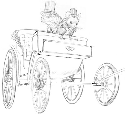
So here's the frog and mouse composited with a carriage. I had to do some distortion in photoshop and add a few lines with the line tool to correct the perspective, since it was a little off. The front right wheel is still placed a little weird, but it's not going to show in the final image anyway, or at least most of it won't, but I'm still not sure if a part of it might sneak into the background. I also left out details under the carriage, because those two, will be covered up.

As a model for the drawing I used a carriage from the 3D warehouse in Google Sketchup, because I just knew I would screw up the foreshortening on the wheels. I knew getting all those foreshortened ellipses was going to be tough, and Sketchup took care of the problem. It's like having a huge library of toys and matchbox cars to draw from! I combined the perspective from the model with details garnered from photo reference, and came up with this. My perspective isn't great, so Sketchup has been a big time saver. I still render perspective the old fashioned way whenever I can so I don't get TOO lazy, and some problems, like the curvilinear perspective in a recent Christmas image, the computer just won't help me with, but sometimes I need the help, and I always inform what I get from the models with ample photo reference.

Sketchup is the secret weapon of more than a few illustrators I know of, and I don't think there's any shame in using it as long as you don't rely on it exclusively because it's not going to solve all your problems with perspective. Sometimes the perspective on Sketchup can be either too perfect, or too extreme, and you still need to know how to put your figures and other information plausibly in the space.

I have seen some artists use sketchup pretty transparently, sometimes lifting the models outright without bothering to finesse them, and to anyone who knows the programs it can sometimes be pretty obvious when people use either it, or Poser. Poser is a 3D program for figures and I haven't found much use for it for just this problem--it's like drawing from an action figure, and action figures are pretty lifeless. So these programs can be helpful, but they can also be your worst enemy if you become too reliant on them. Sometimes it's just a good idea to labor over that difficult ellipse, if for no other reason than to remind yourself that you can draw.

Here's a blog post by comic book artist, Stuart Immonen about how he uses Sketchup.

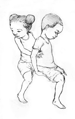
Here are a couple of kids for another illustration:


A while ago I realized that I apparently only draw white people. This was entirely unconscious and just a little embarrassing, so with these new illustrations I hope to add a little more diversity to my images. I was going to say these were African American kids, but I suppose they could be African-anything.

Tuesday, March 01, 2011

Two Gentleman Frogs

These are for a larger composition I'm working on. Or at least one of them is. The other one's the reject, the one with the mustache, though I think I prefer it. It just doesn't fit where I need it to fit.