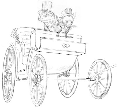
So here's the frog and mouse composited with a carriage. I had to do some distortion in photoshop and add a few lines with the line tool to correct the perspective, since it was a little off. The front right wheel is still placed a little weird, but it's not going to show in the final image anyway, or at least most of it won't, but I'm still not sure if a part of it might sneak into the background. I also left out details under the carriage, because those two, will be covered up.
As a model for the drawing I used a carriage from the 3D warehouse in Google Sketchup, because I just knew I would screw up the foreshortening on the wheels. I knew getting all those foreshortened ellipses was going to be tough, and Sketchup took care of the problem. It's like having a huge library of toys and matchbox cars to draw from! I combined the perspective from the model with details garnered from photo reference, and came up with this. My perspective isn't great, so Sketchup has been a big time saver. I still render perspective the old fashioned way whenever I can so I don't get TOO lazy, and some problems, like the curvilinear perspective in a recent Christmas image, the computer just won't help me with, but sometimes I need the help, and I always inform what I get from the models with ample photo reference.
Sketchup is the secret weapon of more than a few illustrators I know of, and I don't think there's any shame in using it as long as you don't rely on it exclusively because it's not going to solve all your problems with perspective. Sometimes the perspective on Sketchup can be either too perfect, or too extreme, and you still need to know how to put your figures and other information plausibly in the space.
I have seen some artists use sketchup pretty transparently, sometimes lifting the models outright without bothering to finesse them, and to anyone who knows the programs it can sometimes be pretty obvious when people use either it, or Poser. Poser is a 3D program for figures and I haven't found much use for it for just this problem--it's like drawing from an action figure, and action figures are pretty lifeless. So these programs can be helpful, but they can also be your worst enemy if you become too reliant on them. Sometimes it's just a good idea to labor over that difficult ellipse, if for no other reason than to remind yourself that you can draw.
Here's a blog post by comic book artist, Stuart Immonen about how he uses Sketchup.
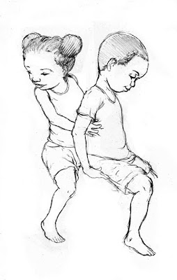
Here are a couple of kids for another illustration:

A while ago I realized that I apparently only draw white people. This was entirely unconscious and just a little embarrassing, so with these new illustrations I hope to add a little more diversity to my images. I was going to say these were African American kids, but I suppose they could be African-anything.

Love the drawing of the African-American children! It actually reminds me of a real life photo of myself and one of my younger male cousins! I also love that you're including diversity in your work... Kudos!
ReplyDeleteThanks! Here's the finished piece: http://jedalexander.com/view/childrens-illustration/108/
ReplyDeleteI also had the opportunity not to long ago to do some Inuit characters for a few pieces I did for Cricket magazine, but I do tend to default to Caucasian characters, a habit I'd like to curb.