Pages

Thursday, May 30, 2013

Ladybug and Gentleman Beetle: The Lay of the Land

I originally meant to do some sort of map in the end papers of the book, but my agent suggested some kind of establishing shot on the first page. I think it turned out to be a very good idea, really giving the reader a sense of place before we delve into the story. Here's the rough for the dummy (later to be inked and colored):


The perspective is, of course, deliberately exaggerated. If this were accurate the house would be birdhouse sized. The idea was to make sure that the reader could see the tiny homes of Ladybug and Gentleman Beetle and show the house in the background without the details being dwarfed by the scale of the house. I think this forced perspective has a nice whimsical look.

I wanted to avoid too quaint a cottage, and too perfect a garden. This garden reminds me more of the kind of garden my grandmother kept. A little unkempt, but not to the degree of being neglected. This mirrors, in some ways the world of the characters--in the tradition of Beatrice Potter, they live a genteel life in their homes, while the world at large has it's natural dangers.

Criticism so far is that this is a "quiet" or "soft" story--I don't want to risk being any more specific than that since these comments were made in confidence--which basically means there's not a lot of action. I understand the appeal of a book with more obvious drama, and maybe a book like that catches the reader in a more immediate way, but my hope is that there's room for quiet stories a well. Some of my favorite stories have been quiet ones.

In general, comments have been positive, particularly about the art style, which is encouraging.

The submission process has just begun, so wish me luck! 

Wednesday, May 29, 2013

Hippo Character Designs

These  rough designs are for a picture book in progress.

The textile on the mother hippo is collaged in, but I'll hand ink it in the final so it won't have such a mechanical look. I've distorted it with the photoshop "transform" tool to make it fit the contours of the hippo more. 

Again, my general approach to anthropomorphism is to have a degree of naturalism, to use real animal anatomy as much a possible, so no hands or little white mickey mouse gloves. 

I love drawing the wrinkled and massive hides of elephants, hippos and manatees, all of which will be present in this new book. But I still have changes to make in my previous book proposal, so this one is on hold till then! 

Tuesday, May 28, 2013

Duck Island Cover Mock-Up

Here's the mock-up for the cover of the Early Reader I've been working on:


And the spread the image comes from:


You may notice this image is similar to the Ella and the Pirates material I did earlier. That's because Duck Island is sort of the for market version of that. It's a different story but has a similar look.

Sunday, May 26, 2013

Artus Scheiner

Discovered a great blog post on an illustrator from the turn of the century named Artus Scheiner, here.

And here's some background:

Scheiner, working as a financial clerk in Prague, began drawing as a hobby. He was completely self-taught. Soon magazines in Austria, Germany, and Hungary began publishing his drawings. From 1897 he began publishing in various Czech magazines, and 1902 saw the release of his first book of fairy tale illustrations.

And here's some images, a number of them not included in the other post:


Note: This is a folktale called Otesanek, by K.J. Erben. It was made into a great movie by Jan Švankmajer, Little Otik.


Tuesday, May 21, 2013

Duck Island Color Final, some Thoughts on P.D. Eastman and Edmond Dulac

The color is subject to change--I may have gone a bit too dark. What do you think?


This scene is very loosely inspired by this one in P.D. Eastman's Go, Dog, Go!


I loved this scene a kid! Still do. A real classic. For some Eastman's name isn't as known as illustrator's less popular and less enduring, but the same folks are often instantly familiar with books like Go, Dog, Go! and Are You My Mother, growing up with them alongside Doctor Seuss and Arnold Lobel.

This is the discovery of the doings on Duck Island scene. At first I thought I'd go more in a whimsical, fantasy direction, but decided that lots of ducks doing ordinary duck things would do the job. Earlier attempts to make some kind of more fantastic duck village were looking a little too Ewok village for my taste. Ducks are fascinating all on their own.


 I originally wanted to go more pastel all around with Duck Island, but I thought that darker would give it more of a sense of being deep in the heart of this place that was hidden and magical. Scenes off the island will be more sunny and pastel, while as they go deeper it gets darker and darker until we get to this little clearing with its beam of light. It's easy to highlight your focal point with a spotlight, but it's also a device best reserved for when absolutely warranted. 

Sometimes just a little fantasy goes a long way. I like the juxtaposition of very real elements with fantasy elements. In my Ladybug and Gentleman Beetle proposal I originally described the interior of the pumpkin as a "ballroom" but decided that the inside of a Jack O'Lantern from a bug's eye view was grand and impressive all on it's own. You can see it here  if you'd like (scroll down).


The color in this one is inspired by Edmond Dulac:


I generally tend to have a fear of going dark, so lately I've been trying to overcome it. Dulac's palette was rich, but often subdued, and I think it really worked. Compared to Dulac, my image looks almost washed out, but I didn't want it to be too much of a departure from the pastel I'll be using earlier in the book.

This one is perhaps my favorite of Dulac's:


I just love that single illuminated lantern with the light reflected on his face with all his ornate surroundings shrouded in darkness. Its so tempting, after putting a lot of detail in an image, to show everything, to make sure no one misses any of your clever little touches and nuances, but it's not always the wisest thing. The details are still there to be discovered, but a little selective light can make it so much richer in the right circumstances. Not always, but sometimes.

Another Secret to Getting Better

It's always good to keep seeking out and discovering new images. When I was in college I was more interested in modernism than the classic illustrators, but now, as an adult, I'm discovering them for the first time and wondering how I'd missed them all these years.

I think a vocabulary of Modernism gives you a toolbox for experimentation, but a classic illustration background provides a toolbox for effective storytelling. You don't want media and style to interfere with the clarity of your storytelling, but at the same time it's good not to get too comfortable with the tried and true. On the other hand, I try not too veer too far into exercises in style and technique. In the end, my goal is to tell stories and tell them well by whatever means at my disposal.

Picture making for it's own sake is an entirely different discipline from illustration, and should be judged in an entirely different way. In this regard, comparing a painter like Degas to an illustrator like Dulac divorced of context outside of the fact that both make pictures does a disservice to both. Both share similar concerns--the art of picture making is no small part of that--but ultimately its in the service of different aims.

Seeing what works successfully for others both in the illustration and fine art world provide you with precedents you can incorporate into your own work, and even better, to mix and match. If you borrow a little bit of this and a little bit of that you can recombine them to make new discoveries of your own, and find your own voice. There's nothing wrong with borrowing from others as long as it's from lots and lots of others and not a single source. Steal, but steal eclectically. Sometimes when I've done something I'm uncertain about, finding someone else who has done something similar and  has made it work gives me the confidence to push further.

Of course, even more important, draw and draw a lot! Drawing is always the fastest way to get better.


Wednesday, May 15, 2013

Figures, Expression and Body Language

Last rough for Duck Island, my new early reader in progress:


This is the climax of the story, and what I was trying to get a across was a kind of boundless joy. It seemed simple enough, but this was one of the hardest parts of the book to draw.

Expression and Body language in Kid's Books, or: Why am I so Damned Slow? 

So you've got 25 pages, and just a handful of words to tell  a story. So everything has to count. Which means every figure has to say something with few or no words to say it.

Recently I've been kicking myself for taking too long to draw figures. At times it's taken me two full work days to resolve one single figure. I can draw an entire landscape of animals, but figures are the killer.

Alex Raymond: Beautiful Figures and  Broad Strokes

As a fan of comic books as a kid (and I continue to be a fan), particularly superhero and adventure comics, I envied and marveled at how artists were able to draw sometimes hundreds of figures every month. Then it occurred to me more recently that most of these figures had a range of about three or four expressions. This is more than adequate for an adventure story based on action and movement--where the figure's dynamism is more important than emotion. Every once in a while  there would be a figure that would convey something subtle in their stance or expression, but largely it was about lyrical movement and action. Other times the figures were more iconic, like cyphers, as in the case of Tintin. Alex Raymond, who did Flash Gordon of the 30s, was and still is a favorite:


When I was first developing my kid's book portfolio, it was enough for me just to get kid anatomy right.  Now I'm thinking more and more about how to convey emotion, and more importantly, how kids convey emotion. Andwhen you take a closer look at some of the best of the children's illustrators, there's a little more going on in this department:

Maurice Sendak

Hilary Knight

Arnold Lobdell

But some of the best comics artists are also capable of a little subtlety when called for:

Dan Clowes

Jaime Hernandez


So without the tyranny of a comic book artist's deadline, I'm still feeling my way through this. And so it's taking some time.

Tuesday, May 14, 2013

Revisions, Revisions, Revisions

More Revisions on my soon to be submitted book dummy.

My writing buddy Shannon pointed out something I knew I needed to do but was too lazy to follow through with. the pumpkin needed to match the same level of render as the bugs on this one. I also beefed up the moon, adding a glow and some realistic moon texture:


I really think this improves the image dramatically and more accurately reflects the interior art, so yay, Shannon!

At the as usual right on target advice of my agent Abigail, I added more darks to this one, and used some more dry brush to make it look more rounded. I distorted the base of the candle to follow the contour of the inner wall of the pumpkin and added shadows to make it look more grounded. I also added a purple compliment into the bugs cast shadow. I like the new dry brush as well because it gives the candle more radiance.


I just finished all the rough art for my other dummy in progress,  Duck Island (you may have noticed that I've been posting that art periodically) and am in progress on a couple of finishes which I should be posting soon.

Once again, loving InDesign as a compositional tool. It's so easy to move pages and add pages and delete pages. It really gives you a sense of the ultimate layout of the book, makes it easier to break the text down into pages. It's also an instant digital dummy if you want to send it to a POD printer to get a hard copy. 

Friday, May 10, 2013

Mock-up Cover For Ladybug and Gentlemen Beetle.

I recently redid the original drawing that inspired my book in progress, Ladybug and Gentlemen Beetle as a cover for the Book Dummy. The dummy is a mock-up of the book to give the editors an idea of what the finished book will look like. It's composed of all the illustrations roughed out, with a few finishes. Here's the original:


The first thing I did was redraw the original images of Ladybug and Gentlemen Beetle to match my new character designs. The changes were minor, and so I was able to use some of the original coloring and modeling that still existed on a layer in the original Photoshop file.


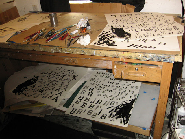
I zoomed in, got rid of the branches to make room for the lettering. I also took out the light coming from the moon so the lettering would contrast more with the background. The lettering is hand drawn. To make the lettering look spontaneous, but still deliberate and clean, I draw each letterform numerous times until I get the lettering I want. I want the lettering to be distinct with its own identity, so it doesn't look like any other title lettering that I've done, but is still in my style. The lettering is done with cheap rough brush from Michael's to give it that hand-painted look.


And here's the finished cover:


Inevitably they're going to want to go with a different cover for the finished book, but this should do nicely for the dummy. Already I'm thinking that I want the pumpkin to be a bit more modeled in the finished book, with more natural texture, but at this point I think it does the job it needs to.