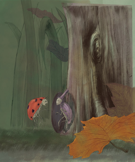
So recently I completed an image for my book in progress, Ladybug and Gentleman Beetle. I wasn't completely sure about it, and sometimes its good to have a second set of eyes, so my friend and fellow illustrator Kris Aro McLeod Had a few suggestions. For one, she thought the knot in the wood was a little distracting, So this was the first version:
I gave it some thought. I had fallen a little bit too in love with that tree, and I liked the knot, but she was right. I also thought that maybe it would be better to have the figures of the beetles larger in the frame, since, as an early reader book with smaller pages than a picture book, they would print very small otherwise. So as much as it pained me, I cropped in a little more, but I didn't want to lose those leaves, so I moved them in a little closer. And here's the result:
Oh, the pain. All of that wonderful detail! But you have to do what you have to do to serve the image, so that nothing distracts too much from the focal point.
So here's the full image. I usually give myself a little extra room on the edges just in case, but never quite this much room, because I didn't anticipate the crop. I work pretty hi-res, so it's not an issue to make the image larger, and everything was drawn considerably larger anyway.

So this was the original shape that I cropped into. It's simply a shape I painted in ink and darkened on photoshop. With some photoshop magic, I was able to make the image conform to the shape. Maybe I'll describe that process in another post, but right now I have to put some ice on my back. I'll probably be better by monday!


Hope your back is better! I like all your adjustments to this illo.--you've "served the image" well!
ReplyDeleteThank you! And now I'm 100% thanks to my excellent chiropractor and a little bit of rest! This happens to me about twice a year, so it's nothing chronic, which I'm grateful for.
ReplyDelete