This is essentially the tagline for the recent Struzan documentary, Drew: The Man Behind the Poster, which I found a bit disappointing. Most of the people they talked to were directors and actors who knew little about illustration or its history. I'm sorry, but when I watch a documentary on illustration, Steve Guttenberg just isn't the guy I want to hear from. There were a couple of illustrators thrown in, like Greg Hildebrandt and Charles White III, but they were given little opportunity to talk about the form. It was mostly just an endless stream of praise.
It is true Struzan is one of the great movie poster artists, and many of his images will be forever associated with the films that they promoted, which is no small accomplishment. And while I do think he deserves to be celebrated, I don't think he deserves to be canonized, which is what the film seemed to have set out to do.
But the documentary doesn't tell the full story. While it's acknowledged that Struzan was asked at times to emulate other artists, it neglects to mention that in beginning of his career, this was almost all that he did. It also neglects to mention Struzan's three principal influences: J.C. Leyendecker, Bob Peak, and not insignificantly, Barron Storey.
Early Influences
At the beginning of Drew Struzan's career, when he was doing album covers for the design studio, Pacific Eye and Ear, he was still finding his voice. Like any artist at the beginning of their career, he emulated others. Here's one of his most popular pieces at the time, for Black Sabbath,
 |
| From Struzan's Black Sabbath album cover for Sabbath, Bloody Sabbath |
This one had a little bit of Salvador Dali,

Channeled through Maxfield Parrish (below). In fact, that figure kneeling on the right on the Sabbath cover looks suspiciously like this one, same light source and everything:
.jpg)
Here's another one:

This one looks like Parrish on the borders, with a little Bernie Fuchs on the interior figures. Here's Bernie Fuchs:

Struzan was always more a draftsman than a painter, and these inspirations tended to take on a more line and plane oriented character than a painterly one.
Struzan broke though with this image of Alice Cooper on Cooper's album, Welcome to My Nightmare. This one got Struzan his first movie poster gig, and, as mentioned, it was movie posters where Struzan truly made his mark.

But while most of his album cover work only showed shades of his influences, this image was a straight up homage to J.C. Leyendecker. (The fact that this wasn't mentioned in the documentary is just astounding to me). And here's Leyendecker:


Though it wasn't the first time he'd done Leyendecker:

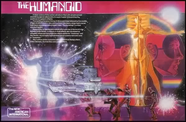
And for a while this became Struzan's thing. You can see it particularly strongly in this early Star Wars poster, a collaboration with Charles White III. White did the robots and shiny stuff, and Drew did the figures:

This was where White also introduced Struzan to the airbrush which would become a big part of Struzan's technique later on. But again, the difference between Struzan's Leyendecker and Leyendecker's Leyendecker is that Struzan was more of a draftsman than a painter. He was able to emulate some superficial elements of Lyendecker's style, but never really got what made Leyendecker a real painter. Not that Struzan didn't eventually gain a certain facility with paint and painterly techniques, but at this point, he was more an imitator than his own artist.
Struzan, at the time, was so good at imitating Leyendecker, they asked him to emulate other classic illustrators like Norman Rockwell:

And notably, Bob Peak:


And this was when Peak was at the height of his popularity. It was a case of "you can't get Peak? Well this guy does a good Peak imitation and he's cheaper. Hire him." Here's some Peak for comparison:


+Original.jpg)
+4.jpg)
It was from Peak that Struzan got his talent for montage, and who, beside's Storey, would remain one of the greatest influences on his work.
Enter: Barron Storey
Barron Storey, my old teacher, always said that he never learned to paint. Which didn't mean he hadn't learned some of the principals of painting. But he is, like Struzan, at heart a draftsman. Storey was a contemporary of Struzan, and while he started out wearing his influences on his sleeve like Struzan, he soon evolved his own style. Here's Storey:

Looking a little like early Peak:

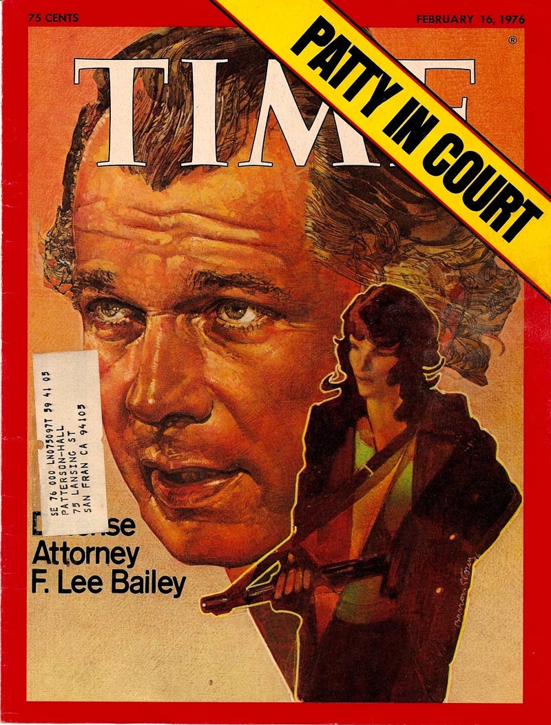
Storey's style was invention born of necessity. Because he felt he lacked the facility to paint, he used line to emulate the mass and body of paint. Here's one of his Time covers:

He approached rendering with slashes of hash marks to define planes rather than painterly brush strokes to describe masses.
And another famous one that's pure draftsmanship, of Howard Hughes, according to Storey, done right at the Time offices the night Hughes died. All he had to work from were what photos existed on file and a description of Hughes' given on the phone from a witness, since Hughes hadn't been seen in public for years:

And it remains one of the most iconic images of the late Hughes, which is remarkable considering that Storey could only speculate about what Hughes looked like based on photos more than a decade out of date.
In a painterly approach (say, Rembrandt), the body of the paint conveys mass. Sometimes a single stroke will describe an eyelid or the bridge of a nose. In a tighter rendering where brushstrokes are less desirable, the paint builds value with blended tone applied as you might with charcoal. This classic approach is as old as the Renaissance and still common among artists today (sometimes achieved with glazes of thin paint), though many artists use a combination of both approaches. Then there are artists who work in the tradition of Durer, where line is built up in layered patterns of methodical cross-hatching. Tim O'Brian is a good contemporary example of an illustrator who uses this method, and Paul Cadmus in the fine art world.
Storey's approach was like none of these, though it had more of a relationship to Durer than the more painterly Rembrandt. But it wasn't one he had entirely invented. A less methodical approach to line can be seen as early as Daumier. But when I think of Storey I think of Italian pen and ink illustrator/comics artist Toppi and South American comics artist Breccia, and since Storey was a fan of comics, I imagine he was likely aware of Toppi. Here's one from Toppi:

I imagine these guys too, have a precedent for this approach to line that I'm not aware of, so if anyone has any insight I'd be curious what you think, but in general it seems to come from turn of the century expressionism.
Storey claimed Robert Weaver, his teacher, as his greatest influence, but the subtlety and spareness of Weaver wasn't Storey's strong suit. Storey is more about obsessive detail and an improvisational approach to rendering, Never applying the same stroke twice or in quite the same way. When not doing a single subject, like a portrait, his compositions could be dense with elaborately rendered imagery. Weaver was more about reportage, while Storey tended to live more in his head. Where Weaver observed, Storey invented. But ultimately the connection between Struzan and Storey is not one of content, but of craft.
Another portrait from Time:
And a detail:

And his classic Lord of the Flies cover:

By the late 70s Struzan was already veering away from the Lyendecker and Peak influence and into his own style (though this one has a hint of Syd Mead):
I think Struzan was very much aware of Storey at the time, and picked up on what he was doing. And that's when Struzan's style really became his own.

Take a closer look:


And this is when Struzan's career really started to take off. There was his talent for idealized portraiture and montage borrowed from Bob Peak, and then there was the influence of Storey. He didn't just pick up Barron Storey's technique, like he had Leyendecker's, but his inventive approach to line and mixed media. It wasn't the materials, it was the approach. Mixed media was not the point. Since he was more a draftsman than a painter, Struzan got Storey. Or at least, a certain aspect of what Storey was good at. Not that he emulated Storey entirely, or gave up the more painterly aspects of his work, but he was able to incorporate Storey's approach to line and form in a way that served his affinity for drawing.
Here are a few greatest hits with details:


And more recently:


His approach is more methodical, but you can see him getting more bold and improvisational in some of the later pieces, but never quite to the degree of Storey.
And that's about where it ended with Struzan, who has recently retired. But Storey kept on experimenting and growing. Both in his professional work (this one still from the 70s):

And in his personal work, particularly in his sketchbooks, which he draws in every day, a few of which I had the pleasure of checking out in person while I was in school (and they look even better in person.) Here's some examples:


And he has been and continues to be a huge influence on some of the best contemporary illustrators working today:
 |
| Bill Sienkiewicz |
 |
| Kent Williams |
 |
| Dave McKean |