I recently printed some mini comics at the print shop where I work. I meant to include some pictures of the press, but I accidentally deleted them.
So after making color separations and plates, the pages were printed and trimmed, and this weekend we finished putting them together. Thomas Thomas graciously volunteered to colate them (that's not a typo, Thomas' first and last names are Thomas).
I stapled them.
And made the final trim.
And the finished product:
I also made another, smaller mini with a two color cover and black and white xeroxed interior, called, Baby God:
And these full color postcards sheathed in this lovely vellum envelope:
And you can purchase these and more at this years Alternative Press Expo in San Francisco on November 1st and 2nd!
If all goes well, I'll also be showing color copies of the rest of the book, which by then should be about 66 pages in all. I plan to do one more short story, but won't likely have it finished by APE. The mini will cover the first nineteen pages, and you can currently view the first 21 pages on Top Shelf 2.0!
Edit: That's actually the first 41 pages on Top Shelf!
Here it is. I know it's been a while. They should be posting this next story in two parts. This is the first part. There are at least a couple of my favorite pages here. This one is 22 pages in all.
At the moment I'm working on pg 58 and 59, and I should be wrapping the whole thing up in another couple of weeks. Phew. This is my longest sustained effort in comics.
My next project is most likely a longish illustrated children's book, and to keep my hand in comics, some wordless comics stories. The last Blue Kid Story is also wordless, and I think I've been building up to this with the previous pages, depending less and less on words to tell the story. The last story has some interesting formal stuff going on, some novel solutions to the problem of telling a story without words.
There was this incredible animated film made of The Snowman that, as you can see, is gorgeous:
I haven't seen the whole thing in years, but I remember coming upon it by accident when I was a teenager, never having heard of it before. Briggs is huge with the brits, but it seems like we're quieter about him over here. Maybe it's because there's a lot of very English stuff in them when it comes to what people eat and how they talk and what they do with their free time, and American kids can't relate, I don't know.
There's this stage show too, and though the art direction looks decent enough, it kind of freaks me out for some reason:
Some stuff just isn't meant to be live-action, you know? Like all these recent Dr. Seuss train wrecks--32 pg books that weren't intended to be stretched out into 90 minute movies, let alone acted out by comedians with Planet of the Apes prosthetics. There's something very grotesque and frightening about these movies and their horrible all over the place merchandizing.
The worst piece of merchandizing I've ever seen was this book called, "Dr. Seuss' Cat In the Hat Storybook". It was drawn in a Dr. Seuss style almost identical to the original, but it wasn't The Cat in the Hat. It was a storybook based on the movie, The Cat in the Hat. It was this totally counterfeit but officially Seuss estate sanctioned Cat in the Hat book that could easily be mistaken for the real thing by someone unfamiliar with the original. It was one of the most disturbing things I've ever seen.
I've always wondered how much merchandizing and adaptation dilutes the original. Alice In Wonderland is a good example: It's getting harder and harder to find the unabridged Tenniel illustrated version and some people are only familiar with the Disney Film. Winnie The Pooh is a similar casualty. Some people don't even know that there were books in the first place, and the Disney versions are so different than the source material that they don't even resemble the original characters. The original books are also very British, and when my dad tried to read them to me as a kid, I just didn't get them. It didn't look like the Winnie the Pooh I knew. The Disney version is more modern and accessible I guess. At least to the kid I used to be.
Now there were some perfectly good and very faithful animated versions of Dr. Seuss' books done with Seuss' involvement in collaboration with Chuck Jones and Ralph Bakshi and others, the running time stretched out to 25 minutes or so with songs with lyrics by Seuss. But people love these books so much they're gladly willing to smother them, and I'm a little worried about this upcoming feature length live-action Where the Wild Things Are movie. Maurice Sendak is involved, but he was also involved in the Where The Wild Things Are indoor theme park at the Sony Metron in San Francisco, with an In The Night Kitchen themed pizza parlor. My impression last time I was there was that it was a very bad idea, which goes to show that sometimes the artist's aren't the best custodians of their own work.
At least the original is always there to be found if you look hard enough. But how many awful movies were made based on very good books that people who have seen those awful movies won't have anything to do with?
Then there's stuff that far exceeds the source material, like The Godfather. The book is fun, but very pulpy. I saw David Cronenburg's Spider after reading the book, and I hated the book, but loved the movie. And I'm sure there are other examples, and I'm sure the authors have more faith than I do in the quality of their own books.
These images were originally done at 38x50 inches. Which is enormous. I tried to take photos of them. I tried to get other people to take photos of them. The photos sucked. So I finally broke down and scanned them. Piece by piece. It took the better part of one weekend and one day to scan and reassemble these. The tree took about 30 scans and the elephants about 50. Finally I have decent images of these. The tree was scanned at 600 dpi and the elephants at 300, and were assembled at actual size. The object was to make clear enough and large enough images to make decent-sized prints.
So now you can see that the tree isn't so dark, and the elephants not so brush strokey, and the buildings in the background do not look like mud. I changed the lines in the buildings to a dark red so that the buildings would be more pink, and so the windows in the background wouldn't get muddy. So this is pretty much what these are supposed to look like, and soon I will make prints out of them.
Whoever you people are, you shan't see any more of "The Blue Kid" comic strips at this particular locale. Have I given up the ghost?
Touche!
Soon, very soon, my dear reader, you will be joined by other readers if you venture to this site.
Not yet though.
For those not in "the know" the above "this" will lead you to Top Shelf 2.0, online comics from the much esteemed alternative comics publisher, Top Shelf! The folks at Top Shelf have recently deemed my strip 2.0 worthy, and so, if all goes as planned, once I've knocked out a few more of these things, the first installment will appear and be resumed there. By their request, so that the content will be "exclusive" to Top Shelf (assuming it's being seen at all at this point)I'll be removing the strips from this site shortly.
But that might be a few weeks. Continue to watch this space for more news!
In the meantime you may feast your eyes on these two handsome devils from Chefferey's Bistro:
Ever since I stopped actively seeking out Freelance, it seems to be finding me. In this case, the fine folks at Sac News and Review have asked me to do a couple of caricatures for a local ad.
The second guy came out a little toothy. It's so weird that a big white boxer's tooth guard-like mass with a few vaguely defined gums at the bottom ends up looking like teeth in the cartoon vernacular. Inexplicably, when you put the gums at the top of the white mass the teeth end up looking very wrong. This is no joke! Try it at home!
Update: was out of town for a couple of weeks (more on that later) so I'm just now getting around to posting this.
This is a cover and some interior illustrations for The Sacramento News and Review. Andrew Nilsen was the art director--he was very easy, and very accomodating--the only stipulation was that I include a green brain in the composition. The headline was "Re-Thinking Green". I'm not sure if I came up with the best solution but here it is:
This is my favorite portrait of the three:
Its the first time I've applied a combination of pen and brush work to my illustrative figures, and I like the lines. They seem kind of Hirshfeldesque to me. I like the sharpness of penwork, and I'm including pen more and more in my work.
These two were a little less sucessful, but more or less resemble the people they're meant to. The theme was "different shades of green" which is why I decided to go black and white with the fleshtones. I thought it would be nice and graphic, and there would be continuity on the page.
Another update: Nilsen gave me a very gracious call after all was said and done, saying that the writers editors and subjects were pleased with the results. I don't usually get calls like these--usually its just a "thanks" or a "good job" and the checks in the mail, so that was very gratifying.
Jeff's room mate Bryant, and another friend from school. This doesn't quite look like him, but it still came out pretty nicely:
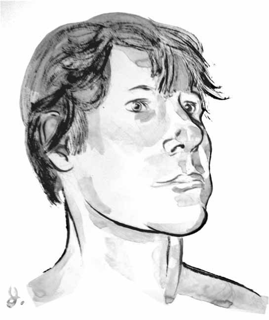
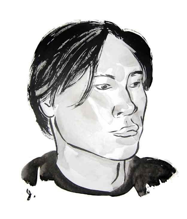
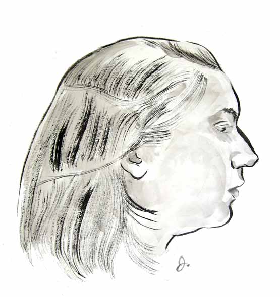
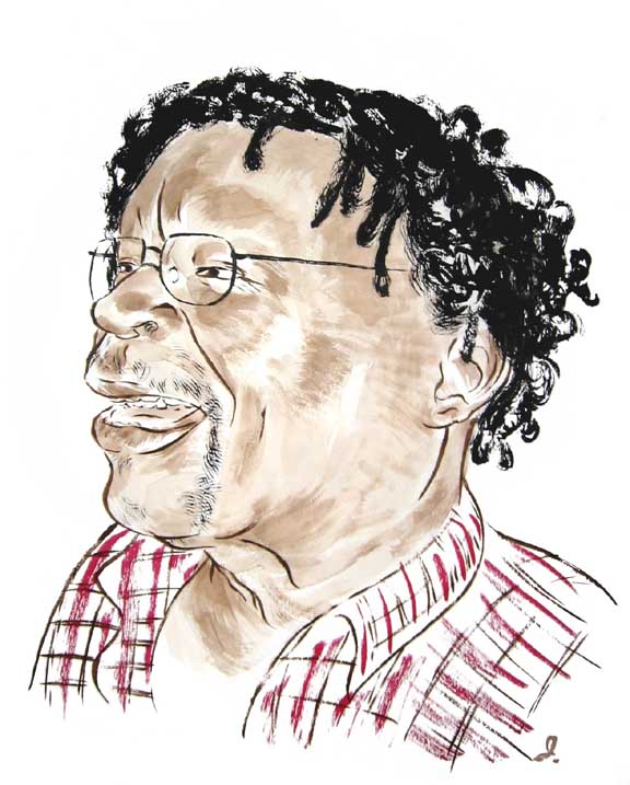
From photos randomly culled from the internet. My original idea here was to do portraits at events, sort of like what caricature artists do, but I gave up on this to focus more on the dog portraits. In retrospect this seemed a little ambitious; it would've required a little more social endurance than I actually have. The idea at the time was to show enough of a range to demonstrate that I could draw pretty much anybody:
Ken, one of my favorite people. The visit on which these pictures were taken Ken managed to get me lost in my own neighborhood as we finished off an entire box of lime popsicles. It was kind of fun. Here's Ken:
So the new pet portrait site is up. I got the domain name, chinesebrushportraits.com, just in case I wanted to use it for something other than just pet portraits. My friend Ethan Miller, who's a whiz at this stuff, put together the simple but clean website. Ethan is currently in the MFA program at San Jose State university, where he's doing some interesting, I guess what you might call, "fine art" programming, which is basically programming that has no practical purpose whatsoever, and it's pretty cool stuff. Here's his site.
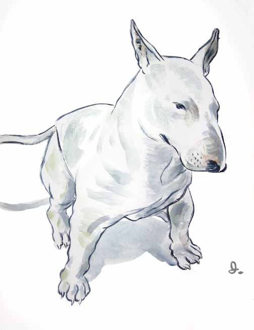
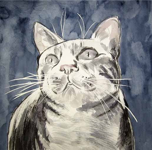
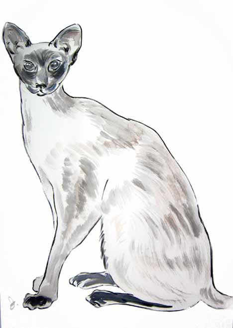
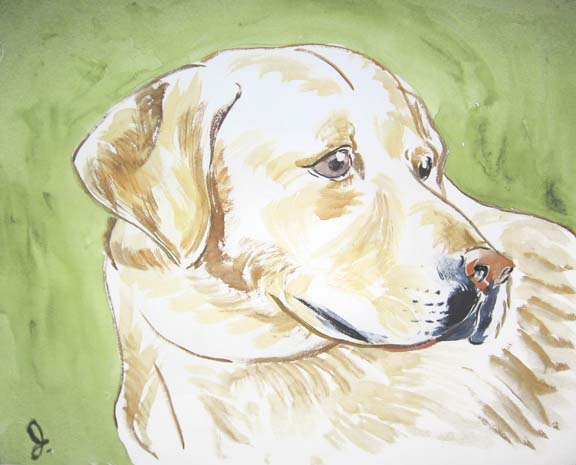
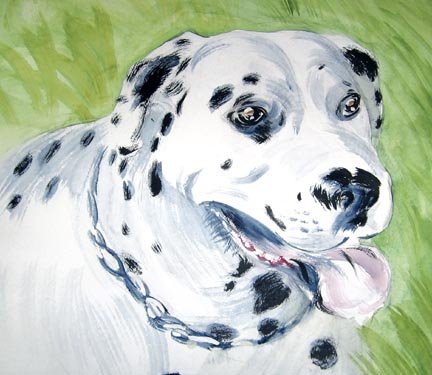
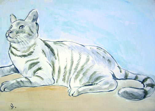
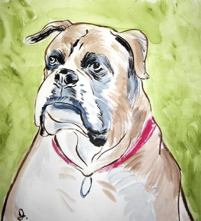
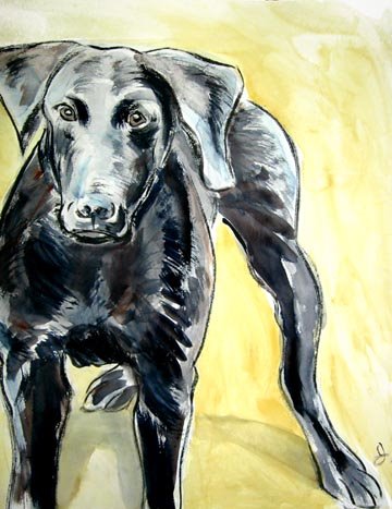
Illustration hasn't been treating me all that great these days, so I've taken up the idea of painting people's pets for $$. It's a little kitschy, but there's got to be some way I can make a living off these grossly impractical skills of mine, and the pet portrait thing seem pretty popular these days.
So here are my first few attempts, using a Chinese brush as my exclusive painting implement:
I find that I enjoy this quite a bit, so who knows, maybe this could turn out to be an alternative source of income? More portraits soon, plus: human portraits. More on that later. (I've actually been doing quite a bit of work lately, just haven't gotten around to getting it all scanned and photographed)