Pages

Saturday, April 25, 2009

James and the Giant Peach

So here's my giant James and the Giant Peach picture. I've always been a fan of the book by Roald Dahl, and love the imagery. My favorite illustrations are the ones done by Lane Smith, who also did the designs for the stop motion movie, one of the best book to movie adaptations I've seen. Lane Smith was the third official artist to take a crack at it, and though I like Quentin Blake, I was never satisfied with his images for the story, and the original illustrations weren't quite there, so I guess the third times the charm.

So my objective was to stay as true to the book as possible. This is the scene just before my favorite image in the book, when they tie the seagulls to the stem and the peach is lifted up into the air.

In my new illustration style my aim is to leave nothing to the imagination, and to cram as much as possible in there, so I have the sharks, the seagulls, all the main characters from the book with relatively accurate insect anatomy, and James. I gave James a couple of patches on his shirt because he was much abused by Aunt Sponge and Aunt Spiker, and my guess is that he didn't have the best clothes.

The descriptions of the characters in the book are sparse, which leaves a lot of leeway for interpretation, but I stayed pretty literal. James was the biggest bitch to nail. I drew James I don't know how many times. I"m still struggling with my kid drawings, but received much good advice from Mark Martin and Angelique Benicio.

So this one's all about the peach, so I gave the peach the most room in the composition.

So click on this one for the bigger version:


And a detail:


And last, the ridiculously huge version:


As before, I drew and inked each element of the picture separately. First the background with the water, the peach and the sharks, then each character and seagull. Here a few of those figures:


I drew a lot more seagulls than I ended up using though. If I had used all of them you wouldn't be able to see the ocean, so I kept it to a few.

Once again I made watercolor textures and scanned them in, then cloned them into the drawing as needed.


I very seldom use anything but the clone tool for color to give it more of a wet media look, adding only a few highlights here and there with the regular brushes. As a final touch, I printed out some of the seagulls in light blue, painted each individually and scanned them.

I'm most proud of the water in this one. Water is a very weird thing to draw with a clean contour line, since it doesn't really have any hard edges. You're sort of making it all up, coming up with your own vocabulary to describe this moving substance. Drawing things like sea foam and waves with lines is a real challenge.

So that's it. This one also took about three weeks to draw. On to the next one!

Click Here to Buy the Poster!

Thursday, April 16, 2009

Road to Oz Redux

The same image, more saturation and contrast.

Sunday, April 05, 2009

The Road To Oz

So I've been trying to figure out for a long time how to make a living making pictures. I tried editorial work for a while, but I was never too terribly good at it. I didn't have the same feel for it that a lot of people I admire have. I've never been that interested in journalism or politics, and solving those kinds of illustration problems didn't come naturally to me, but I had it stuck in my head that if I wanted to be successful in the field, that was what I'd have to do.

So, in an attempt to emulate the people I admired, I tried to cultivate a very graphic, eye-catching style that I thought would appeal to that market. But somewhere I lost track of why I wanted to do this in the first place.

So David Maxine of Hungry Tiger Press asked me to do an Oz picture for his fanzine, just a one-off black and white picture based on the book, "The Road to Oz" for the magazine. I had always liked the Oz books as a teenager, and it seemed like a fun project, so I decided to make a color image instead (I could always grayscale it later), something that I'd have liked looking at as a kid. Looking at a lot of Winsor McCay, I decided to do something really lush and detailed. I've always been much more interested in traditional storytelling than editorial, and as a kid I really liked fantasy, and I had always wanted to make picture books and comic books.

And this is as close as I think I've ever come to something I would have liked to be able to make when I was a kid:


On my browser the colors always seem a little more muted on these blogger posts, so the real colors may be more brilliant than what you see here.

And here are some details:


Process

Doing an image as complex as this would have been intimidating if I didn't approach it in pieces, and lately I've been drawing my figures separately from my backgrounds. I drew and inked each figure individually and then composited them into the picture later.


Perspective has always driven me nuts, and I've never been particularly good at it, but recently I've been using google sketch-up to put together primitive backgrounds that I can then work up and add details to:


And the finished background:


I've always been heavily reliant on photo reference, and usually take a number of photos of myself posing for each figure, but this time I didn't. Most of the reference I used was for for costuming and to get a general idea of fabric folds, but this time all the poses came mostly from my imagination. Here's an example of some of the reference I used:


I colored in on the computer, cloning in watercolor and dry brush textures on photoshop that I had scanned for things like the marble, the rust, and Polychrome's dress.


So I don't know where this is going to lead, but this seems to be the general direction that I'm headed in, with a new focus on Children's markets. We'll see how it goes. I'm kind of excited.

Click Here to Buy the Poster!

Thursday, March 12, 2009

Model Sheets

These are model sheets for a new sci-fi comic I'm working on. I usually don't do this, but last time it was a challenge to keep all the characters looking the same, so I guess there's a reason why people do these things.


Monday, March 09, 2009

New Wordless Comic!

It's called, "Anonymous". This is a superhero story about social masks. Here's a sample page:


And you can see the whole thing (13 pages):

Here.

I might have more to say about this one later. For now I'm just glad I finally finished the thing. Probably the most difficult comic I've ever done!

Monday, February 23, 2009

Before and After photo Reference

After I posted the last painting, there seemed to be some confusion as to whether I'd become an abstract expressionist, so I thought I'd post both the photo reference and the painting side by side so you can see what I'm up to.


I generalized some of the information, but i think the foreground rock in particular is pretty observant of the source material. These are meant to be portraits of specific rock formations from photos I've taken myself--I'm not sure how successful I've been, but that's the general aim.

Saturday, February 21, 2009

Two New Paintings

These are the first two of what I hope will be a series of rock and water themed watercolors.


I'm on the fence about this second one. I used guache for the sky, and went nuts trying to make this perfect, flat application. I'm not sure if the painting benefits by it. It's kind of dead.


These were painted with Chinese brush, ink, watercolor, guache and just a little acrylic. This is my first really serious attempt to do landscape painting. The landscape painters I'm probably most inspired by are Emile Nolde, Turner, and Hokusai. I was going to do this series in oil, but I wasn't getting the immediacy I wanted. It was too easy to overwork the painting, to paint over mistakes. Watercolor records everything. There's no faking it or fudging it, which is why I ended up painting the first painting about 3 times. I'm pretty happy with it now though. It has an unusually muscular look for watercolor which I hope to maintain throughout the series.

Thursday, February 05, 2009

Pence Show

The Pence bicycle show is up now, and will be up till the 15th. There will be a reception the evening of the 13th. The bicycle show is meant to celebrate the Amgen Tour of California as it makes its way through Davis. This is apparently a big deal, and Lance Armstrong will be in the race. I didn't know anything about Mr Armstrong until recently. What I've been able to gather is that he's won the Tour de France 6 times, and aside from having a really annoying website which is probably not his fault, he's a remarkable guy. He came back from a serious bout with cancer to win the Tour deFrance again, but I'm not sure which time that was.

The Pence will be selling my posters and prints. I have two pieces in the show.

I'm currently working on a new strip in collaboration with Tin Salmunic. I'm plotting, writing the dialogue and lettering, and he's doing everything else. At the age of 25, (he might be a little older by now, I'm not sure) he's done work for the likes of ESPN and Playboy and many others and teaches illustration in Virginia. he draws constantly as you will see if you check out his blog just about every other day. We're all of about 2 pages in, but Tin seems fired up about the strip and I'm optimistic about where we're headed with it.

Here's a sample page:


I set out the basic plot, plot a scene, Tin draws it, and then I put in the dialogue. It's a science fiction/humor sort of deal, nothing like what I've typically been involved in with comics. The feel is something between Vonnegut's Breakfast of Champions and Phillip K. Dick, and possibly a Coen brothers movie. I'm making up a lot of it as I go along, which is both exciting and frightening.

Where's the art?

The art is still in progress. Because of recent responsibilities I've slowed down a little on my comics, but the new story will be up soon. I've also just started what I hope will be a new body of work, a series of landscape paintings with a rock and water theme. I'm working in acrylic and oil, so the style's a little different than what I've been doing before--it's probably closest to what I've done in watercolor, but more painterly, possibly less line oriented. I'll put some of that up soon as well.

Tuesday, January 27, 2009

The Best Popeye Panel Ever!

I've been selling minis and posters at the UC Davis Campus and reading the new Fantagraphics Popeye collection (3rd volume) to pass the time.

And I found this...


Picasso always did like the funny pages...

The staff has been very kind at the UC Davis campus, and its been nice to meet everyone. I've even sold a few mini comics! (Usually the posters and prints do better than the minis) It's been seriously windy but my signage has been holding out well. UC Davis has been so kind as to provide an actual living cashier complete with cash register in exchange for their small percentage of the profits! All the cashiers (3 shifts worth) have been very friendly.

I'm 3 pages shy of my new 13 page wordless strip, and since I won't be getting much done this week, it might be a little while till you see it here. I've been putting everything I've got into this one, and have been slowly eking it out at the rate of about a page a week. I don't think I've ever worked so hard on a funnybook story before.

Wednesday, January 21, 2009

Events!

UCD Campus!

On the 25th, 26th, 28th, and 29th I'll be appearing on the University of California Davis campus in the Quad near the bookstore. I'll have posters, mini comics and stickers, and I'll be glad to sign anything you'd like me to sign.

The Pence Galery!

I'll have two pieces at the Pence gallery in Davis for a bicycle themed show in February. I'll post the date as soon as I know for sure. I'll be selling "Yes We Can!" stickers, and possibly more.

Edit:

The Pence will be carrying my postcards, but not the stickers, since they're a non-profit and carrying the stickers might be seen as endorsing the president. The Bicycle show will be from February 1st through the 15th, and I'll be selling my bicycle tree posters at the opening.

Sunday, January 11, 2009

The all NEW jedalexander.com!

After our earlier posters sold unusually well at the Alternative Press expo, I asked Ethan Miller, the designer of my previous site and a childhood friend, if he could design a site for us where we could sell our posters online.

Yes We Can!
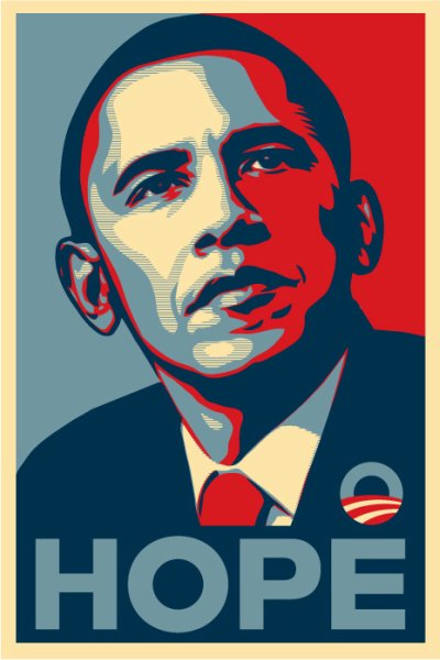
Shortly after Obama made his inspiring acceptance speech, Regina described this poster and asked if I could make it in the style of the famous Shepard Fairey portrait. Happy with the results, we decided to have the poster printed and to offer it for sale on the new website Ethan was designing for us.

This is the first time we've offered the poster, and with the launch of the new jedalexander.com and in celebration of the upcoming inauguration, we'll be selling it at a special reduced price!


And here's some free "Yes We Can!" wallpaper for your desktop:


There's more to see and buy on the site: posters, mini comics, online comics and galleries. We're excited about the new site and Ethan's easy to navigate design, and hope that you can check it out!

jedalexander.com

Sunday, December 21, 2008

Happy Christmas, Hanukkah, Ramadan Kwanzaa, or Non-Denominational Celebration

Or if you choose not to celebrate anything, that's ok too. This is the first year I've actually kind of been into it. At least since I was a kid, but that might've been more about the anticipation of getting stuff. Actually I'm still really into getting stuff, and Reg and I have been having fun giving one another early Christmas gifts.

For instance, Reg got me this, the first good new newspaper strip in over 20 years, Cul De Sac. I love this strip! Buy it immediately! It has an introduction by Bill Watterson, and he just doesn't do that kind of thing!

Reg also got me collections of old post code "New Direction" EC comics, like Extra, and MD and Piracy, and for my birthday, my favorite, Psychoanalysis. If you don't know what I'm talking about it's because you have to be really into this stuff to a geeky extreme to even know it exists, and you're probably not missing anything.

You may or may not have received or be receiving a card with this picture on it:


If you haven't, or don't soon, just ask and you shall receive. I have plenty of them.

I haven't posted in a while because I've been spending most of my time working on a 13 page comic book story that has a lot of very hard things to draw in it. I'm very proud of it, and it should be done in about another month. It is also wordless.

Other News:

Two of my posters, The bicycle Tree and The Rooster, and my postcard sets are currently available for retail at the framing department at Ace Hardware here in Davis CA. We're looking into other retail possibilities in the near future, and are in the process of setting up the website for retail, though we have yet to "go public" with the whole retail thing.

I've also got an ultra top secret hush hush poster in the works that we're going to sell in conjunction with the inauguration guaranteed to make Mark Martin's eyes glaze over (Shhhh).

More Comics On Top Shelf

My superman strip, now titled, "Crime Fighter" is currently up on Top Shelf's website. And of course, it's also on the previous post, so you can check it out there as well if you haven't already.

I must thank Leigh Walton, editor of Top Shelf's online comics, for requesting to post the strip after finding it on my blog, thus proving that someone actually reads this thing.

The Blue Kid

Top shelf has also posted the complete Blue Kid, and all strips can be viewed here.

No news yet about print publication of The Blue Kid. It's been sent to all likely parties, but I've yet to get a yay or nay. If all else fails there's always the Xeric.

Wednesday, November 05, 2008

This Is Happening


It's really happening. Just a few weeks ago I wouldn't have thought it was possible. I've never been so excited and enthralled by the outcome of an election. Obama's acceptance speech was genuinely moving. Obama has the potential to be one of the truly great presidents, maybe to be among the greatest presidents in history.

Unfortunately he's inherited a big mess, but so did Franklin Roosevelt. This is a genuine opportunity to make revolutionary change. So don't blow it Obama!

Edit: It looks like prop 8, the proposition to ban gay marriage, is going to pass here in California. As excited as I am about Obama, prop 8 is a real setback for California.


APE

After that this seems pretty trivial, but here I am at the Alternative Press Expo that was held this last weekend:


The picture's are a little blurry since I forgot my camera and we had to use Regina's picture phone. It was pouring down rain, so from what I heard, the turn out wasn't what was expected, but despite this we did really well. To the right of me is Mari Naomi, author of Estrus Comics, autobiographical comics about her love life. She was really a neat woman, and it was good to meet her.


Here's our spread. We sold out of the elephants print, and sold a ton of the smaller bicycle tree print. We had a larger bicycle tree print, but the small one had a little color, and people seemed to like that one better because of the color. The Baby God minis did Ok, but I sold very few Blue Kid minis for some reason. Since the Blue Kid is the thing I'm most proud of right now this was a little disappointing, but I did learn that people really really seem to like these two particular prints. I didn't have business cards, and I'm not set up to sell anything on my website, so I'm probably going to have to do something about that. Regina is the one hiding behind the table. She won't let me include any pictures of her on the blog.

This was my first sighting of the elf:


To the left of me is Ben Costa, author of a really amazing comic called Shilong Pang and another really cool guy.


More elf. Just in front of the elf is another talented cartoonist that was seated near us. His name is R. Carrasquillo according to his mini comic, The Heights, but I don't remember what the R stands for.To the very far right is Morgan Lee Kessler who had mini zines and prints. She was responsible for our first sale, a Baby God.

And here's the elf in all his glory:


For some reason he reminds me of Doug Henning.

I vowed this time not to buy anything at APE that I could buy anywhere else, something that, for the most part, I stuck to. My major purchases were from the one and only Jason Shiga. Most of his books are hand made, and all of them are amazing. This year he even recorded a rap album! "I Love My Shigacorn" and "2Pac Lives" are my favorite rap singles of all time!


From top left, clockwise: Shiga's rap album (I bought three), Hello World, a choose your own adventure type of comic that is mindblowingly complex (Shiga is a mathematician and often uses math in the formal presentation of his comics), and last, Empire Park, Shiga's newest. Shiga is not only amazing with the formal aspects of comics, but he's great at writing characters and dialogue and, in the case of his books Fleep and Bookhunter, suspenseful plots. His books get very poor distribution so he's the best kept secret in comics.

You can buy his books and music here.

Other highlights included the new giant Kramer's Ergot which is mindblowingly huge and mindblowingly beautiful but also really really spendy. Ted Stearn has a very funny and underrated strip called Fuzz and Pluck. His new hardbound is called Splitsville. Lets see, Jesse Reklaw's Diary Comics, the new Acme Novelty Library, too much stuff to recount, but I didn't really get as good a look around as I would've liked since I was so busy selling things.

I almost forgot:


The Wuvable Oaf! The sweetest gay bear comic you will ever read. It's also very funny and beautifully drawn!

Sunday, October 12, 2008

Mini Comics! (The Making of)

I recently printed some mini comics at the print shop where I work. I meant to include some pictures of the press, but I accidentally deleted them.

 So after making color separations and plates, the pages were printed and trimmed, and this weekend we finished putting them together. Thomas Thomas graciously volunteered to colate them (that's not a typo, Thomas' first and last names are Thomas).


I stapled them.


And made the final trim.


And the finished product:


I also made another, smaller mini with a two color cover and black and white xeroxed interior, called, Baby God:


And these full color postcards sheathed in this lovely vellum envelope:


And you can purchase these and more at this years Alternative Press Expo in San Francisco on November 1st and 2nd!

If all goes well, I'll also be showing color copies of the rest of the book, which by then should be about 66 pages in all. I plan to do one more short story, but won't likely have it finished by APE. The mini will cover the first nineteen pages, and you can currently view the first 21 pages on Top Shelf 2.0!


Edit: That's actually the first 41 pages on Top Shelf!

Saturday, September 27, 2008

More Blue Kid! Also, The Snowman, Bad and Good Adaptations

More Blue Kid!

Here it is. I know it's been a while. They should be posting this next story in two parts. This is the first part. There are at least a couple of my favorite pages here. This one is 22 pages in all.

At the moment I'm working on pg 58 and 59, and I should be wrapping the whole thing up in another couple of weeks. Phew. This is my longest sustained effort in comics.

My next project is most likely a longish illustrated children's book, and to keep my hand in comics, some wordless comics stories. The last Blue Kid Story is also wordless, and I think I've been building up to this with the previous pages, depending less and less on words to tell the story. The last story has some interesting formal stuff going on, some novel solutions to the problem of telling a story without words.

I've been really excited about Raymond Briggs lately. Have I already mentioned that? I've yet to read The Snowman but I really liked The Bear, and The Puddleman, and Ethel and Ernest.

There was this incredible animated film made of The Snowman that, as you can see, is gorgeous:


I haven't seen the whole thing in years, but I remember coming upon it by accident when I was a teenager, never having heard of it before. Briggs is huge with the brits, but it seems like we're quieter about him over here. Maybe it's because there's a lot of very English stuff in them when it comes to what people eat and how they talk and what they do with their free time, and American kids can't relate, I don't know.

There's this stage show too, and though the art direction looks decent enough, it kind of freaks me out for some reason:


Some stuff just isn't meant to be live-action, you know? Like all these recent Dr. Seuss train wrecks--32 pg books that weren't intended to be stretched out into 90 minute movies, let alone acted out by comedians with Planet of the Apes prosthetics. There's something very grotesque and frightening about these movies and their horrible all over the place merchandizing.

The worst piece of merchandizing I've ever seen was this book called, "Dr. Seuss' Cat In the Hat Storybook". It was drawn in a Dr. Seuss style almost identical to the original, but it wasn't The Cat in the Hat. It was a storybook based on the movie, The Cat in the Hat. It was this totally counterfeit but officially Seuss estate sanctioned Cat in the Hat book that could easily be mistaken for the real thing by someone unfamiliar with the original. It was one of the most disturbing things I've ever seen.

I've always wondered how much merchandizing and adaptation dilutes the original. Alice In Wonderland is a good example: It's getting harder and harder to find the unabridged Tenniel illustrated version and some people are only familiar with the Disney Film. Winnie The Pooh is a similar casualty. Some people don't even know that there were books in the first place, and the Disney versions are so different than the source material that they don't even resemble the original characters. The original books are also very British, and when my dad tried to read them to me as a kid, I just didn't get them. It didn't look like the Winnie the Pooh I knew. The Disney version is more modern and accessible I guess. At least to the kid I used to be.

Now there were some perfectly good and very faithful animated versions of Dr. Seuss' books done with Seuss' involvement in collaboration with Chuck Jones and Ralph Bakshi and others, the running time stretched out to 25 minutes or so with songs with lyrics by Seuss. But people love these books so much they're gladly willing to smother them, and I'm a little worried about this upcoming feature length live-action Where the Wild Things Are movie. Maurice Sendak is involved, but he was also involved in the Where The Wild Things Are indoor theme park at the Sony Metron in San Francisco, with an In The Night Kitchen themed pizza parlor. My impression last time I was there was that it was a very bad idea, which goes to show that sometimes the artist's aren't the best custodians of their own work.

At least the original is always there to be found if you look hard enough. But how many awful movies were made based on very good books that people who have seen those awful movies won't have anything to do with?

Then there's stuff that far exceeds the source material, like The Godfather. The book is fun, but very pulpy. I saw David Cronenburg's Spider after reading the book, and I hated the book, but loved the movie. And I'm sure there are other examples, and I'm sure the authors have more faith than I do in the quality of their own books.

Monday, June 30, 2008

What These Are Supposed to Look Like

These images were originally done at 38x50 inches. Which is enormous. I tried to take photos of them. I tried to get other people to take photos of them. The photos sucked. So I finally broke down and scanned them. Piece by piece. It took the better part of one weekend and one day to scan and reassemble these. The tree took about 30 scans and the elephants about 50. Finally I have decent images of these. The tree was scanned at 600 dpi and the elephants at 300, and were assembled at actual size. The object was to make clear enough and large enough images to make decent-sized prints.

So now you can see that the tree isn't so dark, and the elephants not so brush strokey, and the buildings in the background do not look like mud. I changed the lines in the buildings to a dark red so that the buildings would be more pink, and so the windows in the background wouldn't get muddy. So this is pretty much what these are supposed to look like, and soon I will make prints out of them.


Wednesday, May 28, 2008

The Future of "The Blue Kid"

Whoever you people are, you shan't see any more of "The Blue Kid" comic strips at this particular locale. Have I given up the ghost?

Touche!

Soon, very soon, my dear reader, you will be joined by other readers if you venture to this site.

Not yet though.

For those not in "the know" the above "this" will lead you to Top Shelf 2.0, online comics from the much esteemed alternative comics publisher, Top Shelf! The folks at Top Shelf have recently deemed my strip 2.0 worthy, and so, if all goes as planned, once I've knocked out a few more of these things, the first installment will appear and be resumed there. By their request, so that the content will be "exclusive" to Top Shelf (assuming it's being seen at all at this point)I'll be removing the strips from this site shortly.

But that might be a few weeks. Continue to watch this space for more news!

In the meantime you may feast your eyes on these two handsome devils from Chefferey's Bistro:


Ever since I stopped actively seeking out Freelance, it seems to be finding me. In this case, the fine folks at Sac News and Review have asked me to do a couple of caricatures for a local ad.

The second guy came out a little toothy. It's so weird that a big white boxer's tooth guard-like mass with a few vaguely defined gums at the bottom ends up looking like teeth in the cartoon vernacular. Inexplicably, when you put the gums at the top of the white mass the teeth end up looking very wrong. This is no joke! Try it at home!