

Sunday, September 19, 2010

Saturday, September 18, 2010

Friday, September 17, 2010

Thursday, September 16, 2010
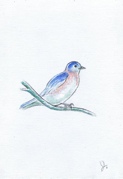
Daily Post: Tiny Blue Bird Painting
A tiny blue bird painting (pictured a little larger than actual size) done for a "tiny" themed show at the Pence Gallery a while back.

Wednesday, September 15, 2010

Tuesday, September 14, 2010
Daily Post: Santa sketches
These are for a Christmas mailer in progress.
Santa coming to town,

Santa leaving town...

Santa coming to town,

Santa leaving town...

Monday, September 13, 2010
Bonus Daily Post: Student Work
These are my favorite irises, bearded irises. I did this as a student, so it doesn't really count as "new work" which is why you get two posts today. The original drawing is pretty huge and done from life, about 24x30 or so. Now I'd just rather draw from photos in my studio and not be damp, though I still occasionally take a sketchbook with me when I travel. I drew this in pencil and inked it at home in crow quill.


Daily Post: Travolta Monster
Last night Reg and I saw the first ten minutes or so of this really horrible John Travolta CIA movie in which right away the characters started doing very badly written un-CIA-like things. We were proud of ourselves for turning it off, but before we did I drew this bald John Travolta with a goatee monster (his look in the film). It doesn't look much like John Travolta but I think it caught the spirit of his character in the film.


Sunday, September 12, 2010

Friday, September 10, 2010
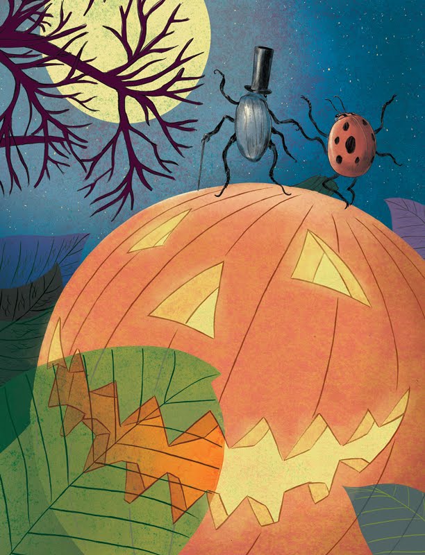
Daily Post: Halloween Mailer
Usually I conceive of a piece with only a vague idea of how I'll attack the color, depending primarily on the strength of the line drawing, solving the color problem later. This time color was very much a part of the piece's conception. I had pretty detailed color notes very early on with this piece, inspired by the work of Mary Blair. Mary Blair was a Disney concept artist who had an amazing sense of color and design, and often the way her work finally appeared on the screen never quite matched up to be as striking as her original designs. This is particularly inspired by the backgrounds in Disney's Alice In Wonderland which still somehow managed to capture the character of Blair's designs.
My colors ended up changing some in the execution, particularly the purples, but largely this turned out much how I envisioned it, and from a color perspective I feel this is one of my better pieces. After this experiment I'd like to make color much more of an integral part of how I conceive a piece from now on. Another thing I tried here was losing the outline on the larger shapes, having the color go right to the edge.

My only concern is that with the limits of digital printing. Dark colors don't fare as well as they might with off-set. With my ealier Kipling jungle piece I had to go to a photo processing lab to get the colors right for my portfolio because they were so dark, so printing this as a mailer may pose a problem. Laser printing tends to be kinder, but there are limits. I'll be attending a Society of Children's Book Writer's and Illustrator's conference today and had to settle for a laser printed copy for my portfolio because of time constraints, and the colors were much darker than I would have liked, but I decided to include it anyway because of the strength of the design. At any rate, how you see it here on the screen is pretty much how it's intended to look. Dark colors seem to fare better on Blogger as well.
My crazy color notes, followed a little less closely than I thought, it seems:

My colors ended up changing some in the execution, particularly the purples, but largely this turned out much how I envisioned it, and from a color perspective I feel this is one of my better pieces. After this experiment I'd like to make color much more of an integral part of how I conceive a piece from now on. Another thing I tried here was losing the outline on the larger shapes, having the color go right to the edge.
My only concern is that with the limits of digital printing. Dark colors don't fare as well as they might with off-set. With my ealier Kipling jungle piece I had to go to a photo processing lab to get the colors right for my portfolio because they were so dark, so printing this as a mailer may pose a problem. Laser printing tends to be kinder, but there are limits. I'll be attending a Society of Children's Book Writer's and Illustrator's conference today and had to settle for a laser printed copy for my portfolio because of time constraints, and the colors were much darker than I would have liked, but I decided to include it anyway because of the strength of the design. At any rate, how you see it here on the screen is pretty much how it's intended to look. Dark colors seem to fare better on Blogger as well.
My crazy color notes, followed a little less closely than I thought, it seems:


Thursday, September 09, 2010
Daily Post: Ladybug
Here's an inked character for my halloween piece in progress. This guy will be dancing with the beetle of a couple of posts back. Again, I'm experimenting with more elaborate rendering in my ink drawings, more spotting of blacks and hatching and feathering. Usually I stick with a straight contour and let the color do all the work, but I would like to try to include more line variety, giving my figures a little more character than when they're simple outlines.


Wednesday, September 08, 2010

Tuesday, September 07, 2010

Monday, September 06, 2010

Friday, September 03, 2010
Daily Post: Companion Piece to the Geese Mailer
I had tried to do a second piece of the girl feeding the ducks as a companion piece to the earlier one a few posts down, but the pose came out stiff because I was trying to copy the photo too closely. This time I made it a little more cartoony, further animating the figure by putting her in a sequence. I ended up using some of those extra duck drawings after all!
Another thing I was messing with here is limited color. Here much of the background and geese were virtually left as line art. Since this will reproduce at about 5 1/2 by 8 1/2 inches, too much busy detail would be distracting. A fully rendered scene with this much action would read poorly at that size. Simplifying both the color and the rendering makes for a much easier read and more pleasing design.

Another thing I was messing with here is limited color. Here much of the background and geese were virtually left as line art. Since this will reproduce at about 5 1/2 by 8 1/2 inches, too much busy detail would be distracting. A fully rendered scene with this much action would read poorly at that size. Simplifying both the color and the rendering makes for a much easier read and more pleasing design.

Daily Post: Drybrush Bee
Edit: I thought I could upload a bunch of posts at a time and then publish them whenever I wanted to, but apparently blogger only publishes them in the order they were downloaded. So this one was supposed to go before the one above. Next time I'll have it all sorted out.
This was done for a Bee-themed show for the Pence Gallery here in Davis. The show won't be for a few months yet.

And with color:

This was done for a Bee-themed show for the Pence Gallery here in Davis. The show won't be for a few months yet.

And with color:

Tuesday, August 31, 2010


Daily Posts!
From now on (or until I can't manage it anymore) I'm going to try to put up posts every day. I've got a lot of sketches and in-progress work that I'll be posting, at least one piece a day in addition to the more infrequent finished work. People have expressed an interest in this stuff and I would like to get a few more eyeballs checking out my blog, and since I draw at least something every day, I'm hoping it won't be too hard to keep up, especially now that I have my new faster and more convenient scanner.
So starting off, here's a monster for a monster book that's in progress:

This one was actually completed last night, but most of the images this week will be things that I've done in the last month or so.
So starting off, here's a monster for a monster book that's in progress:

This one was actually completed last night, but most of the images this week will be things that I've done in the last month or so.
Subscribe to:
Posts (Atom)