Pages

Saturday, February 25, 2012

Piecing It All Together, and What I Learned from Barron Storey


I've mentioned before that I ink pieces of my images separately and then combine them later in the final image, and I think this may have been a little confusing, so I thought I'd share a little more detail about how this works. Often I draw each figure in a scene separately much larger than it will appear, so in the case of a big figure like Blackbeard, who dominates the image, I drew him about 18x24 inches, scanned him in pieces, then pieced him back together on photoshop. Here's the figure in pencil, already cropped:


 I added in the background later, but this is how I went about inking the figure. On photoshop, once I pieced him together, I cut him up again, this time in pieces that will be easier to ink. I make the pieces as large as they will fit on a piece of watercolor paper or bristol board trimmed to 11x17, the largest size that will fit in my printer. Then I blue line the parts, and print them out for inking. Here's the blue line:


And here's the inked hand. I inked it this large so I can get more detail where more detail is required, while still working fairly loosely. 

This gun is a small detail, but it's such a specific piece of hardware I inked it very large so that I could get it right. I inked the whole thing, even though only two thirds of it are seen in the image. This allows me to move it around if I want to make a few subtle changes, but it also helps it to look more consistent--the inks don't stop on one side of the belt and start again on the other--the strokes are continuous, giving more of a sense that the gun is actually behind the belt.

The torso required the least amount of detail, and I actually ended up inking it smaller than scale.  The belt I did separately. The buttons and button holes I did with white gouache. 


And here's the head:


Again, I inked it as large as I could blue line it. Some of these took more than one attempt, and since the original drawing is preserved, I can print out as many blue lined versions of each part as I want until I get it right. This not only provides a huge safety net if I screw up, but it allows me to take more risks with the inks. In general it allows me more control over the overall outcome, even when I'm using a medium (dry brush) that's very unpredictable. I count on it being unpredictable--it's the little accidents that provide interest--but I don't want it to be so unpredictable that it doesn't do essentially what I want it to.  For dry brush--a rendering technique that uses less moisture and more pigment on the brush--I use whatever works, usually cheap craft brushes, and usually paint in a mixture of india ink and brown acrylic ink. The brown ink is mainly to fool me into using bolder blacks, since when I work in black ink I tend to be more timid with blacks. Once I scan it I turn it all black anyway, or I can turn the line any color I want to in photoshop. 

One of the Many Lessons I Learned from Barron Storey

The materials available to you, in a lot of ways, determine how you're going to work. I'd love it, for instance, if my computer could print  in 18x24. Then maybe I'd ink my portraits larger than life! But the best thing to do is use these tools as an asset rather than a limitation. There's more than one way to skin a cat!

My teacher, Barron Storey once showed us an image he did for National Geographic. There looked like there were a hundred different animals in the picture. It was filled with detail. It seemed like an impossible thing to draw. Then he showed us something that to me, was a revelation. He took a little drawing of a monkey that was drawn on tracing paper, saturated the picture with fixative, and pasted it on the image. The paper disappeared and all you could see was the monkey! This is how he had done every animal in the picture. They were all a bunch of little pictures collaged together!

Storey once told me that he didn't think he could paint. This didn't make any sense to me. He did portraits for Time and other magazines that looked like paintings to me. He showed us the originals--they were made with just about anything he could get his hands on--colored pencil and markers and ballpoint pens and somewhere in there, paint too, but he used whatever he needed to get the job done. The message that a lot of his students took from this was: mixed media is the way to go, but mixed media wasn't the point. The point was problem solving. What do you want to achieve, and what's getting in your way of achieving it? You don't have to follow someone else's path to achieve what they do. It's not cheating to find your own way. You don't have to draw every monkey in the picture if you're afraid you're going to screw up. 

Using the computer to assemble my images from scanned watercolor textures and ink drawings, I get to make more choices and take more risks along the way. I can push the color in different directions. I can be more bold with my inks. I can't control everything--you can never control everything, and you don't really want to--but I can make discoveries that I would have never been able to make otherwise with different tools. I think the computer is great, but it's not the only reason why I'm able to solve these problems the way I have. Without the computer I would have found a different way, would have made different discoveries. I would have used tracing paper, or magic markers, or toothpicks, or whatever worked, but the tools aren't important. What's important is that you use your assets to overcome your limitations in whatever way you need to. Be inventive! You might not find my way easier, but find what works for you.

 I would stay away from the spray fixative though. Thanks to digital airbrushes and other digital substitutes for effluents, we contemporary artists stand to have a lot fewer respiratory problems. God I hope Barron has stopped smoking...

Oh, and if you missed it, here's the finished pirate.


Thursday, February 23, 2012

The Silent Majority?

Lately I've been averaging about 10 hits a day on my website, with about 30% return customers, but this blog has been getting an average of about 100 hits a day with 10% returnees. For me, that's a lot of hits. Tons of hits. I am sincerely grateful for your hits. But also, I would love to hear from you! Leave a comment. You won't be judged. Are you an illustrator? Illustration fan? Just curious about the stuff I write? A Lucian Freud fan? (The essay I wrote after Lucian Freud's death seems to be, by far, my most popular post). And then there's my much neglected website.  Introduce yourself! Jedalexander.blogspot.com wants to know!


Wednesday, February 22, 2012

Blackbeard!

So here's my last pirate, this one a painting. Or at least, partly a painting. I scan in watercolor textures and then add a few shadows and highlights on photoshop, coloring some of the black line on another layer. Here's the black and white version: 


The figure is first drawn all in one piece, (aside from the background which is done separately) and then inked in various pieces at various scales. The hands and face were inked quite a bit larger than the jacket, and the belt and guns were done separately as well. I like to draw big when there's a lot of detail involved, and I add a lot of detail in the inks. So this is all one big puzzle pieced together. And here's the finish:


I'm very pleased with how it turned out, and so is my agent, Abigail! With this one I experimented with laying in some of the watercolor textures over pieces of the image in multiply, rather than what I typically do, which is confine them to my flats. (sorry folks, but this is just for the photoshop people). So these big swaths of watercolor texture and color get blended in with the rest of the image, and gives a lot of texture to whole thing. It's a good look. And here's a close-up of the finished face, which I showed a close-up of  in its dry brush phase in an earlier post:


You can see here where all those messy looking dry brush marks came in handy. They're sort of like the contour of a paint stroke, the outside of the paint stroke that gives the paint stroke shape, even though the inside is almost flat color. So it gives the illusion of an oil or acrylic brush stroke. Pretty cool, huh?  I've also got a nice blue reflective shadow that really brings out the form, with that hard touch of red on the nose to make it pop, subtle but effective. I love when I get away with this kind of expressionistic color--there are few circumstances in life where you see a pirate with a devil red face, but since the whole image is washed in red, it doesn't seem unnatural. 

These pirates are portfolio pieces, but I like them so much I'm doing a short story to go along with them. Maybe a magazine submission? We'll see...

Tuesday, February 21, 2012

99% of All Young Adult Books

Angst ridden protagonist, usually with a dead parent or two dead parents, possibly adopted only to later discover that they're from a fantastical alternate world, a fairy, or an alien. If it's a girl, she's persecuted by the bitchy girl antagonist, but then there's the hunky guy and the best friend who later becomes a love interest thus creating the classic romantic triangle, though our heroine may be in competition with the bitchy girl for the attention of the hunky guy, and the bitchy girl may do something reprehensible to sabotage her chances or otherwise screw her over. Insert fairies, vampires, werewolves, post apocalypse here. Also, single themed dystopias are popular--a future where everybody has to conform to something or other so that the mistakes of the past are not repeated, but that something or other is super oppressive in some way, denying our hero their fundamental humanity, but our hero is somehow unique and transcends all obstacles so that they may liberate themselves and perhaps the world. Oh, and organ harvesting may possibly be involved. Or a horrible trial. There's always some horrible trial or series of trials given to test our exceptional hero to his/her limits in order to discover if they are worthy of something or other, but our hero subverts this awful system, see: Hunger Games, The Maze Runner, etc. may possibly involve a horrible infectious disease, a rebellion or zombies.


Don't forget to visit my website, sketches, illustrations, comics and more! Also comment if you so desire. A lot of traffic lately, but alas, no one comments. I'm a good listener!

Monday, February 20, 2012

A Quick Note About One of the Most Exciting Developments in Comics: Kickstarter


A lot has been said recently  in the comics community about what the recent Kickstarter campaign for Rich Burlew's The Way of the Stick may mean. Whatever you think about the strip, or even whether you've even heard of the strip, lets look at this simply from an economic perspective.

He raised a million bucks past his initial goal of $57,000 with little more than 12,500 backers. Diamond, the largest comics specialty store distributor in North America, made a total of $417 million wholesale last year. They make most of their profit from superhero comics. The average superhero comic sells about 30,000 copies. The highest selling individual superhero comic last year sold 231,00 copies. The Order of the Stick raised 1058,465 and counting with only 12,622 backers for a second printing. They offered premiums for people who donated more, such as iron-on patches, coloring books, magnets and a new previously unpublished story in PDF form. I doubt people were contributing as much as they were for the coloring books. They simply love the comic so much that they want to do whatever they can to support it.  Kickstarter seems to be rapidly becoming the main form of funding for comics in the U.S., but rather than relying on aggressive marketing and merchandizing like Warner Bros. and Disney (the owners of DC and Marvel comics respectively), the creators who use Kickstarter rely on small groups of very loyal supporters. And these are creator owned, self-published books. There's no denying it now: this is the future of comics. Music and film might follow suit. That means smaller audiences, creator owned product, and more diversity all around. What could be cooler than that?

If you want to contribute, or simply check out what all the fuss is about, you can go to their Kickstarter page, here.

Incidentally, my blog is getting more hits than my website by about 10 to 1, so if you like the stuff you see here, please check out my website.  There you can see most of my illustrations, sketches and comics at one central location!

Sunday, February 19, 2012

Why People Who Make Stuff Should Stop Using the Useless Word, “Haters” Indiscriminately


The slang term, “haters” has been getting a lot of circulation on the web, but it has an unfortunate reductive effect. The word is often used among young creatives. The term is equally as interchangeable with true maliciousness, as it is with people who simply disagree with you. It's a dismissive that doesn't allow any constructive criticism or dissent. It's often used to describe a collective, invisible enemy, whose target is a single individual. People also talk about “my haters”, or simply, “haters”, as in: we're in this together, you an I, us against those who indiscriminately hate us and our opinions or creations out of pure malice. This is in part based in a true kind of maliciousness that exists because of the anonymity of the web—people prove to be more vicious when they don't have to face their targets.

People who make stuff, pictures, music, whatever your passion is, tend to be sensitive, and justly so, when first learning their craft. These disciplines are difficult. Sometimes criticism, especially unconstructive criticism, can crush you before you get a chance to start. Encouragement is good, but I also think the indiscriminate acceptance so common on the web can be almost as destructive as indiscriminate cruelty. You can easily get into the trap of categorizing people as “haters” or supporters. The problem is, this is the best way to stay stagnant in your development, to have no conception of how much you're learning. In the arts, much is subjective. There's nothing that can definitively be declared of quality, and not of quality. Taste and aesthetics vary, but making anything still involves discipline, and when that discipline is directed towards a goal, it can be easy to lose sight of how close you are to that goal. If you seek out people who do the thing you want to do, and do it well, at least according to your own aesthetic, they can help you, if they're willing, to come closer to that goal. That's the whole purpose of teachers and mentors. If you are in it for the fun of it, with no particular goal in mind, by all means embrace your supporters. But if you have a goal in mind, strangers don't know what your goals are, and if you post your work publicly and rely on the opinions of strangers, ultimately you're going to receive some very extreme reactions. But these people don't and can't possibly hate you. They don't know you, your goals, your intentions, why you make this stuff. They don't matter. Not really. You can't let them harass you either, any more than you can take them seriously, but the more you think in terms of this invisible enemy that's out to get you, the more distorted your sense of self worth, and the true value of your art, is going to be.  

Saturday, February 18, 2012

A Close-Up Look at My Dry Brush Technique

Dry brush is a technique where you paint with less moisture on the brush so that the brush strokes have a more rough textures, sometimes leaving a kind of tread mark from the bristols. It's a technique I've developed over time, inspired in part by artists like Robert Fawcett and Noel Sickles.  Here's a close-up look of a piece in progress so you can get a better sense of what I do:


Another inspiration is Rembrandt, who had a way of getting just the right character of expression with just the right mark. Here you can see I incorporate a variety of marks in a very intuitive way. Often I have to start again when it's not quite working out. I can never control the brush completely, and there's always surprises and accidents that enrich the image, and in the best case scenario I can make less marks do more work. This one will eventually be in full color, so come back soon and see how it all worked out!

Thursday, February 16, 2012

Another in the Pirate Series

No actual pirates in this one. It's my kid protagonist, standing his ground against invisible adversaries. I'm pretty pleased with it. All that wonderful black! I think I've finally overcome my fear of black. I've been having such a good time with these pirates I've decided to write a story to go along with them, which I'm working on now. And one last pirate! The last one in color.


Thursday, February 09, 2012

Some Wednesday Figures.

This first pose is about 15 minutes, the second about 20. 


Monday, February 06, 2012

Pirates! Arrr!!

So here they are! Pirates! The first two in a series of four.

The Stowaway


"The Boy's Escaped."


So these aren't actually illustrating any particular story, but are done as examples of how I might illustrate the interiors of a young adult book. They're meant to have a Treasure Island feel. The title for this nonexistent book might be something like, "Blackbeard's Ghost." These images get their inspiration from all those great classic black and white illustrators from the beginning of the last century, Like Noel Sickles and Robert Fawcett, and Joseph Clement Coll, and of course, Hal Foster and Alex Raymond. As a kid, when I'd see illustrations like these they seemed impossibly perfect, and I only just think I'm beginning to do work that comes within a mile of that kind of draftsmanship. It's always gratifying to do a picture, that makes you think, "I would have loved these when I was a kid." I'm also greatly inspired by N.C. Wyeth, who did what were arguably the best illustrations for Robert Louis Stevenson's Treasure Island ever published. 

When I was a kid I had this illustrated book put out by National Geographic about pirates, I'm not sure of the name of it, but it was filled with all these great images, Wyeth's among them, and that first glimpse of those Treasure Island images stays with me. There was also these great illustrations by an illustrator whose name I may never know (I'd love to have that book again!)  of free divers, these guys who would dive naked for sunken treasure and pearls. I loved that stuff! I remember as a kid dressing up as a pirate with an eyepatch and a wooden sword and these gold clip on earrings my mom gave me, but the other kids teased me about the earrings. Earrings were just too girly, even when you were seven, even if you were a pirate, apparently. I remember feeling deeply embarrassed about that. That was before gangster rap, so I just missed the boat, I guess. It was a good look.

But this was a good time. More pirates to come! 


Thursday, February 02, 2012

Pirate ship interior


Here's a background done in dry brush and watercolor for one of my pirate pictures. It's been a while since actually fully painted a background--usually I  do the drybrush and pencil and color it in photoshop using scanned watercolor textures, but this has a more spontaneous look. I'll see how it looks in the finished image!

Tuesday, January 31, 2012

Are Kids More Creative Than Adults, or Where Do Ideas Come From?

I recently read a quote that someone posted associating creativity with childhood, implying that children are more creative than adults and that to sustain that creativity, you have to be in touch with that part of you that's a child. I think this is only partially true. Playing and being inventive in play comes naturally to children, not simply because they're children, but because they're people.

Play is encouraged in young children, but after they reach a certain age, they're meant to abandon play, outside of organized games. All kids draw, but there's an age, around eight or nine, when those with a talent for it are recognized, and those who don't have the same aptitude are discouraged. Drawings young children make aren't judged, or at least, they're judged considerably less. Drawing is considered a function of being a kid. But when they get older judgement seeps in, when they're introduced to the mystery of what is a good drawing, versus what is a bad drawing, when there are "artists" and "non-artists" kids that can and kids that can't.

The assumption is that children need to play, that play is critical, but that when they grow older, it's no longer necessary, and that an integral part of growing up is abandoning the part of your imagination that allows you to be inventive. To pretend. But an ability to be inventive has nothing to do with anything childlike. If anything, our potential to be inventive, to engage in imaginative play increases as we grow intellectually.  So maturity is the reason why people have greater ability to write and draw and make things--it's not only skill, but our capacity that increases as we grow older. It's not so much being in touch with your inner child, but  an ability to subvert the part of society that says you can't. Of course some people are more encouraged than others, but being discouraged from play is an integral part of adulthood, and there are acceptable and unacceptable forms of play even for the "artists", the people who are supposed to be good at it.

 It's in  the years between the age of eight or nine, to the time when we become teenagers, when we're first told that we can't, or that we're not good enough, or that it's not practical. We're discouraged so much, that for most adults, the act of picking up a pencil and drawing a picture is so foreign, that it simply doesn't occur to them to try. The last time they did it for the sake of it, they were too young to remember. But it's not about being a kid. It has nothing to do with being a kid. It's about what society tells us we can, and can't be. Everyone has ideas, but there's a mechanism in most people's heads that stops an idea before it has a chance to happen, that compares that idea to every other idea they've encountered and measures it to be worthy or not, usually with the assumption that it couldn't possibly be. It's an act so unconscious, that people often think they don't have any ideas, when it's only that they've been conditioned not to allow themselves to have them.

Then there's that question that's so common its become a joke, that so many artists are asked,"where do you get your ideas?"  The assumption is that it's an impossible question, that some people have ideas and some people don't, and that's just the way things are, but I don't think it's quite that simple. What I think people are really asking is, "Where are my ideas? Why is it so easy for you, and not for me?" which is actually a pretty good question. I  don't know that there's a rational answer, but at least part of the answer is that somewhere, someone in your life said, "you can't."So how can you change that? Play. Play anyway and anywhere you can. You might be a little rusty, but you'll get better if you practice, and even better when you no longer have to try, when it becomes what it always should have been--simply a function of being a person. 

Sunday, January 15, 2012

Pirate Drawing

A pirate I won't end up using for my pirate series.

Saturday, January 14, 2012

My Favorite Model

Usually when I draw figures I draw on a number of sources. I never find exactly the pose I need, but use a number of photos to get what I'm after. But every once in a while, I'll need an adult male, and so I prop up my camera, set the timer and pose. These are for a pirate piece I'm working on. 

This first guy has some unpirate-like slacks, but his legs will mostly be cropped out. Those are Maori tattoos on his face, since I was thinking Queequeg from Moby Dick. I like the idea of pirates that pick up crew from allover the world with different ethnicities, but I have no idea what real pirates from this era--I guess the 18th and early 19th century?--were like, outside of Treasure Island, which is what I listened to on audio while I drew these.

What I love about the timer on my camera is that I can pose as unselfconsciously as possible, and be as hammy an actor as I need to be. Of course these photos are pretty awful, and the lighting is pretty bad. Sometimes I spend a little more time working to get better shadows, but all I really needed for these background figures were the poses.  I've got plenty of time to take as many photos as I need until I can get just the pose I want. When I translate these poses into pirates, I feel like I lose a little, and gain a little--sometimes I don't quite capture a tilt of the head or a shrug of the shoulders, but in reinterpreting my poses as the characters, I want to change their builds and features and generally make them pirates and not a bunch of people that look like me. It's easy to get into the trap of relying on the photos so much that you're simply trying emulate the photo, and that's when things start to look stiff and inanimate. Well, for me anyway. 

Monday, January 09, 2012

A Great Book Will Always Remain a Great Book: Why Your Kid Will Never Outgrow Picture Books


Your Early Reader Needs Picture Books, Even if You Think They've Outgrown Them


There is an increasing trend to get kids into reading chapter books as early as possible. The publishing industry has responded to this trend by making picture books less sophisticated and with fewer words than they had in the past. I think this is a mistake. Picture books are a pivotal and significant part of a kid's growth and development as a reader. Kids need to be able to read picture books as long as they have a desire to. 


I recently came across a post on a blog called the "Homeschool Classroom" that discussed this issue, expressing that their child, at four, had reached a "reading wall." Here's the original post.


And here's a slightly edited version of my response:

Your boy is four years old. Picture books are OK. I repeat: picture books are OK. There are plenty of challenging picture books for even the most advanced reader. Try William Steig. Try William Joyce. Or Chris Van Allsberg. Yes, there are less words per page. But you'd be surprised--the vocabulary is not necessarily less sophisticated. The stories are often challenging and engaging. Compelling an early reader to read books he's not that interested in is not going to make them a better reader in the future. Let him choose his own books, even if they are what you consider to be below his reading level. Picture books are a very important and critical part of a kids early development as a reader. At four he needs picture books.

There are also some very excellent lavishly illustrated storybooks in the slimmer, picture book format. And no matter what the age level, I don't think it helps to make reading a compulsory act. Give him books that he likes and he will seek them out. Read him books that are maybe a little more sophisticated but that engage him--books that he may not be able to read on his own but that he can enjoy, like Doctor Dolittle or Peter Pan. These are nighttime reading. Bedtime stories. And read him his favorites--even if they're below his reading level--over and over again if that's what he wants. That's how you change a reluctant reader into an enthusiastic one!


I Missed My Picture Books


When I was eight years old, I moved from my home in Pennsylvania to California with my mother and brother. And I left behind my picture books. I had a wonderful collection of some of fantastic picture books, Babar, Maurice Sendak, Steig, classic fairytales illustrated by Dulac and some of the great illustrators of the past. At eight, I saw these as "baby books" and my mother asked if it was OK for my grandmother to sell them. I would get to keep the money. She sold the lot for $50, and my mother started a bank account for me. At the time, I thought this was a great idea. It wasn't long before I figured out what I'd done.


We no longer had any books in my house that I wanted to read. We had my older brother's Beverly Cleary and Judy Bloom books. I tried to read Ramona the Great which was supposed to be written for my age group, but I found it totally unsatisfying. I had always considered myself an enthusiastic reader, prided myself on my interest in reading, but there was nothing I wanted to read. Then I discovered comic books.


Comic books were picture books that I could buy myself. I could seek them out on my own, and buy them with my own money. At the time, the only thing I checked out from the library were hardbound collections of comics, like The Smithsonian Collection of Newspaper Comics and Origins of Marvel Comics and Flash Gordon. My parents thought: at least I was reading, but I think these comics were as sophisticated as any chapter book or young adult book. You see: when I was a kid, I liked fantasy, but there wasn't a Harry Potter. We had Roald Dahl, and later I'd discover Daniel Pinkwater, and John Dennis Fitzgerald's The Great Brain (not fantasy, but no less a great series). I loved a Wrinkle in Time, but didn't read it till much later. But we simply didn't have the wealth of young adult books, of truly engaging young adult books that we have now. Yes, there are too many vampire books, and the fantasy genre dominates, but they are books that kids want to read. And there are so many that are well written, and that have compelling characters, and that go so far beyond the The Hardy Boys and The Babysitter's Club in the sophistication of their content. But there has to be a transition point. Even when a kid's reading level is high enough for them to read a chapter book, or  even a young adult book, picture books can still be important. 


A Great Book Will Always Remain a Great Book


Maybe I was supposed to be too old for picture books, but I never stopped loving them. And I'm positive that even at eight, or nine, or even older, I would have still read them over and over, even if they were "baby books." These were, and remain important books for me. A great book is a great book, and if it's a truly great book, no matter how few words it has, no matter what age it was intended for, it should continue to be a great book, and kids shouldn't be compelled to abandon them. 


Wednesday, December 28, 2011

The Longest Winter For Cricket Magazine!

This month's Cricket Magazine features a story called "The Longest Winter" by Pamela D. Guaci, with illustrations by me! The story is about two Inuit brothers who go on a seal hunt. In this one the younger brother dreams that he's a seal, struggling to get through to the surface:


This one shows the distance between the two brothers:


They bond through the hunt, imagining their father, who had recently died, smiling over them. 


Like the last piece I did for Cricket, these required a lot of reference. The first challenge was to try to draw a harp seal. Unfortunately there weren't many pictures of swimming harp seals on the web. Here was one of the few I was able to find:


But it wasn't quite enough to really get a sense of what they looked like in motion. So I found more reference for a seal that looked similar who lived in a warmer climate, the monk seal.


So I found pictures of monk seals, watched videos on Youtube, added a little blubber, and whoola! I had a harp seal! For my Inuit reference I watched everything from the classic documentary Nanook of the North:


To this pretty horrible Anthony Quinn movie:


But these were Inuits from Greenland, and I was drawing Alaskan Inuits. So I did eventually find more authentic reference for my Inuits, and took a few photos using the timer on my camera for some of the harder poses:


I also had a student of mine do a few poses, but ultimately, I only use photos to get a general sense of the pose. When I draw directly from the photo my drawings tend to look a little stiff, so I try to reinvent the figure in the drawing.


These were the sketches I submitted to Cricket:


The art director, Karen Kahn wanted me to make sure the horizon faded out as it met the sky in the second image, something I could resolve in the color stage, and for the third, she wanted the hole in the ice to be smaller and more of an uneven shape. She also wanted me to show the tool made out of a bone and feather that the boy uses in the story. These changes were easy enough to make, and they were happy with my solutions.

Not long ago, I received an e-mail from the author, curious about how I had handled the story. I sent her the images and was gratified to hear that she was very pleased with them. So hopefully I got most of the details right! And here's the magazine, with a great cover by Heidi Younger:


Tuesday, December 20, 2011

Centaur Inks

So here's the centaur I posted earlier, now inked:


The last time I posted it I called it a pegasus, which wasn't entirely a mistake--he's to have wings, so he's sort of a pegasus/centaur. This is for my Wrinkle in Time illustration to beef up my YA portfolio. This particular drawing was inked in 3 parts, and there will be three figures on his back, and wings of course, so the whole drawing is done on a number of different pieces of paper.


Monday, December 19, 2011

Yet More Monsters

More monsters to give you the creeps...


Friday, December 16, 2011

More Mini Monster Drawings

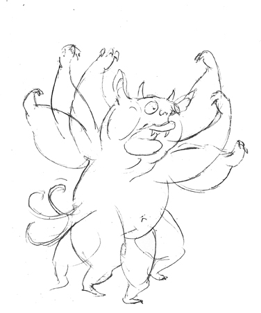
More drawings for 50 Monsters to Give you the Creeps. This million-eyed beast has an excruciatingly piercing (and annoying) whistle:


And here's a Flibbertigibbet Flibbertigibbetting:

Thursday, December 15, 2011

A 20 Minute Pose


Here is a 20 minute pose from yesterday's figure session:


Remembering to Draw

Once again, I choked on the long pose, so you won't be seeing that one. Last night, someone looked at the drawing I was doing at the end of the session, and said simply, "It looks like you're trying too hard." I wasn't sure about how I felt about this statement, until he elaborated, "it looks like you're trying to get it too perfect. You just need to not think about it so much, and draw." And he was right. I always get fussy on that long pose. I have more luck with the 20 minute poses, but it's that long pose where I always forget to draw, to turn off that fussy, over analytical part of my brain and to involve myself fully in the act of drawing.

 Drawing requires a little bit of both--you still have to pay attention to proportion and measurement, but then there's a part of you that has to fool itself into thinking that what you're drawing isn't a flat image but something three dimensional, and this is not the most logical way to think. You can approach it methodically, but there's a part of your brain, the non-rational part, that has to interpret what you're seeing and translate it into marks on paper, and there are a million ways to do this. You're always interpreting, deciding to emphasize some things and deemphasize others, to exaggerate some things and simplify others. I never stop learning about drawing, but sometimes I forget the most basic aspect of the process--to get out of your own way and to allow it to occur. It's good to have people around you,who, however bluntly, are willing to remind you of this. It's valuable to cultivate your own community of artists, whether in person or online, and to have at least a few people who are willing to tell you what often isn't easy to hear. But then it gets easier and easier to take that feedback as you gain confidence in your ability--knowing you can do something well gives you a foundation to be able to be told that you can also do it better. 

Wednesday, December 14, 2011

More Mini Monster Drawings

More from 50 Monsters to Give you The Creeps, the side project I've been doing during breaks while my current fully rendered piece is driving me crazy. 


Tuesday, December 13, 2011

More Monsters...

More monsters for my monster book. 

This would be a Dwarfis Creepus Insomnilopus:


And a Backwards Forwalpus:


Monday, December 12, 2011

50 Monsters in Progress

Some recent drawings for a picture book dummy about monsters, 50 Monsters to Give you the Creeps. This one has been in progress for a long time, so I'm just chipping away at it while i work on other projects. 

This is a comparative anatomy drawing between the common housecat, and Australapithacat. 


Some monsters get scared, too...


If you scroll waaay back in the blog you'll find the original drawings for these guys.  Each monster will have a profile that will include a description, a full page picture of the monster, and a smaller drawing with the monster in action, or that describes something about the monster.

But anyway, this is what I've been doing in the evenings. During the week I stick to my main priority, this bear of an image for my portfolio based on A Wrinkle in Time that's kicking me in the ass. It's always the figures! I don't think I'll ever be satisfied with my ability to draw people! But I keep working at it. There's another figure drawing session this week...

Saturday, December 10, 2011

A Couple of Random Sketches

These are, as advertised, just a couple of random sketches. They turned up somewhere, in a pile of stuff, and I have no recollection of drawing them. I think I must have drawn the first one while watching Disney's Sleeping Beauty since it has that look. 


It's been an exhausting week for a variety of reasons I won't go into. Nothing seemed to work out this week. I've been busy with a relatively complicated piece, which is just starting to come together, so that's something. It's been taking me ages to get this one together, but it should be resolved soon. Otherwise, I got my Christmas cards ready for the printer just in time, though I couldn't afford personal cards this year, unfortunately. These are going to publishers only. Dark blue is one of the most horrible colors to print digitally, so I've had to look at proofs, and adjust, and adjust some more to get the thing to resemble the colors I intended. I think I got them pretty close. We'll see when they come in the mail on the 19th. 


50 Monsters

I'm finishing up a dummy that I've been doing on the side, a compendium of silly monsters. You may have seen me post the drawings about a year ago now I think. So I've got 50, with descriptions, but I want individual illustrations for each one to demonstrate what they do. I've got about 20 of those done. I get these incidental drawings done, usually in the evenings, while we're watching TV. Reg and I are currently into The Fringe. It's typical trashy J. J. Abrams with all his usual red Mcguffins and red herrings, but it's still pretty fun. 

Books in Progress

After some feedback from first readers, I'm getting ready to do a second draft of my second YA novel for teens. The first is completed and sent to my agent. I've finished the first draft for a chapter book, and I've been writing the first draft for a middle reader book--something to do while I've been sitting on the YA novel until I've had enough distance from it to dive in again. After I've been sitting on it long enough, rewriting seems more like an opportunity than a burden, as I rediscover the book all over again.

Friday, December 02, 2011

Red Fox Racer, Early Memories of Saturday Morning Cartoons


Abigail Samoun asked all the artists she represents to do a small drawing of a fox for the holiday calendar. I haven't seen any of the other foxes yet, but all the artists at Red Fox are extremely talented, and I'm looking forward to seeing how the calendar turns out. For my own fox, I decided to draw a  fox in a foxy race car. The race car looks a little stern, but I'm thinking of it as more determined than angry.


The Laugh Olympics and other Horrible Cartoons 

When I drew this, a part of me was thinking about one of my favorite cartoons as a kid, The Laugh Olympics. All of the Hanna Barbera cartoon characters would compete in a variety of olympic competitions, and there was always a race where each character would have some personalized wacky car to drive. I always liked the unlikely combinations of characters, like Snidely Whiplash with Batman, or Grape Ape with Mutley. I think Snaggle Tooth and Sour Puss were the announcers. I can't remember. Anyway, I'm sure the cartoon would be completely unwatchable now.

 Most of those late 70s Hanna Barbera cartoons are pretty awful, though I think most adults my age who grew up with them have a lot of nostalgia for them. Hanna Barbera pretty much owned the airwaves back then. That was when Saturday mornings were always a big deal. My brother and I would sometimes get up so early we'd stare at the test pattern, waiting for the cartoons to start. Back then, the network TV stations crapped out sometime in the very early morning, and if you got up early enough there would be a color bar test pattern, followed by the National Anthem with an image of a flag whipping in the wind. That was back when some TV stations would air an image of a burning log in a fireplace on Christmas, or Christmas eve. TV was generally pretty awful and pretty weird back then. But even though the cartoons by and large, were pretty awful (aside from a few rare exceptions, like The Bugs Bunny Road Runner show), Saturday mornings-- before there was a Cartoon Network, when cable offerings were pretty meager--was something to look forward too.

Back then, everyone watched the same TV shows. When you went to school, everybody had seen Scooby Doo that weekend. During the week we'd watch Happy Days or All in the Family. I remember when everyone in my second grade class was talking about the Fonz jumping the shark, back when "jumping the shark" only meant that the Fonz was about to jump over a shark. I always seemed to miss stuff like this. Like when The Six Million Dollar Man fought the Yeti, or when The Battlestar Galactica ship actually made it to earth. TV really sucked unbelievably then. There was no Mad Men or Deadwood. But we all watched the same shows religiously. 

I think the quality of TV cartoons is also lot better now, and Nostalgia is pretty much all those old cartoons amount to, for me. I can't bare to watch stuff like Scooby Doo or the Flintstones, though I know they still have their appeal to a lot of people. I still like stuff like Jonny Quest and Bullwinkle, but I don't think I'll ever want to watch Turbo Teen, or Captain Caveman and the Teen Angels ever again for any other reason than childhood nostalgia.

Thursday, December 01, 2011

New Christmas Card


Here's the front and inside, respectively, of my new Christmas card. This one actually came out a lot how I imagined it might. I'm falling more and more in love with drawing architecture--my role models for architecture are Windsor McCay and Nicolas DeCrecy--I love those rich, detailed environments! I also love the way they invent their own architecture, and how it always, no matter how elaborate, seems to flow and make sense. My buildings here aren't quite that inventive, but they do the job. 


I've been enjoying doing these night scenes lately, and using super contrasty light sources. Again, I had a great time with the perspective, no CGI primitives, just a ruler and a pencil. I tightened up the background under the light box and scanned it directly from the pencils, no inking, and changed the contrast to make the lines dark. This is the second time I've tried this, and I'm really satisfied with the technique, at least for stuff like architecture where line weight variety isn't as much of an issue. The sled is also done this way. For figures  and animals I'm sticking with ink, but for backgrounds, this really saves a lot of time, and I can use that time to put more detail in and simply focus on the drawing.

Now if I can get the thing printed in time, I'm in business!