Friday, October 28, 2011
Thursday, October 27, 2011
Tuesday, October 25, 2011
I'm Now Being Represented by Red Fox Literary!
I've been hinting at some good news for a while now, but didn't want to announce it until all the paperwork had been signed, and I just received the signed forms today! So as of now, my writing and illustration will be represented by Abigail Samoun at Red Fox Literary.
I was also honored to discover that Red Fox recently took on one of my favorite all-time illustrators, Henrik Drescher! I've been a fan of Drescher since my teens, with books like Pat the Beasty and The Boy Who Ate Around. I'm looking forward to working with Abigail and Red Fox Literary and making lots and lots of books!
Monday, October 24, 2011
New Picture, "Harvest Moon", What's my daily routine?
Harvest Moon
I did this illustration in order to include more kids in my images, but at the time I made it, it hadn't occurred to me that it was a Halloween image, so it's Halloweenness is a complete accident. In fact it didn't occurred to me until I completed it. My original plan was simply to do a birthday party, but I like to draw animals so I added the animal costumes. ThenI wanted to add some dramatic lighting, so I thought it would be nice to have it at night in the forest. Then, in the end, I decided to add a big bright harvest moon, which also helped to balance the image, bringing the eye around from the focal point.
And here's a detail:
I did this illustration in order to include more kids in my images, but at the time I made it, it hadn't occurred to me that it was a Halloween image, so it's Halloweenness is a complete accident. In fact it didn't occurred to me until I completed it. My original plan was simply to do a birthday party, but I like to draw animals so I added the animal costumes. ThenI wanted to add some dramatic lighting, so I thought it would be nice to have it at night in the forest. Then, in the end, I decided to add a big bright harvest moon, which also helped to balance the image, bringing the eye around from the focal point.
And here's a detail:
I like the feel of this one, and now the fact that it's an unconventional Halloween image. I like that it has a little element of mystery, why these kids are out alone in the woods with no adults. It reminds me a little of Peter Pan's lost boys, and of Max, from Where the Wild Things Are in his wolf suit.
Where Have I Been?
I haven't posted in quite a while, in part because I didn't want to show this one in progress. The images never quite looked right on their own--it's largely a bunch of drawings of kids sitting in space, since the background was done separately. I was also a little unsure of this one until it started to come together.
The other reason I haven't been around is because I've been putting together some of my writing projects for submission. More on that later. No definitive interest by publishers yet, but there's some other news I'll be sharing soon that's almost just as good.
My Daily Routine: The Long Answer to the Question, "How Long Do you Spend Every Day Working?"
When I've gone to workshops and artist speaking engagements, someone is always bound to ask, "how long do you spend every day working?" When I used to hear their answer, I generally felt woefully inadequate comparing my own productivity to theirs. I think discipline is something you build up over time, and everyone has their own way of doing this. It took me years to develop the discipline I have now. For me, routine is critical, but time spent working and time spent wisely are two different things.
Using the Pomodoro technique I've mentioned in earlier posts, I've gotten a better sense of what a real work day should be, but the Pomodoro technique is new to me, so the work day I describe here is something I've only developed recently. I try to work about 12 to 16 Pomodoros (as described in earlier posts), or 25 minute periods every day, while spending the morning writing. I don't time my writing period since it tends to vary, though I try to write 200 words at the very minimum, though usually I write more On bad days I write less, but these are rare. This takes about two hours. While taking breaks during my art making time maximizes my productivity, taking breaks slows down my momentum when I'm writing, so for me, it's better to spend a shorter but focused and uninterrupted period writing than drawing. During my Pomodoro breaks I like to go on Google+ or Facebook, but these breaks go fast! (But that's kind of the idea) I tend to work on the weekend as well, but less, because of household chores and other responsibilities, though sometimes on weekends I'll have a longer writing session. And working doesn't always involve drawing. Sometimes its about collecting reference and doing research. Sometimes it's inking, or coloring. Sometimes I'll spend the whole day spinning my wheels trying just about everything and failing miserably to get anything to work.
So my day begins at 5:30. I usually screw around for an hour, then walk our dog, Cinder. When I get back from my walk, I eat breakfast. Writing usually follows, unless I'm doing something like a blog post, but that, I guess, also counts as writing. Drawing begins at 9:00 to 9:30, and ends anywhere from 5:00 to 6:00, or 6:30. I usually take an hour lunch around noon, sometimes longer if I have errands.
Wednesdays I teach a student for an hour, and every other wednesday I have a figure drawing session in the evening that I administrate, which is usually a four hour time investment or more. Hiring models and other general upkeep of the group is also time consuming, so I don't tend to draw much on these days, but I do tend to write.
The Virtues of Goofing Off
Of course all of this is subject to having a life. This doesn't always represent a typical day. The math adds up just a little too perfectly, and most days aren't perfect. There are always other responsibilities and distractions that come up, or sometimes I just take the day off. Or I'll take a trip. Or I'll go to the comic book shop. Or I'll decide I just want to watch a movie instead. I like to spend time with my wife. I love having the evenings free. This said, I don't tend to get out much. social networking sites are great, but they're also a great time waster, but the Pomodoro Technique has really helped my limit my internet time.
I think the consequence of being a full-time artist is spending a lot of time alone, and having your world become just a little smaller than it could be. If you want art to be a true discipline, this is the way it has to be. You have to make it an integral part of your life, but it's also important to have a life. My studio is a tiny room in our house with a single window that looks out onto the backyard. I like my work, so its not exactly a hardship, but sometimes you need to get out of your cave and get a little sunshine, or goof off, or otherwise do what you need to do to enjoy the life you have. And exercise! Get some exercise! Many Illustrators tend to get pudgier as they get older, so to avoid falling into this trend, I try to ride my bike whenever I can. For me, this isn't too hard a habit to maintain--it's more of a necessity, since I don't drive. but it's always good to have some kind of outlet for exercise. I intend to to have a long life and career. So eat right, exercise, develop your discipline, and enjoy your life and work! That's the best advice I could give anyone who wants to become an illustrator.
Edit: I originally wrote "6 to 8 Pomodoros" when I meant to say, 12 to 18 Pomodoros. I tend to add each two in my head as an hour, so I was thinking hours instead of 25 minute periods. Oops!
Wednesday, October 19, 2011
More About Being an Illustrator in an Increasingly Digital World
The most successful illustrators of the turn of the century--and I guess I should specify the 20th century at this point--were magazine illustrators. There was a golden age of print media at the turn of the century with the rise of the automated four-color press. There was a high demand for color pictures, and since there was no color photography, illustration was the only way to go. Periodicals were a cheap, current form of entertainment, and even during the depression, everyone still read newspapers and magazines. This golden age began to decline some time in the fifties, with the rise of TV and color photography, and now, finally, we're seeing the internet overtake most periodical print media, like magazines and newspapers.
So what are illustrators supposed to do now? Now we're told: make digital media. Learn to animate. Learn to storyboard. Learn to provide content for video games and movies. New media will replace old media. But I think this is approaching the problem from the wrong direction.
First, I don't think traditional illustration is going to disappear entirely. Though digital media may largely replace old media, I don't think it's going to entirely replace the inanimate illustrated book or story. You may replace the mode of presentation and distribution--it may be on an Ipad or Kindle, but the form itself will endure. An animated or interactive Cat In the Hat isn't going to be able to replace the simple experience of reading the book. It's still a unique experience that people value. Otherwise it would have happened already--Chuck Jones did a great animated version of The Cat in the Hat in the 70s (available on DVD and Blue Ray!), there's that awful Mike Meyers movie, there are video games, interactive toys, but kids keep wanting to read the dead tree version for some reason.
But still, digital media continues to grow as a popular form. You can't stick your head in the sand. So I do think Illustrators can benefit from being involved in more aspects of media production, but it's not the form of media that you work in that's going to make you a success. Illustrators need to be storytellers first, rather than simply picture makers. That doesn't mean they have to learn to animate, so much as learn to tell stories structurally and visually in a complete way. Rather than ornament someone else's story, they need to learn to tell their own. The more complete their unique vision is, the more invaluable they become. Artists who have spread themselves over the greatest variety of media have done so because their vision and ability to tell stories is what's compelling, not their aptitude for working in different media. Flexibility is important, but have a vision, first.
Illustration by Boris Arzybasheff
Friday, September 30, 2011
Dump Truck End Papers!
I'm working on what's called a book dummy, a rough mock-up of a book for a book proposal, for a picture book about dump trucks. I've been doing a lot of studies of dump trucks lately to prepare, and decided to take a bunch of those studies and make end papers with them. These are just pencils, and the real end papers would be inked and colored. Originally I thought to use only one of these, but then I thought it would be cool if I used one in the front of the book and the other in the back.
Thursday, September 29, 2011
Wednesday Figure Drawing, More about Time Management
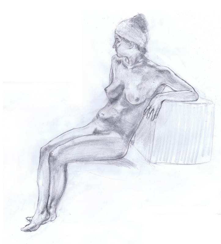
Here's another drawing from a Wednesday session, this time a long pose. I usually choke on the longer poses, but this time spent a little more time on the structure. We had some great artists last night, including the model herself. Brooke is not only a great model but an amazing painter, and I keep trying to get her to draw with us! The quality of the work all around at the figure sessions is really improving, and It's great to be in such good company.
The pose was pretty straight forward, so it was a little easier, but I simplified the tone quite a bit, instead of going for more of of a detailed more line oriented render.
Developing Time Management Skills for a freelancer and Work-at-Home Artist
It was a long working day, having effectively started some time at around 7:00, ending at 9:30 at night (with breaks of course!) There's work time, and then there's work time effectively spent, and with the Pomodoro technique I'm learning the difference. 6 hours of 25 minute sessions with 5 minute breaks in between beats 8 hours of diminishing returns.
Fortunately the figure sessions, with 20 minute sessions and five minute breaks, falls right in line with my everyday working method. It's made me rethink: what is a an 8 hour work day? What's a 10 hour work day? How can it best be spent? As a freelancer and work-at-home artist, when I'm working on self-motivated projects there often aren't set, external deadlines, so I'm forced to structure my day in a meaningful way. It's easy to get distracted. It's easy to fool yourself into thinking you've put in more time than you have.
To make the most of your work day, you need to have a way to account for your time, especially when those distractions can be such compelling ones, like the internet. Many of us don't have that incredible focus that allows us to work hours on end--I do for certain tasks, but not for all of them, particularly drawing, since I find it most demanding. I envy people who have that kind of relentless endurance, but I'm not one of them. You don't have to be one of them either. Everyone has their own working method and pace, but it all comes down to how you manage your time. Not having that endurance doesn't make you a lesser artist, but if you don't, you need to discover what will help you to stay on task.
So I need tools to keep me motivated. Audio books are incredibly helpful, especially fun ones. Right now I'm listening to a lot of Sarah Dessen, my current favorite young adult author. If a book requires too much of my attention, it only makes it harder to keep focused, but when it's an enjoyable and easily engaging book, it gives me one more reason to look forward to working. Since I only listen to audio books while working, this can be a big motivator.
The other ritual I have is putting on my shoes. This may seem odd, but putting on my shoes is a cue for me that I'm officially working. Working at home, I don't have to put on my shoes. I could work in my boxer shorts if I wanted to. But maybe it's like the way Mister Rogers takes off his dress shoes and puts on his sneakers at the beginning of every show--the shoes somehow affect my attitude. Don't ask me why. Whatever ritual you have that does this for you--a cup of coffee, a shower, seize on it. Work is ritual, and in working at home, you need to separate what you do with the rest of your time, and work. When work time easily flows into every other task at home, it's easier to be just kind of working sometimes, or preoccupied with the idea that you should be working. I haven't fully masters this skill, but the Pomodoro technique has helped. So what's your cue to start working? Starting can sometimes be the hardest part.
Which brings me back to the Pomodoro technique mentioned earlier. If you need to at first, or if other responsibilities require it, maybe 10 minutes of sustained activity and then a five minute break will work better for you. Not all of us have the luxury of a full, uninterrupted work day. So if your time is divided, how can you maximize the time you do have? How can you make it more focused? How can you give yourself a cue that now is work mode, and that all other distractions have to fall to the wayside? Take your work time seriously.
But even if it's drawing in front of the TV, there's value in having small goals, for example: I'm going to finish this drawing at the end of this TV show. If all you have are small snatches of time, take advantage of them, which again, means, take them seriously. Making small goals and achieving them helps to give you the small satisfactions required to go to the next step.
But I Didn't Have Enough Time!
It's bad enough to give this as an excuse as a student, but never give this as an excuse as a professional, even if it's simply a workshop. If you need a deadline extension, ask for it, but never excuse the quality of your work because you "didn't have enough time." Of course, sometimes you won't have as much time as you would like, in which case, your fundamental craft comes into play, your ability to give something polish, to pay attention to every part of the image. You may not have time to give the piece the level of rigor that you would like, but you do have a fundamental responsibility as a professional to make sure it's polished. The words, "I didn't have enough time" simply indicate to an editor or art director that you aren't ready. Every piece should have this fundamental polish, which is why it's so important to maximize the time you have. So give yourself the tools you need, whatever they might be! Time management is as important a part of your craft as any other skill.
Wednesday, September 28, 2011
Saturday, September 24, 2011
Overcoming Fear of Perspective
Since I was in school, I was afraid of perspective. I said it. Perspective freaked me out. I could never seem to get it right.
In more recent years, for more complicated perspective scenes, I've been using 3D models from the program Google Sketchup. I felt a little guilty about this. It seemed like a crutch. A few times I've shared the 3D models I used on my blog, to demonstrate the difference between the models and the final product, as if to say, See? The models are just a tool. And it's true. They were. But it still didn't feel right. This was despite the fact that my knowledge of perspective is pretty solid. But using 3D models was less because of lack of knowledge than fear of getting it wrong. I hated perspective. I couldn't wrap my head around it.
One of my principal problems was that when I did perspective, I got so hung up on grids and vanishing points, I forgot to draw. This used to happen when I used photo reference for figures--I would get so hung up on duplicating the image in the photo, that I wasn't paying attention to what the photo was communicating. I wasn't paying attention to the forms, or using what I knew about the figure to reinvent the figures on the page. Before, when using perspective, I wouldn't spend enough time on the structure. I wouldn't gesture out the structure as I would a figure, but would instead right away get too worried about these technical issues. And this was how I started to use the 3D models--I would come up with my primitives and grids first, then move the 3d camera around until I got the composition I wanted. I was getting the result I wanted, but going about it all backwards.
There are some great books on perspective. One of my favorites is David Chelsea's Perspective for Comic Book Artists. It's one of the best books I know about the subject, and you don't need to be a comic book artist to learn from it. Books like these will teach you the fundamentals about perspective. They'll teach you the rules. Unfortunately they won't teach you how to draw.
Not too long ago I did something that I thought was impossible for me: curvilinear perspective. This is when you have a sort of fish-eye effect. I put together a basic curvilinear grid, which I mostly eyeballed. If you're curious what piece this was, it's the Christmas image in my portfolio. Once again I did a grid first, then started putting in the buildings. Since the whole point was to draw a neighborhood, a grid, it didn't really matter as much. But I was still missing the point.
More recently I started to simply rough in the kind of perspective I want, eyeballing buildings and other structures with what I already essentially know. Then I pop that rough idea, with all my compositional elements, under the lightbox, and then I start worrying about vanishing points and grids. But then sometimes I don't worry about this stuff at all. I just draw. If you draw enough, a lot of this will come intuitively. The illustrator Robert Fawcett claimed to have never learned perspective and that he completely did it by eye, but his perspective looked flawless. I doubt I'll ever abandon my grids and vanishing points completely, but then sometimes, they're not as necessary as I think.
The trucks in the previous post were done freehand, perspective by eye, no vanishing points, no grids. It's something I would have never thought I would be able to do not too long ago. Is the perspective perfect? I highly doubt it. But using CGI as an underpinning for my perspective sometimes has made the perspective just a little too dead-on. It looks too perfect, and not quite organic. So for the foreseeable future, I don't think I'll be using CGI for my perspective solutions. After all these years, I've finally overcome my fear of perspective.
In more recent years, for more complicated perspective scenes, I've been using 3D models from the program Google Sketchup. I felt a little guilty about this. It seemed like a crutch. A few times I've shared the 3D models I used on my blog, to demonstrate the difference between the models and the final product, as if to say, See? The models are just a tool. And it's true. They were. But it still didn't feel right. This was despite the fact that my knowledge of perspective is pretty solid. But using 3D models was less because of lack of knowledge than fear of getting it wrong. I hated perspective. I couldn't wrap my head around it.
One of my principal problems was that when I did perspective, I got so hung up on grids and vanishing points, I forgot to draw. This used to happen when I used photo reference for figures--I would get so hung up on duplicating the image in the photo, that I wasn't paying attention to what the photo was communicating. I wasn't paying attention to the forms, or using what I knew about the figure to reinvent the figures on the page. Before, when using perspective, I wouldn't spend enough time on the structure. I wouldn't gesture out the structure as I would a figure, but would instead right away get too worried about these technical issues. And this was how I started to use the 3D models--I would come up with my primitives and grids first, then move the 3d camera around until I got the composition I wanted. I was getting the result I wanted, but going about it all backwards.
There are some great books on perspective. One of my favorites is David Chelsea's Perspective for Comic Book Artists. It's one of the best books I know about the subject, and you don't need to be a comic book artist to learn from it. Books like these will teach you the fundamentals about perspective. They'll teach you the rules. Unfortunately they won't teach you how to draw.
Not too long ago I did something that I thought was impossible for me: curvilinear perspective. This is when you have a sort of fish-eye effect. I put together a basic curvilinear grid, which I mostly eyeballed. If you're curious what piece this was, it's the Christmas image in my portfolio. Once again I did a grid first, then started putting in the buildings. Since the whole point was to draw a neighborhood, a grid, it didn't really matter as much. But I was still missing the point.
More recently I started to simply rough in the kind of perspective I want, eyeballing buildings and other structures with what I already essentially know. Then I pop that rough idea, with all my compositional elements, under the lightbox, and then I start worrying about vanishing points and grids. But then sometimes I don't worry about this stuff at all. I just draw. If you draw enough, a lot of this will come intuitively. The illustrator Robert Fawcett claimed to have never learned perspective and that he completely did it by eye, but his perspective looked flawless. I doubt I'll ever abandon my grids and vanishing points completely, but then sometimes, they're not as necessary as I think.
The trucks in the previous post were done freehand, perspective by eye, no vanishing points, no grids. It's something I would have never thought I would be able to do not too long ago. Is the perspective perfect? I highly doubt it. But using CGI as an underpinning for my perspective sometimes has made the perspective just a little too dead-on. It looks too perfect, and not quite organic. So for the foreseeable future, I don't think I'll be using CGI for my perspective solutions. After all these years, I've finally overcome my fear of perspective.
Labels:
CGI,
Curvilinear perspective,
David Chelsea,
Fear of perspective,
Google Sketchup,
Perspective,
Robert Fawcett
Friday, September 23, 2011
Wednesday, September 21, 2011
Le Renard Rouge
A small original painting ( about 4" x 8") done in ink and watercolor on a postcard sent as a "thank you" to a much admired agent littéraire.
Saturday, September 17, 2011
Friday, September 16, 2011
Some Sketches, Increasing Productivity with the Pomodoro Technique
Here are a few sketches of some very animated furniture for a picture book project I'm working on.
Every two weeks I run a figure drawing session at the Pence Gallery. I was finding that my focus and productivity was really strong during these sessions, andI wondered why I didn't have quite the same focus at home. Then I realized: it was the timer. 20 minute drawing sessions are broken up by 5 minute breaks. This made me recall a similar technique that my wife had told me about called The Pomodoro Technique, a technique that many professionals use to increase their productivity.
The Pomodoro Technique
Illustrator's and freelancers often struggle with time management. It's particularly difficult to manage your time when you have an inconsistent workflow. I recently started using a time management technique called the "Pomodoro Technique." It's very simple: Set a timer for 25 minutes. After the timer goes off, set the time again for a five minute break. Then set the timer again for another 25 minutes, then another five minute break. Each 25 minute interval is one Pomodoro. After four Pomodoros you give yourself a longer break, Maybe fifteen minutes, or break for lunch. Then start again.
I'm finding this helps me in a number of key ways: for one, it cuts back on my internet use significantly. I like to use the internet. In fact I LOVE to use the internet. But I often waste a lot of time just checking in with Facebook, or Google+, or checking my e-mail. Or someone posts something on one of the social networking sites and I spend entirely too long chasing links. Well that's something better left to one of my long breaks. And the checking in stuff I can do during my short breaks. But I'm also finding that I want to do all this obsessive checking-in less when I know I have only a short time to do it. Often I'd rather spend the time eating a snack, or getting my studio for a change of scene.
These 25 minute intervals are deceptively short, but it's a good kind of deceptive. It's the perfect way to fool myself into keeping focused, knowing that there's a break right around the corner. I find this makes me a lot more productive than when I do long marathons of uninterrupted work, at least, as far as drawing is concerned. Drawing is the one activity where I really have to push myself to keep going. Writing, I can do for hours. Inking, coloring, I have no problem sustaining. But keeping up my drawing stamina can often be difficult. This technique has proven to be a great solution.
Every two weeks I run a figure drawing session at the Pence Gallery. I was finding that my focus and productivity was really strong during these sessions, andI wondered why I didn't have quite the same focus at home. Then I realized: it was the timer. 20 minute drawing sessions are broken up by 5 minute breaks. This made me recall a similar technique that my wife had told me about called The Pomodoro Technique, a technique that many professionals use to increase their productivity.
The Pomodoro Technique
Illustrator's and freelancers often struggle with time management. It's particularly difficult to manage your time when you have an inconsistent workflow. I recently started using a time management technique called the "Pomodoro Technique." It's very simple: Set a timer for 25 minutes. After the timer goes off, set the time again for a five minute break. Then set the timer again for another 25 minutes, then another five minute break. Each 25 minute interval is one Pomodoro. After four Pomodoros you give yourself a longer break, Maybe fifteen minutes, or break for lunch. Then start again.
I'm finding this helps me in a number of key ways: for one, it cuts back on my internet use significantly. I like to use the internet. In fact I LOVE to use the internet. But I often waste a lot of time just checking in with Facebook, or Google+, or checking my e-mail. Or someone posts something on one of the social networking sites and I spend entirely too long chasing links. Well that's something better left to one of my long breaks. And the checking in stuff I can do during my short breaks. But I'm also finding that I want to do all this obsessive checking-in less when I know I have only a short time to do it. Often I'd rather spend the time eating a snack, or getting my studio for a change of scene.
These 25 minute intervals are deceptively short, but it's a good kind of deceptive. It's the perfect way to fool myself into keeping focused, knowing that there's a break right around the corner. I find this makes me a lot more productive than when I do long marathons of uninterrupted work, at least, as far as drawing is concerned. Drawing is the one activity where I really have to push myself to keep going. Writing, I can do for hours. Inking, coloring, I have no problem sustaining. But keeping up my drawing stamina can often be difficult. This technique has proven to be a great solution.
Thursday, September 15, 2011
Tuesday, September 13, 2011
Inuit man, inks
Here's the inks for the Inuit man I did for the Cricket piece. The hairline looks a little weird--I didn't bother to resolve it since most of it would be cropped out above the eyes.
Monday, September 12, 2011
Cricket Teaser
Here's a small fragment of one of the recent pieces I did for Cricket magazine. I can't show the whole thing, I'm afraid,until it sees print, but I'll post the full version and talk more about it then. They seemed really pleased with the work and I'm anxious to collaborate with them in the future!
Sunday, September 11, 2011
"The Gingerbread Boy" for SCBWI's Illustrator's Day, art directed by Joann Hill from Disney/Hyperion
An optional assignment for The Society of Children's Book Writers and Illustrators fifth annual Illustrator's Day at Fort Mason in San Francisco ( I know that's a mouthful. SCBWI Illustrator's Day for short) was to do two pages and a spread for the book, "The Gingerbread Boy." Joann Hill from Disney/Hyperion would art direct the pieces by e-mail, and we would show the finished pieces at the event. It was a fun project and it was great to work with Joann, who, like any good art director, made some great suggestions to improve my images. I've posted the initial sketches I submitted to Joann, and the finished pieces so that you can see the differences.
Thinking of desserts, I thought of the painter Wayne Thiebaud,
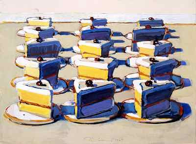
Though Thiebaud was an inspiration. I didn't want to emulate Thiebaud, but used him as more of springboard than anything else. Joann, like me, was a fan of Thiebaud and really liked the idea.
The first piece illustrate's the text,
“I’ve run away from a little old woman and a little old man.
I can run away from you, I Can.”
I decided to make the cow a chef from a roadside diner. The roadside diner comes a little later.
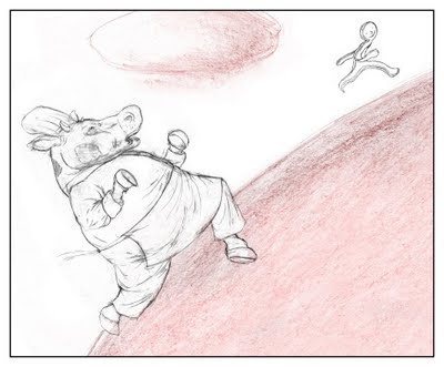
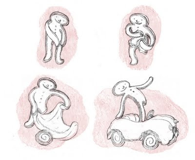
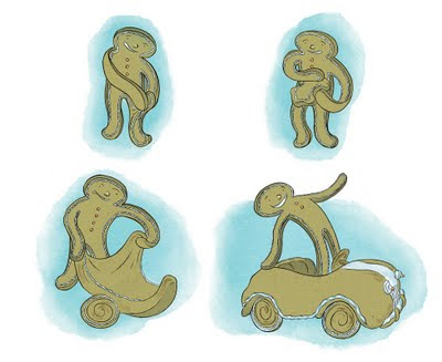
This series of images is designed to be wordless. Here I"m expanding on the idea of "as fast as his legs could carry him", a phrase used earlier in the text. Rather than a strict literal interpretation of the idea, I chose to have the gingerbread boy take one of his legs and turn it into a car so he could get to where he needed to go a lot faster than, strictly speaking, on foot.
This one illustrates the text,
"And the cow ran after the gingerbread boy..."
and on the facing page of the spread:
"...but couldn’t catch him."
So here's the roadside diner on a Thiebaudesque landscape.
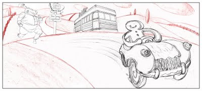
Joann gave me some really positive feedback on my sketches, but suggested a few key changes. She thought the cow looked a little bit surly, and that he wasn't quite looking at the Gingerbread Boy. She wanted the cow to have more of an expression of "delight." So I changed the cow's expression, and getting the cows eye line to match up with the Gingerbread Boy was simply a matter of giving him a little tilt.
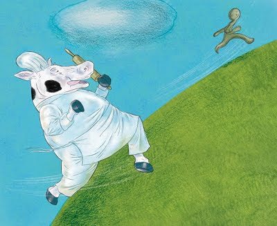
I used a number of textures here: the hill is a pattern made with a fan brush, oil paint and mineral spirits. Much of the color is pastel, and the cloud and outline for the hill is simply done in pencil on print making paper, which I popped over the textures.All the line is in ink, and the color is placed in later digitally.
For the second illustration, Joann liked the idea of the car, but didn't care for the fact that the gingerbread boy was amputating his own leg, which is easy enough to understand. I suggested that he take the dough from his leg without it diminishing him, similar to something you might see in claymation. She liked this idea, but wanted me to vary the Gingerbread Boy's expression more as he's struggling to make the car. I added eyebrows to give his simple dot eyes a little more range of emotion, and I think the expressions added a great deal to the narrative.
And here's the spread.
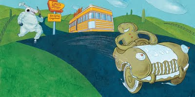
Joann also had me change the expression of the gingerbread Boy in the spread, again adding to his character and emotional range. At first she was ambivalent about the diner. Diner's reminded her of hamburgers, and she was questioning the logic of the cow working at a diner. Eventually she decided that she had over thought this, and that she liked the diner as an image. She suggested that the cow carry a rolling pin, which contributed more to the idea that he was a baker, rather than a grill cook. It was great to see that Joann didn't stick with her first impression and was able to change her mind. This emphasizes to me the collaborative nature of illustration, that there's always a little give and take. A good art director can be flexible, and flexibility on both ends is what ultimately makes a better finished piece. It was great to collaborate with Joann, and I hope that I'll be able to someday work with her as a professional!
I'd also like to give a special thanks to Lea Lyon, who organized the event, and is a talented illustrator in her own right. This is the fifth year that Lea has put this together, and there were some excellent guests. Guests included the amazing illustrator Andrew Glass, Literary agent Linda Pratt from Wernick and Pratt Agency, and of course Joann Hill. There were also some other professionals available for critiques, including John Clapp, my former teacher at San Jose State, and Abigail Samoun from Red Fox LIterary. I'm a fan of both Abigail and John, so it was great to see them both at the conference. Please feel free to click on any of the links above to learn more about the guests at the conference.
Thinking of desserts, I thought of the painter Wayne Thiebaud,

Though Thiebaud was an inspiration. I didn't want to emulate Thiebaud, but used him as more of springboard than anything else. Joann, like me, was a fan of Thiebaud and really liked the idea.
The first piece illustrate's the text,
“I’ve run away from a little old woman and a little old man.
I can run away from you, I Can.”
I decided to make the cow a chef from a roadside diner. The roadside diner comes a little later.

This series of images is designed to be wordless. Here I"m expanding on the idea of "as fast as his legs could carry him", a phrase used earlier in the text. Rather than a strict literal interpretation of the idea, I chose to have the gingerbread boy take one of his legs and turn it into a car so he could get to where he needed to go a lot faster than, strictly speaking, on foot.

This one illustrates the text,
"And the cow ran after the gingerbread boy..."
and on the facing page of the spread:
"...but couldn’t catch him."
So here's the roadside diner on a Thiebaudesque landscape.

Joann gave me some really positive feedback on my sketches, but suggested a few key changes. She thought the cow looked a little bit surly, and that he wasn't quite looking at the Gingerbread Boy. She wanted the cow to have more of an expression of "delight." So I changed the cow's expression, and getting the cows eye line to match up with the Gingerbread Boy was simply a matter of giving him a little tilt.

I used a number of textures here: the hill is a pattern made with a fan brush, oil paint and mineral spirits. Much of the color is pastel, and the cloud and outline for the hill is simply done in pencil on print making paper, which I popped over the textures.All the line is in ink, and the color is placed in later digitally.
For the second illustration, Joann liked the idea of the car, but didn't care for the fact that the gingerbread boy was amputating his own leg, which is easy enough to understand. I suggested that he take the dough from his leg without it diminishing him, similar to something you might see in claymation. She liked this idea, but wanted me to vary the Gingerbread Boy's expression more as he's struggling to make the car. I added eyebrows to give his simple dot eyes a little more range of emotion, and I think the expressions added a great deal to the narrative.

And here's the spread.

Joann also had me change the expression of the gingerbread Boy in the spread, again adding to his character and emotional range. At first she was ambivalent about the diner. Diner's reminded her of hamburgers, and she was questioning the logic of the cow working at a diner. Eventually she decided that she had over thought this, and that she liked the diner as an image. She suggested that the cow carry a rolling pin, which contributed more to the idea that he was a baker, rather than a grill cook. It was great to see that Joann didn't stick with her first impression and was able to change her mind. This emphasizes to me the collaborative nature of illustration, that there's always a little give and take. A good art director can be flexible, and flexibility on both ends is what ultimately makes a better finished piece. It was great to collaborate with Joann, and I hope that I'll be able to someday work with her as a professional!
I'd also like to give a special thanks to Lea Lyon, who organized the event, and is a talented illustrator in her own right. This is the fifth year that Lea has put this together, and there were some excellent guests. Guests included the amazing illustrator Andrew Glass, Literary agent Linda Pratt from Wernick and Pratt Agency, and of course Joann Hill. There were also some other professionals available for critiques, including John Clapp, my former teacher at San Jose State, and Abigail Samoun from Red Fox LIterary. I'm a fan of both Abigail and John, so it was great to see them both at the conference. Please feel free to click on any of the links above to learn more about the guests at the conference.
Labels:
Disney,
Gingerbread Boy,
Gingerbread Man,
Hyperion,
Joann Hill
Thursday, September 08, 2011
Curse of the Weregiraffe: The Pitch

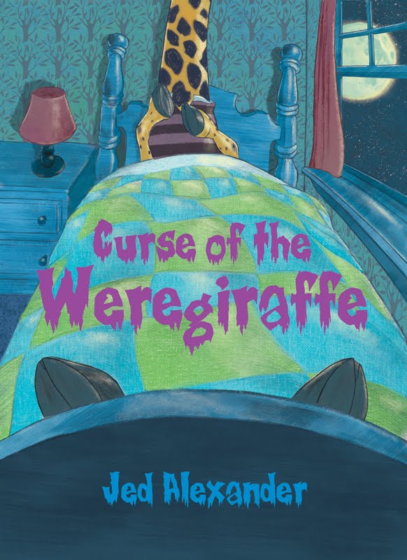
So I'm working on a book called, "Curse of the Weregiraffe." The mock-up cover is on the previous post. Here's the pitch:
Andy Friedman is cursed.
What happened to all the trees in Gracie Park? Who broke into The United Cabbage and Fruit Cannery and emptied every single can of canned cabbage? And how did a giant monster giraffe get into the Forest J. Ackerman Junior High School Multi-Purpose Room during the basketball game between the Forrest J. Ackerman Junior High Junior B Giants, and the Hugo Gurnsback Junior High Junior B Ferrets?
While on African Safari with his family, sixth grader Andy Friedman is bitten by a giraffe. In fact, it wasn’t even a bite, but a nip. A harmless nip.
One month later, on the first night of the gibbous moon (the stage of the lunar cycle just before and just after the full moon) Andy felt the hunger. The hunger that caused every leaf, every lawn, every tree and every plant that Andy laid eyes on (even his mother’s nasturtium!) to be irresistibly delicious! And it was that night, that the hunger turned Andy into the most horrible of all herbivores, the weregiraffe!
But when Andy meets Professor Glen Strange, he finds that his best friend Ogden isn’t the only one who knows his secret. And Andy soon discovers that professor Strange knows more about Andy’s secret than even Andy himself.
Wednesday, September 07, 2011
Curse of the Weregiraffe
This is a spec cover for a YA chapter book I've been writing, so the book doesn't officially exist yet. The book only needs a final polish at this point, but I"m pretty happy with it.

I've been having a great time writing it and this was a fun piece to do. I just finished all my stuff for the SCBWI meeting, including my Cricket pieces, so this was just a little bonus piece. I was working on it before I did the Cricket assignment, so all I needed to do was color it. I'm having fun adding a lot more diverse textures, everything from pastel, to watercolor to graphite. I got the texture on the quilt with graphite on canvas board with a pencil rendering dropped over top of it. The moon is watercolor turned into a transparent clipping path and placed over pastel. The wood textures are a combination of ink dry brush and gaouche dry brush. The only truly digital thing is the highlights. I was also lucky to find that great tree textile online, as well as the typeface which is called "Creepsville". I'm really pleased with it. Hopefully some version of it will end up as the actual cover.

I've been having a great time writing it and this was a fun piece to do. I just finished all my stuff for the SCBWI meeting, including my Cricket pieces, so this was just a little bonus piece. I was working on it before I did the Cricket assignment, so all I needed to do was color it. I'm having fun adding a lot more diverse textures, everything from pastel, to watercolor to graphite. I got the texture on the quilt with graphite on canvas board with a pencil rendering dropped over top of it. The moon is watercolor turned into a transparent clipping path and placed over pastel. The wood textures are a combination of ink dry brush and gaouche dry brush. The only truly digital thing is the highlights. I was also lucky to find that great tree textile online, as well as the typeface which is called "Creepsville". I'm really pleased with it. Hopefully some version of it will end up as the actual cover.
Saturday, September 03, 2011
Busy busy busy...
For every mark I make with a brush, I have to make about 20 on a piece of test paper. When I do dry brush, it's more than that. Here's what my trashcan looks like after a week of inking...
Pay no attention to my dirty floor. Years of built up graphite and other miscellaneous messes have not been kind. Even when I mop this stuff just doesn't come up! The amount of paper I use in general is kind of embarrassing. I go through a ton of bond paper, watercolor paper and bristol board. I'm sure I've murdered a small forest. I have no excuses for this. If I could get a digital tool that could duplicate the look of a thoroughly abused and worn crappy brush, I'd switch to a tablet in a second. I have about a dozen beaten up brushes that do the job. There's nothing like a cheap, ink incrusted craft brush to get great dry brush effects! At least I recycle.
So I'm in the process of coloring three pieces now, and I just finished coloring three others, but I won't be posting any of this stuff for a good while. I've got an SCBWI illustrator's conference on the 10th, and I want to get as much new work as I can done by then.
Pay no attention to my dirty floor. Years of built up graphite and other miscellaneous messes have not been kind. Even when I mop this stuff just doesn't come up! The amount of paper I use in general is kind of embarrassing. I go through a ton of bond paper, watercolor paper and bristol board. I'm sure I've murdered a small forest. I have no excuses for this. If I could get a digital tool that could duplicate the look of a thoroughly abused and worn crappy brush, I'd switch to a tablet in a second. I have about a dozen beaten up brushes that do the job. There's nothing like a cheap, ink incrusted craft brush to get great dry brush effects! At least I recycle.
So I'm in the process of coloring three pieces now, and I just finished coloring three others, but I won't be posting any of this stuff for a good while. I've got an SCBWI illustrator's conference on the 10th, and I want to get as much new work as I can done by then.
Subscribe to:
Posts (Atom)