Pages

Saturday, November 13, 2010

Daily Post: Snowscape

This is the background line art for my christmas card, which I'm in the process of coloring. Some of you may remember an earlier post with a flying santa. Well this is what he's flying over. I better get this thing done soon!


The Armadillo Records show went great! Nick Jaina was amazing! We also had the best showing of any Davis Art Walk event where I've shown my work.

Thursday, November 11, 2010

Daily Post: This Guy

So, for the first time since I started, I missed a daily post yesterday! It'll never happen again (for those who are paying attention). It was a crazy busy day yesterday, one of those days when you swear you did something but you didn't.

Monday, November 08, 2010

Friday Art About at Armadillo Music! Nov. 12th

For the Davis Art About Art Walk I'll be showing my prints and posters at Armadillo Music at 205 F Street in Davis on November 12th! Starting at 6:00pm, a live performance by Portland-based folk artist Nick Jaina, Opening and Refreshments, 7:00pm.

Also featuring this exclusive signed and numbered limited edition print only available at Armadillo Music!

Sunday, November 07, 2010

Daily Post: Twisty

This one is a little less in the realm of kid friendly, but it was fun.

Saturday, November 06, 2010

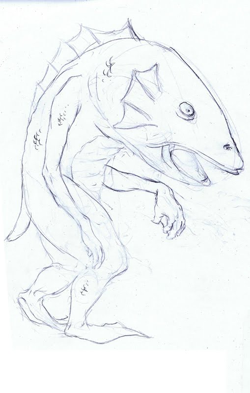
Daily Post: Lumpy Guy, Thoughts on the New Walking Dead TV show vs. The Original Dawn of the Dead

Done while watching AMC's new Day of the Dead show. Not really a zombie or particularly related to the show.


It's interesting how what was essentially George Romero's idea in the sixties became a genre. There's pretty much nothing in the new show, concept-wise that wasn't taken directly from Romero's zombie trilogy--or what is it now? septilogy? I haven't seen any of his new movies after Land of the Dead, which was pretty fun, but I heard his recent efforts weren't so good. Anyway, the Walking Dead is pretty much Night of the Living Dead the TV show, and is quite well done. It looks like it succeeds in being exactly what it sets out to be. At this point, with CGI, zombie apocalypses are no sweat. An arial view with a million shambling zombies in a deserted city? No problem. A zombie with only a torso dragging itself around on the grass? Yuck. No problem. The special effects are completely seamless. The scares are real--Romero could be proud. They definitely know how to build up the tension and suspense.

I read the first few issues of the comic and the TV series seems to be following it pretty closely. I didn't find the comic all that compelling--the characters were mostly archetypes and the concept seemed old hat, but I'm told it gets better as it progresses as the characters become more fleshed out. Comics can't carry the same tension and suspense that you can get in a movie, good actors well directed can make simple characters compelling, so the TV series immediately had more appeal to me.

Reg and I watched the recent Zombie parodies together, Shaun of the Dead and Zombieland--Zombieland was kind of eh, but Shaun of the Dead definitely got it right. So was willing to try this new show. I warned her, it was going to be gross. It was gross. But after all these years of being unable to get reg to watch horror movies, reg loved The Walking Dead. I mean, loved it. She immediately wanted to see everything zombie. She e-mailed me from work the next day with the message, "can we see a zombie movie? Tonight?"

So I ended up getting two the following night, 28 Days Later (I don't care what you say, it's a zombie movie!) and Dawn of the Dead. I thought 28 Days later was a good one to start with since the scares are comparable to The Walking Dead, and it has strong characters.

28 Days later is zombies as an out of control virus, with zombies that run, but basically it's zombies without the word zombies being uttered. In fact, generally in zombie movies, no one says the word zombie, so that's not exactly new. Danny Boyle is a director that I find often disappointing because his movies are so often just on the cusp of being a lot better than they are. 28 Days later unfortunately keeps to this rule, with an ending where bike messenger Cillian Murphy inexplicably turns into a commando-style tactician with what amounts to superpowers. Up till then, the movie was pretty naturalistic, a zombie movie with unusually good writing, strong characters and strong performances, genuinely terrifying. Reg loved it.

So last night was time for Dawn of the Dead, her first Romero zombie movie. I warned her about the campiness. I didn't realize before how recent Dawn of the Dead was when I saw it originally when I was about 10. It came out in 1979, and the film was only about 4 years old when we saw it on our brand new VCR in the early 80s. This was back when we still wore short short bathing suits and the first movie we saw on our VCR was Cheech and Chong's Up in Smoke.

So despite this, I forget sometimes how much the early 80s still resembled the 70s, and Dawn of the Dead is as 70s as horror movies get. At the beginning of the film they're chasing down this gang leader who turns out to be a white guy unconvincingly painted to look Puerto Rican, maybe the last time anything like that was ever done in a wide release mainstream movie. The blood is as bright red as tempera paint. The black guy says stuff like "sucka" and "chump". It all seems quant and innocent now, but when I was 10 it was terrifying. I remember seeing some sort of "making of" afterwards where they showed how they did the scene where the zombie gets half decapitated with a helicopter blade. It turned out to be a very convincing dummy. At the time, knowing how it was done softened it a little for me and probably prevented a few nightmares.

At first Reg wasn't so into it because of the relentlessly cheesy 70sness of it all, but by the time they got to the mall, she was into it. Not too long ago I saw Zack Sneider's remake, which was scarier--he borrowed Danny Boyle's running zombies, and there's the notorious zombie birth scene--but the characters weren't nearly as compelling as Boyle's. Not that they were so convincing in the original. But I still prefer the original. In Sneider's you never got that great image of zombies pushing shopping carts in the mall. I can't see how he could have passed that one up. The original also better captured the whole feel of living in this mall for months, going on shopping sprees and getting obsessed with an abundance of stuff. I mean, that was practically the whole point. In one scene, as one of the characters is defending their mall stronghold from an army of bikers (the biker scene in general is one of the best and campiest in the movie) he says something like, "it's ours. We took it." He's so invested in all that stuff that he loses sight of his own survival. This concept was completely missed in Sneider's film. Dawn of the Dead is first and foremost a zombie movie, not some great comment on consumerism, but this subtext is part of what makes the movie fun. But Sneider is not really strong on subtext.

So now Reg wants us to have our own miniature zombie fest, so I get to introduce her to some of my favorites: Night of the Living Dead of course, Evil Dead 2, Evil Dead 3, Army of Darkness, Land of the Dead, and I still haven't seen Return of the Living Dead. So we'll get to see that one together for the the first time. I don't think she's going to be much into the high camp and gore of Re-Animator--it's no Evil Dead 2. But it'll be fun. Now if only I can talk her into early Cronenberg...

So with three of my favorite shows right now, Mad Men, Rubicon and the very promising Walking Dead, AMC, as far as I'm concerned, is the new HBO. And if you haven't seen Rubicon yet, do. It's a John le Carré style espionage thriller with great characters and great performances. It's not exactly fast-paced, there's no gun play or car chases, but it's smart, and it only gets better as it progresses. AMC also does Breaking Bad, but I found Breaking Bad to be pretty disappointing, the old, I'm-dying-so-I'm-throwing-caution-to-the-wind-and-by-god-I'm-living-for-the-first-time-because-of-it schtick. But the other three--so far so good. I'm started to get sick of Dan Draper screwing everything within arms length in Mad Men, but otherwise, Mad Men has a lot to recommend it as well. Right now the best part about Mad Men isn't the men but the women--Peggy and Joan.

Wednesday, November 03, 2010

Tuesday, November 02, 2010

Monday, November 01, 2010

Daily Post: SCBWI Spring Spirit Conference Contest Entry

So this is the finished image with the Robin. This is my entry to the Society of Children's Book Writer's and Illustrators Spring Spirit Conference contest.


And a detail:


With this one I was working on my cute--this has been a criticism of my work of late, that my characters aren't, appealing, or essentially, cute enough. This needs to read pretty small so detail in the expression isn't going to read to any great degree, so I mostly worked on cute. More brush feathering in this one, with the hair, and of course, the feathers. This was done in four pieces, the landscape, the clouds, the bird and the kids all done separately. The landscape and clouds were done pretty large--18x24, then pieced together in photoshop from the scans. Color is, once again, scanned watercolor and gouache textures.

The winner of the contest will have their image used to promote the conference, and will be invited to have dinner with the art directors and editors in attendance. It's a huge showcase for your work. I know some of the very talented people who will likely be entering, so the competition will be pretty stiff.

I wrote this on Saturday and am posting it today--its got to be postmarked Nov. 1st, so hopefully I got it in the mail right under the wire.

Sunday, October 31, 2010

Daily Post: Three Ladies, Thoughts about Disney's Sleeping Beauty

I drew these after watching Disney's Sleeping Beauty, sort of half inspired by the three fairies, half Rea Irvin, with some me thrown in there somewhere. I colored the lines in photoshop--these are just regular old pencil drawings.


Sleeping Beauty is a mixed bag: The story begins with one of those live action Disney sequences with a fruitcake-like jewel encrusted storybook opening as the narrator talks turkey. The character design instantly shines in the next scene, with a big crowded procession, a different look than earlier Disney films, taking it's lead from Eyvind Earle's backgrounds. Earle's designs have now become very associated with what we think of as Disney, but they definitely have their own look. The palette is typically Disney psychedelic--in fact there's a lot of proto-psychedelia in this one with some swirly grooviness as each fairy casts her spell. the psychedelic art of the later 60s owes a lot to Disney. Here, Disney has instructed his animators and background artists to follow Earle's designs closely, so while in earlier films, great designers like Mary Blair saw their best work buried or outright ignored by the animators and background artists, this one is all Earle. This sense of design is taken to even greater heights with less astro-brightness in 101 dalmatians, my favorite Disney film for it's beautiful backgrounds and character animation.

In the commentary by Leonard Maltin and John Lasseter and another Disney animator whose name escapes me, Maltin and Lassiter typically gush, while a few beyond the grave Disney animator sound bites accurately describe Earle's designs as sterile and dominated by horizontals and verticals. But there's also a lushness to them, even if it's a super controlled sort of lushness, like Franz Marc squeezed into a Bauhaus furniture garlic press. Earle claims, in his sound bite from the past, that this is all strictly inspired by Medieval paintings, but you can't help but see some serious modernism creeping its way in.

Maltin and Lasseter, though annoyingly fawning, are total Disney geeks and provide generous amounts of Disney history and trivia. Lasseter isn't nearly as embarrassing here as he was in his intro to Myazaki's Spirited Away, but is still pretty embarrassing. But they both know their shit, and my interest in this stuff has grown to the point where I find Disney ephemera totally fascinating. I'm a sucker for this stuff. It's like my obsession with 60s superhero comics. If you care to ask, I can bore the pants off you.

The story is one of Disney's weaker ones. Usually in these Disney princess stories its up to the supporting cast to dress things up since the princesses and princes tend to be pretty bland. I haven't seen this one at all, and most of the other Disney movies that I've been watching recently I haven't seen in years, so I keep forgetting the eye-rolling Disneyness of it all, especially when the princesses take to the screen. Though Snow White has her own 30s doll-like weirdness, at least she had character. Reg always feels sorry for the thankless role of the princes who are forced to be even blander than the princesses, if such a thing is possible. As the young preadolescent prince looks on at the princess in the crib, his future bride, we sympathize with him, blithely unaware of his future role as prop-like and solicitous accessory to the princess.

The fairies are that familiar Disney combination of spunky, cute, pugnacious and irritating, but there's some great business with the two kings and the lute player that makes up for this. The star of the show is the beautifully designed witch, subtly animated with great voice characterization by Eleanor Audley. Unlike Snow White, none of this is rotoscoped, and the naturalism of the movement is a testament to how good these animators were back then. It's a real lost craft. By then they were using live-action footage of actors to help them visualize the movement, but in the end it was all just a guy and a pencil. And they were all guys of course. Animation still seems to be male dominated. There are few if any female animation directors who direct features and as far as I know women tend to more frequently show up in preproduction than in animation. Back in the day artists like Mary Blair had to fight their way past the Disney ink and paint glass ceiling since in the early years, inking and painting cels was all that Disney thought women were suited for. It was a tough road to hoe, but eventually Blair became one of Disney's favorite designers.

So Disney continues to be equal parts frustrating and enthralling to me. lady and the Tramp, with the exception of the Italian chefs, a few nice backgrounds and some nice character stuff with the bloodhound and the scotty dog, was painfully forgettable. Pinnochio was definitely Disney at his finest, right up there with 101 Dalmatians. On a pure diligence of craft level, Pinnochio was by far the best, and the Pleasure Island scene had the creepiness of the best of the Fleisher Bros. And even though Disney didn't really have much to do with 101 dalmatians creatively, or Jungle Book, which is right up there with Dalmatians (by then much of his time was taken up by the live action features and Disneyland), it was still while Disney was overseeing things that the best Disney films were made. The man couldn't draw a lick, but somehow he knew how to lead an organization, tell a story, and could recognize good animation when he saw it. The animators and story guys respected his judgement. Most of the time. He drove Bill Peet nuts, and Peet was by no means the only one. And he helped McCarthy destroy a number of careers, a backlash stemming from how much he resented the animator's union. And that only scratches the surface of what a great guy he was, but to dismiss him as a hyper conservative, power hungry kitsch magnet would be a mistake. At least, in part. I wouldn't want to hang out with the guy, but love them or hate them, the movies won't be easily forgotten.

Saturday, October 30, 2010

Daily Post: Fangs

Still working on that image with the robin. I should be done with that one in the next couple of days. In the meantime here's another monster.

Friday, October 29, 2010

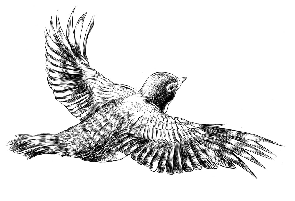
Daily Post: Robin with Inks

Here's the bird I posted pencils of earlier, again, a part of a larger image that I'll post soon. I got to do more feathering in this one ( a brush technique involving a series of tapering brush strokes) something I've been incorporating more and more into my ink drawings. I've always been heavily dependent on contour, (the outlines of the image) and so this is new, riskier territory for me, but I really like the effect. Usually I rely on color to give the drawing substance and weight, but lately I've been getting a little more adventurous.

Wednesday, October 27, 2010

Daily Post: Mailers in Action


here are some mailers I've done recently. The photos are dark, but I thought it might be interesting to show how they fold out when they're actually printed. Of course the colors and pretty much everything looks better on these things in person (or if I could have taken a better photo) But here they are:

For the Halloween one I thought it would be cool to do rounded corners:


Here's the six fold mailer in action, just in case a few posts back, you weren't sure what I was talking about:

Of course the images themselves can all be better seen on my website, jedalexander.com

Saturday, October 23, 2010

Daily Post: Robin

A part of a spring-themed image I'm working on.

Thursday, October 21, 2010

Daily Post: Scary Man and Scary Dog from my Dream

Drawn this morning.

This is the closest I could come to the scary man and scary dog in my dream last night. The dog is a little closer to my image of the dog than the man. Appropriate, I guess, for halloween. Maybe this had something to do with my watching Lady and the Tramp last night?


Tuesday, October 19, 2010

Daily Post: Two Heads

This is more of a traditional Jack the Giant Killeresque two-headed giant.

Monday, October 18, 2010

Daily Post: Prickly

We're back from APE. We'll have pictures soon, but I'm too wiped out right now. But here's a new drawing!

Wednesday, October 13, 2010

The Alternative Press Expo!

I will be here this weekend, all weekend:


We'll have four new posters, and several new 8x10 FRAMED dry brush prints on Arches paper. That's right, framed with glass acid free backing and very classy, at the bargain price of only $40! Only available at The Alternative Press Expo. We'll also be offering for the first time, your choice of matted or un-matted posters, also for bargain prices! 18x24 (with a 17x23 image area) posters on heavy stock, matted with acid free backing in an acid free bag only 25 bucks! We're practically giving this stuff away! Un-matted posters just $14, two for $25!

DaIly Post: Whoah, It's This Guy

Saturday, October 02, 2010