

Sunday, September 12, 2010

Friday, September 10, 2010
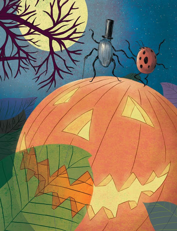
Daily Post: Halloween Mailer
Usually I conceive of a piece with only a vague idea of how I'll attack the color, depending primarily on the strength of the line drawing, solving the color problem later. This time color was very much a part of the piece's conception. I had pretty detailed color notes very early on with this piece, inspired by the work of Mary Blair. Mary Blair was a Disney concept artist who had an amazing sense of color and design, and often the way her work finally appeared on the screen never quite matched up to be as striking as her original designs. This is particularly inspired by the backgrounds in Disney's Alice In Wonderland which still somehow managed to capture the character of Blair's designs.
My colors ended up changing some in the execution, particularly the purples, but largely this turned out much how I envisioned it, and from a color perspective I feel this is one of my better pieces. After this experiment I'd like to make color much more of an integral part of how I conceive a piece from now on. Another thing I tried here was losing the outline on the larger shapes, having the color go right to the edge.

My only concern is that with the limits of digital printing. Dark colors don't fare as well as they might with off-set. With my ealier Kipling jungle piece I had to go to a photo processing lab to get the colors right for my portfolio because they were so dark, so printing this as a mailer may pose a problem. Laser printing tends to be kinder, but there are limits. I'll be attending a Society of Children's Book Writer's and Illustrator's conference today and had to settle for a laser printed copy for my portfolio because of time constraints, and the colors were much darker than I would have liked, but I decided to include it anyway because of the strength of the design. At any rate, how you see it here on the screen is pretty much how it's intended to look. Dark colors seem to fare better on Blogger as well.
My crazy color notes, followed a little less closely than I thought, it seems:

My colors ended up changing some in the execution, particularly the purples, but largely this turned out much how I envisioned it, and from a color perspective I feel this is one of my better pieces. After this experiment I'd like to make color much more of an integral part of how I conceive a piece from now on. Another thing I tried here was losing the outline on the larger shapes, having the color go right to the edge.
My only concern is that with the limits of digital printing. Dark colors don't fare as well as they might with off-set. With my ealier Kipling jungle piece I had to go to a photo processing lab to get the colors right for my portfolio because they were so dark, so printing this as a mailer may pose a problem. Laser printing tends to be kinder, but there are limits. I'll be attending a Society of Children's Book Writer's and Illustrator's conference today and had to settle for a laser printed copy for my portfolio because of time constraints, and the colors were much darker than I would have liked, but I decided to include it anyway because of the strength of the design. At any rate, how you see it here on the screen is pretty much how it's intended to look. Dark colors seem to fare better on Blogger as well.
My crazy color notes, followed a little less closely than I thought, it seems:


Thursday, September 09, 2010
Daily Post: Ladybug
Here's an inked character for my halloween piece in progress. This guy will be dancing with the beetle of a couple of posts back. Again, I'm experimenting with more elaborate rendering in my ink drawings, more spotting of blacks and hatching and feathering. Usually I stick with a straight contour and let the color do all the work, but I would like to try to include more line variety, giving my figures a little more character than when they're simple outlines.


Wednesday, September 08, 2010

Tuesday, September 07, 2010

Monday, September 06, 2010

Friday, September 03, 2010
Daily Post: Companion Piece to the Geese Mailer
I had tried to do a second piece of the girl feeding the ducks as a companion piece to the earlier one a few posts down, but the pose came out stiff because I was trying to copy the photo too closely. This time I made it a little more cartoony, further animating the figure by putting her in a sequence. I ended up using some of those extra duck drawings after all!
Another thing I was messing with here is limited color. Here much of the background and geese were virtually left as line art. Since this will reproduce at about 5 1/2 by 8 1/2 inches, too much busy detail would be distracting. A fully rendered scene with this much action would read poorly at that size. Simplifying both the color and the rendering makes for a much easier read and more pleasing design.

Another thing I was messing with here is limited color. Here much of the background and geese were virtually left as line art. Since this will reproduce at about 5 1/2 by 8 1/2 inches, too much busy detail would be distracting. A fully rendered scene with this much action would read poorly at that size. Simplifying both the color and the rendering makes for a much easier read and more pleasing design.

Daily Post: Drybrush Bee
Edit: I thought I could upload a bunch of posts at a time and then publish them whenever I wanted to, but apparently blogger only publishes them in the order they were downloaded. So this one was supposed to go before the one above. Next time I'll have it all sorted out.
This was done for a Bee-themed show for the Pence Gallery here in Davis. The show won't be for a few months yet.

And with color:

This was done for a Bee-themed show for the Pence Gallery here in Davis. The show won't be for a few months yet.

And with color:

Tuesday, August 31, 2010


Daily Posts!
From now on (or until I can't manage it anymore) I'm going to try to put up posts every day. I've got a lot of sketches and in-progress work that I'll be posting, at least one piece a day in addition to the more infrequent finished work. People have expressed an interest in this stuff and I would like to get a few more eyeballs checking out my blog, and since I draw at least something every day, I'm hoping it won't be too hard to keep up, especially now that I have my new faster and more convenient scanner.
So starting off, here's a monster for a monster book that's in progress:

This one was actually completed last night, but most of the images this week will be things that I've done in the last month or so.
So starting off, here's a monster for a monster book that's in progress:

This one was actually completed last night, but most of the images this week will be things that I've done in the last month or so.
Sunday, August 29, 2010
A Million Things to Do: Works in Progress
I only tend to post my finished work. This may make it seem like I don't actually produce all that much, and someone once remarked that they liked my work but I was "slow". Let me dispel that notion right now. I'm usually working on several projects at once. Here are a few of them.
3 of 30 designs (presently) from a proposed monster book:


Two blue-lined panels for a wordless sci-fi comic. Right now less than 3 pages penciled, nothing inked. This one is at the bottom of my priority list, but getting done slowly. I did character designs for it about 2 years ago that some of you may remember being posted. Its been on the back burner for a while, but now it's sort of on the 4th burner.


On the drawing board now: the background for a Christmas card mailer. I was able to improvise a not completely accurate makeshift curvilinear grid, and I'm pretty happy with the way it's came out. I wasn't sure if it was going to work, and have never tried anything quite like it. I don't know how well you can make it out, but this is birds-eye view of a town on a curved landscape.


I'm also in the process of writing the final draft of my first young adult novel for teens, and completing the first draft of a second, approx. 60,000 words each, or the equivalent of 200 book pages each. I have a first draft of a chapter book for young readers that needs to be rewritten, so no new writing projects until I get at least one of these in the can.
I used to find that when I started several projects at once, nothing really got done, but recently I've been more consistent about finishing things I start. The key, it seems, is not to set any one project aside for any great length of time, the one exception being book manuscripts. It's good sometimes to sit on a manuscript for a while once I have a completed draft so that I can return to it with fresh eyes.
Since having a bunch of stuff in process tends to turn my studio into a mess, I came up with the recent strategy of putting each new project in a project folder when I'm not working on it, unless it's too enormous to fit, in which case I'll just put it in my generic too enormous to fit portfolio.
Then there are projects I'd like to do that I've done preliminary sketches for, and I have a file for story ideas, but all that stuff isn't going to be touched for a while, and no new drawing projects until I've gotten a least a 2 of my current drawing projects in the can.
I've not been so great about keeping sketchbooks, but I still do random stuff and little drawings. I think I'm going to have to put together a project folder for this stuff too. Here's a little drawing that falls in this general category:

Then I have a two person show to prepare for at The Pence Gallery next February, where I'll show some completed work that hasn't been shown, and some new pieces that still need to be produced. The show will showcase my drybrush and watercolor work of animals and landscapes.
This may seem like a lot, but routine definitely helps.
3 of 30 designs (presently) from a proposed monster book:


Two blue-lined panels for a wordless sci-fi comic. Right now less than 3 pages penciled, nothing inked. This one is at the bottom of my priority list, but getting done slowly. I did character designs for it about 2 years ago that some of you may remember being posted. Its been on the back burner for a while, but now it's sort of on the 4th burner.


On the drawing board now: the background for a Christmas card mailer. I was able to improvise a not completely accurate makeshift curvilinear grid, and I'm pretty happy with the way it's came out. I wasn't sure if it was going to work, and have never tried anything quite like it. I don't know how well you can make it out, but this is birds-eye view of a town on a curved landscape.


I'm also in the process of writing the final draft of my first young adult novel for teens, and completing the first draft of a second, approx. 60,000 words each, or the equivalent of 200 book pages each. I have a first draft of a chapter book for young readers that needs to be rewritten, so no new writing projects until I get at least one of these in the can.
I used to find that when I started several projects at once, nothing really got done, but recently I've been more consistent about finishing things I start. The key, it seems, is not to set any one project aside for any great length of time, the one exception being book manuscripts. It's good sometimes to sit on a manuscript for a while once I have a completed draft so that I can return to it with fresh eyes.
Since having a bunch of stuff in process tends to turn my studio into a mess, I came up with the recent strategy of putting each new project in a project folder when I'm not working on it, unless it's too enormous to fit, in which case I'll just put it in my generic too enormous to fit portfolio.
Then there are projects I'd like to do that I've done preliminary sketches for, and I have a file for story ideas, but all that stuff isn't going to be touched for a while, and no new drawing projects until I've gotten a least a 2 of my current drawing projects in the can.
I've not been so great about keeping sketchbooks, but I still do random stuff and little drawings. I think I'm going to have to put together a project folder for this stuff too. Here's a little drawing that falls in this general category:

Then I have a two person show to prepare for at The Pence Gallery next February, where I'll show some completed work that hasn't been shown, and some new pieces that still need to be produced. The show will showcase my drybrush and watercolor work of animals and landscapes.
This may seem like a lot, but routine definitely helps.
Tuesday, August 24, 2010
The Geese of Prospect Park

And a detail:

This image is based on a photograph (used with permission) that the very talented illustrator Danny Hellman posted on Facebook of his daughter Alice feeding geese in Prospect Park, geese that, unfortunately, no longer exist. The 250 geese that frequented Brooklyn's Prospect Park were tragically slaughtered by the Federal government because they apparently were thought to pose a risk to air traffic at JFK airport. More information can be found:
here.
Danny's photos were amazing, a series of candid shots of his very charming daughter whom I wish I could have captured with a little more fidelity. My picture pales to Danny's. I found capturing the animation of Alice very difficult, so I went with a simple, more sedate pose, based on the photo that initially caught my attention. At some point I'd like to give drawing Alice another shot! She seems like a really fun Kid, and Danny's affection for her is very apparent in the photos.
Alice's pose was taken directly from the photograph, but the rest I invented or elaborated on using a variety of other sources.
I envisioned using this as a mailer, so at the front of the mailer would be this image, with room for my website and other information:

And last, here are some geese I didn't end up using, among them, some of my favorites, but they didn't end up working for the picture. Maybe I'll use them somewhere else some day.

All of the images were done with my usual method, brush, ink and pen rendering, scanned and colored with watercolor textures. Here I experimented more with feathered brush strokes. By "feathering" I mean a parallel series of tapered brush strokes that have a nice, soft, modeling effect. Not always used for the rendering of actual feathers.
If you would like to see Danny's illustration work, check out his website, here.
Wednesday, August 11, 2010
Once There Was a Man Whose Nose and Mustache...
Edit: Here's a new version with the lettering more integrated.

I've probably drawn about 10 versions of this image since the time I was 18. I was an obsessive perfectionist when I was a kid, and would draw the same picture over and over until I got it right, though I never seemed to get them right. 10 may be an underestimate. I'm still pretty anal, but not so much anymore that I'm not satisfied with the things I make. I think I did, at one point, make a version of this I was happy with, but its long lost. So here's my current version of it.
This will also likely be the only limerick I ever write. I'm not a great fan of limericks and don't tend to write rhyming verse in general, so this isn't something I intend to pursue. This is it folks.
Here's a detail:

And the finish:

Back by popular demand: hand lettering. I haven't hand lettered in a while, and there is something satisfying to me about hand lettering vs. typography, though sometimes one seems more appropriate to me than the other. For this one though, no matter what type style I tried, it never quite seemed to gel, so I ended up hand lettering it. I don't tend to get too fancy with my hand lettering--I'd like to try different types of title lettering at some point, but right now this is my default hand lettering style.
Another thing I tried here was something that I frequently used to do in painting, but that doesn't always translate well to print; a neutralizing green beneath a skin tone. There are a number of ways to do this--believe it or not, green is a color commonly used in skin tones to neutralize its compliment, red, so the skin tone won't have the artificial glow to it that it generally has if you go straight pink or red-brown. One technique I used was to apply a base tone of green and then glaze (apply a thin layer) of the pinkish color over top of it, but this tended to be more effective when seeing the actual painting in person, rather than in print.
Lately I've been using pastel textures, which made me think of the illustrator Gary Kelly. Kelly puts down his base tone of green, then similarly lays in a pink color after he's fixed the green layer with spray fixative, and the green would peek through here and there in grainy patches, causing you to visually mix the colors, sort of like what some of the impressionists used to do. In pastel, this effect reproduced extremely well. When it's done well, most people don't even catch it, unless they know to look for it, and it enriches the shadows. I've always liked the rich effect of a color peeking through from underneath its compliment, and so using the two-tone pastel texture I made for the last piece, this was easy to do.
Oh, and just an added note about the repeated imagery: not quite reused art here. I printed out the pencil drawing in blue line and inked it twice. I don't like reused artwork, but I hate redrawing things, so this seemed like a good compromise. Again, most people don't notice, but other artists definitely do. Reused art is the cardinal sin for cartoonists, and I suppose I'm just as much of a snob about it. It's just that extra element of craft when the images are all hand drawn, or at least, in this case, hand inked.

I've probably drawn about 10 versions of this image since the time I was 18. I was an obsessive perfectionist when I was a kid, and would draw the same picture over and over until I got it right, though I never seemed to get them right. 10 may be an underestimate. I'm still pretty anal, but not so much anymore that I'm not satisfied with the things I make. I think I did, at one point, make a version of this I was happy with, but its long lost. So here's my current version of it.
This will also likely be the only limerick I ever write. I'm not a great fan of limericks and don't tend to write rhyming verse in general, so this isn't something I intend to pursue. This is it folks.
Here's a detail:

And the finish:

Back by popular demand: hand lettering. I haven't hand lettered in a while, and there is something satisfying to me about hand lettering vs. typography, though sometimes one seems more appropriate to me than the other. For this one though, no matter what type style I tried, it never quite seemed to gel, so I ended up hand lettering it. I don't tend to get too fancy with my hand lettering--I'd like to try different types of title lettering at some point, but right now this is my default hand lettering style.
Another thing I tried here was something that I frequently used to do in painting, but that doesn't always translate well to print; a neutralizing green beneath a skin tone. There are a number of ways to do this--believe it or not, green is a color commonly used in skin tones to neutralize its compliment, red, so the skin tone won't have the artificial glow to it that it generally has if you go straight pink or red-brown. One technique I used was to apply a base tone of green and then glaze (apply a thin layer) of the pinkish color over top of it, but this tended to be more effective when seeing the actual painting in person, rather than in print.
Lately I've been using pastel textures, which made me think of the illustrator Gary Kelly. Kelly puts down his base tone of green, then similarly lays in a pink color after he's fixed the green layer with spray fixative, and the green would peek through here and there in grainy patches, causing you to visually mix the colors, sort of like what some of the impressionists used to do. In pastel, this effect reproduced extremely well. When it's done well, most people don't even catch it, unless they know to look for it, and it enriches the shadows. I've always liked the rich effect of a color peeking through from underneath its compliment, and so using the two-tone pastel texture I made for the last piece, this was easy to do.
Oh, and just an added note about the repeated imagery: not quite reused art here. I printed out the pencil drawing in blue line and inked it twice. I don't like reused artwork, but I hate redrawing things, so this seemed like a good compromise. Again, most people don't notice, but other artists definitely do. Reused art is the cardinal sin for cartoonists, and I suppose I'm just as much of a snob about it. It's just that extra element of craft when the images are all hand drawn, or at least, in this case, hand inked.
Sunday, July 18, 2010
Six-Fold Mailer
Another mailer to promote myself a children's illustrator.
I'm pretty happy with this one. The monster ended up looking a little like something drawn by Eric Orchard, but this didn't occur to me until later, so, sorry Eric. Apparently you were my unconscious inspiration.
Again I was thinking about type and how it can be integrated effectively in an illustration, but at the same time I was thinking about how I can use the format of the mailer in a novel way to show sequential action. Just like the way illustrators try to take advantage of page turns in book illustration, I wanted to take advantage of how the mailer would be read as it was unfolded.
Here's a detail:

This is the full sequence:


This is the orientation of the images as they will be printed, with the larger image on the opposite side:

This is the order in which the recipient will see the images as they unfold the mailer, each row representing one fold:

With the final image on the back:

The ground for the image was a pastel texture with soft pastel on print-making paper. I first laid down a blue color, fixed it with spray fixative, then laid in a blue gray so the dark blue would show through in a textured pattern. Since all the color was eventually manipulated on photoshop, all that mattered was that it was two analogous colors. They could have been any two colors and I could have achieved the same result on photoshop, which is how I got all the nice purples in the monster. The figures were colored with watercolor texture. All the line art, was, as usual, done with brush and ink in multiple parts, scanned and assembled. Some changes had to be made: for example, the monster's hand had to be enlarged from the original drawing.
The letters were tricky. I didn't want them to have an entirely mechanical look, so after distorting them to put them in the right perspective and making the little pieces (Last time I made a big to-do about distorting type and what a bad idea it was, but this is kind of a special circumstance), I printed them out in pink on bristol board and painted the 3-dimensional edge on them using gouache, a water-based paint similar to tempera. Then I grayscaled them, separated them from the background and colored them on photoshop. All the type was done with Futura condensed.
My long term plan is to send mailers out about once a month for the next 7 or 8 months, then to send mailers about once every two months after that. This one is going to probably be sent in January or February. I sent a 16 page portfolio booklet to about 50 publishers, about a month ago, and will be sending my first mailer to these publishers and about 40 more, next week. My idea is to get a bunch of these in the can, first, so I can work on other projects in the coming months and continue to stay current with the mailers I send.
This is all a part of my single-focus effort to get involved in the children's and young adult book market. There's the writing side to this too: I'm in the process of putting a final draft together for my first YA novel for teens and am about to finish the fist draft of my second YA novel for teens. I've also got a chapter book for young readers and a picture book written that I would like to make dummies for, and a two-person show of new work at the Pence Gallery in February, my first real fine art show. The work in the show is very different than my illustration work: mostly dry brush and watercolor studies of animals and landscapes.
So a lot is in the works. hopefully in the next year or two my efforts will start to pay off!
I'm pretty happy with this one. The monster ended up looking a little like something drawn by Eric Orchard, but this didn't occur to me until later, so, sorry Eric. Apparently you were my unconscious inspiration.
Again I was thinking about type and how it can be integrated effectively in an illustration, but at the same time I was thinking about how I can use the format of the mailer in a novel way to show sequential action. Just like the way illustrators try to take advantage of page turns in book illustration, I wanted to take advantage of how the mailer would be read as it was unfolded.
Here's a detail:

This is the full sequence:


This is the orientation of the images as they will be printed, with the larger image on the opposite side:

This is the order in which the recipient will see the images as they unfold the mailer, each row representing one fold:

With the final image on the back:

The ground for the image was a pastel texture with soft pastel on print-making paper. I first laid down a blue color, fixed it with spray fixative, then laid in a blue gray so the dark blue would show through in a textured pattern. Since all the color was eventually manipulated on photoshop, all that mattered was that it was two analogous colors. They could have been any two colors and I could have achieved the same result on photoshop, which is how I got all the nice purples in the monster. The figures were colored with watercolor texture. All the line art, was, as usual, done with brush and ink in multiple parts, scanned and assembled. Some changes had to be made: for example, the monster's hand had to be enlarged from the original drawing.
The letters were tricky. I didn't want them to have an entirely mechanical look, so after distorting them to put them in the right perspective and making the little pieces (Last time I made a big to-do about distorting type and what a bad idea it was, but this is kind of a special circumstance), I printed them out in pink on bristol board and painted the 3-dimensional edge on them using gouache, a water-based paint similar to tempera. Then I grayscaled them, separated them from the background and colored them on photoshop. All the type was done with Futura condensed.
My long term plan is to send mailers out about once a month for the next 7 or 8 months, then to send mailers about once every two months after that. This one is going to probably be sent in January or February. I sent a 16 page portfolio booklet to about 50 publishers, about a month ago, and will be sending my first mailer to these publishers and about 40 more, next week. My idea is to get a bunch of these in the can, first, so I can work on other projects in the coming months and continue to stay current with the mailers I send.
This is all a part of my single-focus effort to get involved in the children's and young adult book market. There's the writing side to this too: I'm in the process of putting a final draft together for my first YA novel for teens and am about to finish the fist draft of my second YA novel for teens. I've also got a chapter book for young readers and a picture book written that I would like to make dummies for, and a two-person show of new work at the Pence Gallery in February, my first real fine art show. The work in the show is very different than my illustration work: mostly dry brush and watercolor studies of animals and landscapes.
So a lot is in the works. hopefully in the next year or two my efforts will start to pay off!
Thursday, June 24, 2010
Indy Euphoria
Already a new Indy Euphoria! Who knew?

I'll be appearing as an official guest at Indy Euphoria at the Scottish Rite Center this Sunday, June 27th! More information here:
www.Indy Euphoria.com
Guests include: Steve Weissman, Johnny Ryan, Jordan Crane, Theo Ellsworth, Tom Neely, Skinner, Sparkplug Comic Books, dan Brereton, Raphael Navarro,Alex Chiu, and others. And Me!

I'll be appearing as an official guest at Indy Euphoria at the Scottish Rite Center this Sunday, June 27th! More information here:
www.Indy Euphoria.com
Guests include: Steve Weissman, Johnny Ryan, Jordan Crane, Theo Ellsworth, Tom Neely, Skinner, Sparkplug Comic Books, dan Brereton, Raphael Navarro,Alex Chiu, and others. And Me!
Tuesday, June 15, 2010
Jack Jumps over the Candlestick.
Here's my latest mailer. No mailers have actually been mailed as of yet--still waiting for a proof from the printer on the first.

This was inspired by an exercise that Kristen Nobles from Candlewick Press had attendees attempt at the 2010 SCBWI Spring Spirit Conference. She gave us all a very short time to thumbnail the nursery rhyme, "Jack be nimble, Jack be quick, Jack jumps over the candlestick". After the exercise she asked how many people drew Jack as a boy, and pretty much everyone had. She then suggested that Jack could be an animal, or just about anything that jumps. She then asked how many drew the candlestick on the floor, and pretty much everyone had. Then she asked, why was the candlestick on the floor? Where do you usually see candlesticks? She wanted to encourage us to look outside of our first impressions and basic assumptions about a story.
My approach to illustrating my recent children's book subjects has been to try to be as accurate as possible to what I felt was the author's intention, but most of the subjects I've been illustrating have been prose chapter books. Since picture books have very limited text, the process is much more of a collaboration. The artist does a lot more narrative heavy lifting because the text doesn't always suggest exactly what should happen on the page, so this is my attempt to stretch the text in a different direction.
Also wanted to try to do something interesting with the typography since in picture books, type is often integrated into the imagery in a more meaningful way. The typeface is Futura, a typeface that the illustrator Frank Staake tends to use often, and I was inspired by the way he uses type. I wanted to have they typography mesh nicely with the imagery and reflect the character of the words. I've found that generally when I distort type, it doesn't tend to look as good--the characters of the best faces are designed to fit together well, and everything is considered, including the negative spaces between characters and the way characters fit together. When you distort type you change all of this. That doesn't mean that distorting characters can't be effective, but in my personal experience, it looks better when I leave it alone.
So for "nimble" I wanted the type to look flexible and stretchy, without stretching it out, so i curved the path of the text and made a dotted line thread through the words to emphasize the path, alternating the color of the characters to give it a kind of rhythm. For "Jack be quick" I made a dotted line that bounced from one word to the next, with the word "quick" larger, and in the condensed form of the typeface to make it visually correspond to the build-up of speed, again using the same color scheme but making the emphasis in red on the word "quick". I thought about doing something similar with "jumps" by making the text appear to jump over the candlestick, but this ended up making the image too busy with text, so I decided to keep the last passage simple.

This was inspired by an exercise that Kristen Nobles from Candlewick Press had attendees attempt at the 2010 SCBWI Spring Spirit Conference. She gave us all a very short time to thumbnail the nursery rhyme, "Jack be nimble, Jack be quick, Jack jumps over the candlestick". After the exercise she asked how many people drew Jack as a boy, and pretty much everyone had. She then suggested that Jack could be an animal, or just about anything that jumps. She then asked how many drew the candlestick on the floor, and pretty much everyone had. Then she asked, why was the candlestick on the floor? Where do you usually see candlesticks? She wanted to encourage us to look outside of our first impressions and basic assumptions about a story.
My approach to illustrating my recent children's book subjects has been to try to be as accurate as possible to what I felt was the author's intention, but most of the subjects I've been illustrating have been prose chapter books. Since picture books have very limited text, the process is much more of a collaboration. The artist does a lot more narrative heavy lifting because the text doesn't always suggest exactly what should happen on the page, so this is my attempt to stretch the text in a different direction.
Also wanted to try to do something interesting with the typography since in picture books, type is often integrated into the imagery in a more meaningful way. The typeface is Futura, a typeface that the illustrator Frank Staake tends to use often, and I was inspired by the way he uses type. I wanted to have they typography mesh nicely with the imagery and reflect the character of the words. I've found that generally when I distort type, it doesn't tend to look as good--the characters of the best faces are designed to fit together well, and everything is considered, including the negative spaces between characters and the way characters fit together. When you distort type you change all of this. That doesn't mean that distorting characters can't be effective, but in my personal experience, it looks better when I leave it alone.
So for "nimble" I wanted the type to look flexible and stretchy, without stretching it out, so i curved the path of the text and made a dotted line thread through the words to emphasize the path, alternating the color of the characters to give it a kind of rhythm. For "Jack be quick" I made a dotted line that bounced from one word to the next, with the word "quick" larger, and in the condensed form of the typeface to make it visually correspond to the build-up of speed, again using the same color scheme but making the emphasis in red on the word "quick". I thought about doing something similar with "jumps" by making the text appear to jump over the candlestick, but this ended up making the image too busy with text, so I decided to keep the last passage simple.
Tuesday, June 01, 2010
Hansel and Gretel Themed Mailer

So here's my new mailer. Still waiting for the first one to be printed. This one is a modern reworking of the Hansel and Gretel story, again I'm trying to tell a mini story here, the first image on the outside of the mailer with a tri-fold panorama interior.
So I'm not going to post all the sketches and reference for this one, but I did another version of the car that was covered in different varieties of candy. It ended up looking like it had the measles, with not really much continuity of design. This one is modeled after a classic 50s convertible.
The mottled texture of the grass and road are done with gouache, a kind of water-based paint similar to tempera that really holds texture well, so I laid down the color then dabbed it with a sponge and a rough house painting brush. The other textures are pastel and watercolor for the sky and the stop sign, as usual, assembled with the line art on the computer.
I wanted this to have on overcast feel, a midwestern about-to-rain look with the landscape and the cows in the background, a subtle air of menace.
The two kids have these kind of Mickey Mouse pants. I'm not sure why, but that's how they turned out. Really simple, cartoon Carl Barksesque design. Well, on to the next...
Saturday, May 15, 2010
New Wednesday Figure Drawings
I'm very pleased with this first figure. This is a 2 minute pose and everything a gesture drawing should be--just enough information to describe the figures basic anatomy and a clearly defined line of action.

A 20 minute pose.


A 20 minute pose.

Friday, May 07, 2010
New Wednesday Figure Drawings
These are two 20 minute poses. Again I've been choking on the long pose. I never quite know how to pace myself, and I tend not to spend enough time working out the proportions. With these I didn't worry so much about proportion: everyone was drawing these Henry Moore-esque drawings because of the pose of the model and the way she was shaped. It was a fun session.


Thursday, May 06, 2010
Taking Advice From Your Peers
Typically what I do when I finish an image is post it on Facebook. I have a wonderful peer group of illustrators and cartoonists on Facebook who often have things to say about the image. Some of these things are helpful, some less so, and it's important to discriminate between what will work for you and what won't. It's easy to get distracted by too much feedback and lose track of what's important to you, and with this image, after a number of conflicting opinions, I started to lose sight of what was working and what wasn't. So I gave it a couple of days. During this time I had a lot of conflicting emotions to go along with so many conflicting opinions: how dare someone say so-and-so, and are they right? At this point its easier and more appealing to go along with the people who say it's a great image and I shouldn't change a thing. So I stepped back and took what I reasonably could from the experience.
Some of the criticisms were subjective and more about the emotional content of the image, and there's not much I can do with these aside from starting from scratch and making a new image. I also didn't agree entirely with some of these assessments, and though in the end I could be wrong, all I can really do is go with my intuition.
One piece of advice I was able to take and reasonably act on was the length of her legs. In the panel where she is skating, and in the final panel, her legs were quite a bit shorter than they were in the panel where she's tying her shoes. So with the magic of photoshop, I was able to lengthen her legs. This is where it becomes valuable to keep everything on a different layer. I was able to stretch and distort the line art by itself, making the legs longer and the feet a little bigger to match the earlier image. Since the first foot in the skating image is foreshortened, I was able to keep it the same: a smaller foot and a foreshortened leg compared to the full profile leg and larger foot in the foreground. Before this both feet were the same size, but on the same plane, but now since one is in the further in the foreground this distortion makes sense. After this I was able to stretch the color as well, rather than to recolor it, fussing around with it until it fit.
Next I added a shadow under the image where she's tying her shoes. Before she looked like she was floating a little, and this served to ground her butt more firmly onto the ice.
Lastly, I lengthened the legs on the small figure making the snow angel. This one is probably the least "on model" but I feel it makes sense in the image, much smaller and a little more cartoony than the other figures.
So here's the finished (I hope) image, after all of these changes:

Some of the criticisms were subjective and more about the emotional content of the image, and there's not much I can do with these aside from starting from scratch and making a new image. I also didn't agree entirely with some of these assessments, and though in the end I could be wrong, all I can really do is go with my intuition.
One piece of advice I was able to take and reasonably act on was the length of her legs. In the panel where she is skating, and in the final panel, her legs were quite a bit shorter than they were in the panel where she's tying her shoes. So with the magic of photoshop, I was able to lengthen her legs. This is where it becomes valuable to keep everything on a different layer. I was able to stretch and distort the line art by itself, making the legs longer and the feet a little bigger to match the earlier image. Since the first foot in the skating image is foreshortened, I was able to keep it the same: a smaller foot and a foreshortened leg compared to the full profile leg and larger foot in the foreground. Before this both feet were the same size, but on the same plane, but now since one is in the further in the foreground this distortion makes sense. After this I was able to stretch the color as well, rather than to recolor it, fussing around with it until it fit.
Next I added a shadow under the image where she's tying her shoes. Before she looked like she was floating a little, and this served to ground her butt more firmly onto the ice.
Lastly, I lengthened the legs on the small figure making the snow angel. This one is probably the least "on model" but I feel it makes sense in the image, much smaller and a little more cartoony than the other figures.
So here's the finished (I hope) image, after all of these changes:

Tuesday, May 04, 2010
Children's Book Mailer
After the Society of Children's Book Writers and Illustrator's conference the first thing I did was put together this follow-up mailer to send to editors and art directors. What I learned from Kristen Nobles from Candlewick was that one of the key things they look for in a mailer is character. The kinds of elaborate scenes I typically do are too busy. Though perfectly readable and effective at children's book size, these kinds of busy images are hard to read at the usual 5x7 mailer size. So I decided to keep it simple. I decided to do a mailer that would emphasize expression and body language. Another thing Kristen mentioned was that they like to see people interacting with animals. The point here isn't so much to come up with the most original concept, but to demonstrate that I have this skill.
The other thing I decided to do was a tri-fold mailer that was a sort of mini narrative. Because I have a background in comics, this kind of narrative came naturally to me. In picture books you want to distill in one image a key moment from the story, but the objective of the mailer is a little different. I need to attract the attention of the viewer quickly because publishing houses receive a large number of these mailers, and the mailer needs to be memorable. I thought that by keeping the pace of the action more immediate I could engage the viewer right away while giving them a sense that I can tell a story and that I can show the same character in different attitudes.
To be honest this isn't as carefully thought out as it sounds--my approach was mostly intuitive, but this is essentially where I was headed with the idea.
This will be the front image of the mailer where I'll have my e-mail address, website and other information:

This will be the interior, what you will see when you open it up. The final image will be a full-bleed, so this image has already been cropped to represent what it will look like with a trim:

Here are some early sketches of the character. Originally I had imagined the character as younger, but by making the character have longer arms and legs I could make her a lot more animated, so I aged her a little more. You can see here how on a younger character the features are smaller in proportion to the head.

When I started drawing more kid friendly material I didn't realize how much of a challenge drawing kids would be. When I did one of my first images featuring a kid, my interpretation of James and the Giant Peach, I ended up doing over 70 images of James before I came up with a James I was satisfied with. This time it took a lot fewer drawings, but I still had to go through a fair amount of sketches to get the character I wanted.
Here are just a few of the over 100 images I collected from the web to draw my final image. You can't have too much reference. It always helps to make your image more authentic. I try not to use any one pose from a photograph because I find that when I reinvent the character from multiple sources I avoid making the character look stiff. Drawing directly from photo reference without understanding what makes the figure tick, without being able to visualize the figure in the round, can make the figure look flat and static. Even when I do use just one photo for a figure as I sometimes do, it's important never to forget how to draw as you render it.
Of course this mainly applies to naturalistic poses. Mine are admittedly exaggerated and a little cartoony, but at their root they're based on observation. Some of my favorite illustrators, however, like Ben Shahn and Heinrich Drescher, draw figures that are more symbolic and expressionistic, a very different approach that I also admire and sometimes use in my comics work, like The Blue Kid.

Of course I have no idea if this is going to work. I'm new to this process, and this is how I've decided to approach it knowing the little that I know at this stage of the game. My plan is to follow up this mailer with two others of the same type in the next few months, with follow-up mailers afterward every three to four months.
In the past, when I did editorial, I thought it was adequate to send out one mailer a year, until the illustrator Frank Stockton straightened me out. He told me that at minimum, three to four months was as long as you should wait. Art directors need to know that you're serious and intend to follow through. Also, unlike in editorial, where postcards are adequate, some children's book publishers like to first see a small sampling of your work. To this end, I've had digitally printed a mini magazine that showcases my work which I intend to send as a precursor to my mailers. This is the beginning of what I hope will be an effective long-term strategy to catch the attention of art directors and editors and to let them know that I'm serious and reliable.
Over the months that follow, if you continue to follow my blog you'll see how successful this strategy turns out to be. I spent the last year establishing a new portfolio of kid friendly work, and this year I intend to actively promote it with the aim of cultivating a career in young adult and children's media.
Wish me luck.
The other thing I decided to do was a tri-fold mailer that was a sort of mini narrative. Because I have a background in comics, this kind of narrative came naturally to me. In picture books you want to distill in one image a key moment from the story, but the objective of the mailer is a little different. I need to attract the attention of the viewer quickly because publishing houses receive a large number of these mailers, and the mailer needs to be memorable. I thought that by keeping the pace of the action more immediate I could engage the viewer right away while giving them a sense that I can tell a story and that I can show the same character in different attitudes.
To be honest this isn't as carefully thought out as it sounds--my approach was mostly intuitive, but this is essentially where I was headed with the idea.
This will be the front image of the mailer where I'll have my e-mail address, website and other information:

This will be the interior, what you will see when you open it up. The final image will be a full-bleed, so this image has already been cropped to represent what it will look like with a trim:

Here are some early sketches of the character. Originally I had imagined the character as younger, but by making the character have longer arms and legs I could make her a lot more animated, so I aged her a little more. You can see here how on a younger character the features are smaller in proportion to the head.

When I started drawing more kid friendly material I didn't realize how much of a challenge drawing kids would be. When I did one of my first images featuring a kid, my interpretation of James and the Giant Peach, I ended up doing over 70 images of James before I came up with a James I was satisfied with. This time it took a lot fewer drawings, but I still had to go through a fair amount of sketches to get the character I wanted.
Here are just a few of the over 100 images I collected from the web to draw my final image. You can't have too much reference. It always helps to make your image more authentic. I try not to use any one pose from a photograph because I find that when I reinvent the character from multiple sources I avoid making the character look stiff. Drawing directly from photo reference without understanding what makes the figure tick, without being able to visualize the figure in the round, can make the figure look flat and static. Even when I do use just one photo for a figure as I sometimes do, it's important never to forget how to draw as you render it.
Of course this mainly applies to naturalistic poses. Mine are admittedly exaggerated and a little cartoony, but at their root they're based on observation. Some of my favorite illustrators, however, like Ben Shahn and Heinrich Drescher, draw figures that are more symbolic and expressionistic, a very different approach that I also admire and sometimes use in my comics work, like The Blue Kid.

Of course I have no idea if this is going to work. I'm new to this process, and this is how I've decided to approach it knowing the little that I know at this stage of the game. My plan is to follow up this mailer with two others of the same type in the next few months, with follow-up mailers afterward every three to four months.
In the past, when I did editorial, I thought it was adequate to send out one mailer a year, until the illustrator Frank Stockton straightened me out. He told me that at minimum, three to four months was as long as you should wait. Art directors need to know that you're serious and intend to follow through. Also, unlike in editorial, where postcards are adequate, some children's book publishers like to first see a small sampling of your work. To this end, I've had digitally printed a mini magazine that showcases my work which I intend to send as a precursor to my mailers. This is the beginning of what I hope will be an effective long-term strategy to catch the attention of art directors and editors and to let them know that I'm serious and reliable.
Over the months that follow, if you continue to follow my blog you'll see how successful this strategy turns out to be. I spent the last year establishing a new portfolio of kid friendly work, and this year I intend to actively promote it with the aim of cultivating a career in young adult and children's media.
Wish me luck.
Saturday, May 01, 2010


Subscribe to:
Posts (Atom)